Here’s the transcript of a chat this morning with ATT:
opener : Hi, I’m AT&T’s automated virtual assistant. How can I help you today? Otis : Our student is back from semester abroad so we would like to reactivate XXXXXXXXXXXX agent : Oh no! We can help you with reinstating your service.
Was your service interrupted because of: Payment issue Other Otis : Other agent : The Reactivate Wireless Service page has detailed steps to restore your line! Otis : ##Url#https://www.att.com/esupport/article.html#!/wireless/KM1011528 agent : Here are step by step instructions for restoring your line. Otis : ##Url#https://www.att.com/esupport/article.html#!/wireless/KM1011528 agent : Here are step by step instructions for restoring your line. Otis : the page doesn’t have the answer and your “step by step instructions” aren’t showing up agent : Hmmm. Could you rephrase your question? Otis : I want to chat with a real person agent : Let me get you to a specialist. Please tell us your first name. Otis : Otis agent : Thank you, Otis. You will now be connected to a specialist who will assist you.
How might this have been a better experience? Keep the bots out of the chat room. Specifically, when I clicked “Chat” I expected to be connected with a live person. This was the way ATT chat worked in the past. If you’re going to try to make me use a virtual assistant, make it clear you are doing so. (Because I assumed I was going to get the same experience as previously, I did not notice the reference to the automated virtual assistant till I read the transcript.) And it should be a separate help/support function than Chat, which has the user perception of being a conversation with a real person.
You’ve replaced a toilet seat, right? It takes about five minutes: you unscrew the plastic nuts underneath, pull off the old seat, position the new one by poking the plastic bolts through the very obvious holes, secure it with new clean nuts and you’re done.
Well, if you have a Kohler one-piece toilet things are a little different. This video–which was MADE by Kohler, not an irate customer–tells you how to replace the anchors that hold the toilet seat in about (their estimate) 45 minutes. Mind, these instructions are just for the anchor…. you still have to put in the toilet seat and its bolts. And you have to buy a kit (Kohler sells it for $47 but you can get it for much less on Amazon) that includes the anchors and a bunch of specialty hardware to handle the difficult task of getting out the old anchor (which in my case was broken off in its hole) and stabilizing the new one while you compress it.
Take note as you watch the video of the sequence in which the washers go on the mounting bolt: first the flat washer, then the lock washer which is the opposite of the way it’s usually done. This means that after you seat the anchor and back off the mounting bolt, when you lift it off the toilet the lock washer will inevitably fall… into the toilet! At which point you have no choice but to fish it out by hand.
My teenager was impressed that a company has found a way to make money on its own design incompetence, but as he grows older he’ll learn. Google a bit and you’ll find Kohler is reviled among plumbers and any homeowner who’s ever had to work on their products and all swear never to buy Kohler again. I’m giving them my broken-off bolt award for “Worst User Experience of the Year”.
Second place, by the way, goes to my 2010 Prius for its right* low beam headlight. The halogen lights in newer cars do burn out and need replacement, which on the left* side is as straightforward as you might expect. But the right* side requires taking off the bumper for access, giving you the choice of spending half the day on the project or paying the dealer $150. Nice move, guys.
* I originally described it from the mechanic’s perspective, where you’re facing the car. Corrected to standard nomenclature where right is the passenger side (in the U.S. anyway).
Infographic from the Marketing Sherpa case study, “Content Marketing: Interactive infographic blog post generates 3.9 million views for small insurance company”. The callouts are interactive; the reader clicks them to get the results at right. I also like the fact that this fits my screen without scrolling.
I am working on a business-to-business lead generation campaign in which I was given a bucket of information “assets” to sprinkle as offers throughout the series of contacts. Included are several infographics. I find myself reluctant to use them and I wonder if I’m alone in this.
It’s one thing to visit a web page and find a graphic that tells a story with images and type design, more effectively than words could do alone. That’s what an infographic is supposed to do. (I have previously complained about infographics that don’t get over this easy hurdle, and seem to be just a way to keep designers employed.) But how do you get people sufficiently interested that they’ll click through or give their contact information to see the infographic?
A search for “infographic” in my email archive doesn’t come up with a lot of examples. Here’s CEA Smartbrief:
What’s the ROI of Brand Advocacy at Retail? We were curious about the value of turning retail employees into brand advocates. So we conducted an independent academic study that crunched two years of data on 63,500 sales associates in over 330 locations — and discovered that brands with customer-centric brand training sell up to 69% more. Download the infographic.
And here’s an ad for Citrix, on the Infoworld: Mobilize newsletter:
Infographic: Mobile Workspaces Enable New Ways to Work The number of workers who telecommute is expected to increase 63% in the next 5 years, but the technology to support this is lacking in most organizations. Mobile workspaces that follow people anywhere, across their devices, secure enterprise information and afford the ultimate in productivity. SEE THE INFOGRAPHIC.
And here’s Russell Kern’s ROInsider:
Download our easy-to-read infographic on Big Data to learn what it means to connect with today’s consumer.
I like the first example because it sets up the graphic as support for one surprising fact. I’m interested in Kern’s reassurance that his is easy to read, implying that’s a hurdle with infographics. And Citrix treats the word “infographic” as equivalent to “white paper” or “special report”; there’s no additional advantage or baggage.
But what I’d like to know is whether the promise of an infographic performs as well as or better than these other, tried and true, information delivery vehicles. As a business prospect, I’m a bit embarrassed by the idea of clicking on a promised infographic because of the implication I can’t handle words so I’ve got to get my information in pictoral form—like a comic book!
Another issue with infographics is how they are to be accessed. Do you really expect me to cheerfully and willingly download a picture as I would a white paper, which I accept must be absorbed offline? And what am I going to do with it when I get it? By definition, infographics are supposed to be quick reading. Now I’ve read it, and I’m done, and I have this unwanted download (possibly with a virus attached) to dispose of.
Then there’s the practical aspect of reading the infographic: most are huge, and require extensive scrolling on the screen. That goes against everything I know about lead generation offers: if you make it difficult for people to get at your promotional information, they’re much more likely to abandon it than to struggle through.
I saw a study some years ago (from eMarketer, I think) of the comparative effectiveness of various lead gen offers (white papers, sales kits etc with interactive calculators being the best performing). I’d love to see infographics evaluated in this mix. My hunch is that prospects will view an infographic on a web page if you describe it in a compelling way, but they’re not going to download it. So that’s how I’m going to handle it in my project, and I’m going to couple it with another offer. They can go to a page and see our interesting visual, then give us a bit of contact information if they want to delve further with a related written document.
In writing this post I searched “infographic” on Marketing Sherpa, which is all about direct marketing case histories, and found just one which is the example above. This is on the blog of a company that sells travel insurance, and it appears they promoted it through quite a few channels, so I don’t know that it’s helpful in answering my question about the effectiveness of infographics for lead gen. (The article does mention that it was tested in emails against a “just plain insurance” message and achieved a 96% lift, but that is what I would expect with any offer vs no offer.) If anybody has any hard stats of whether infographics work, please share!
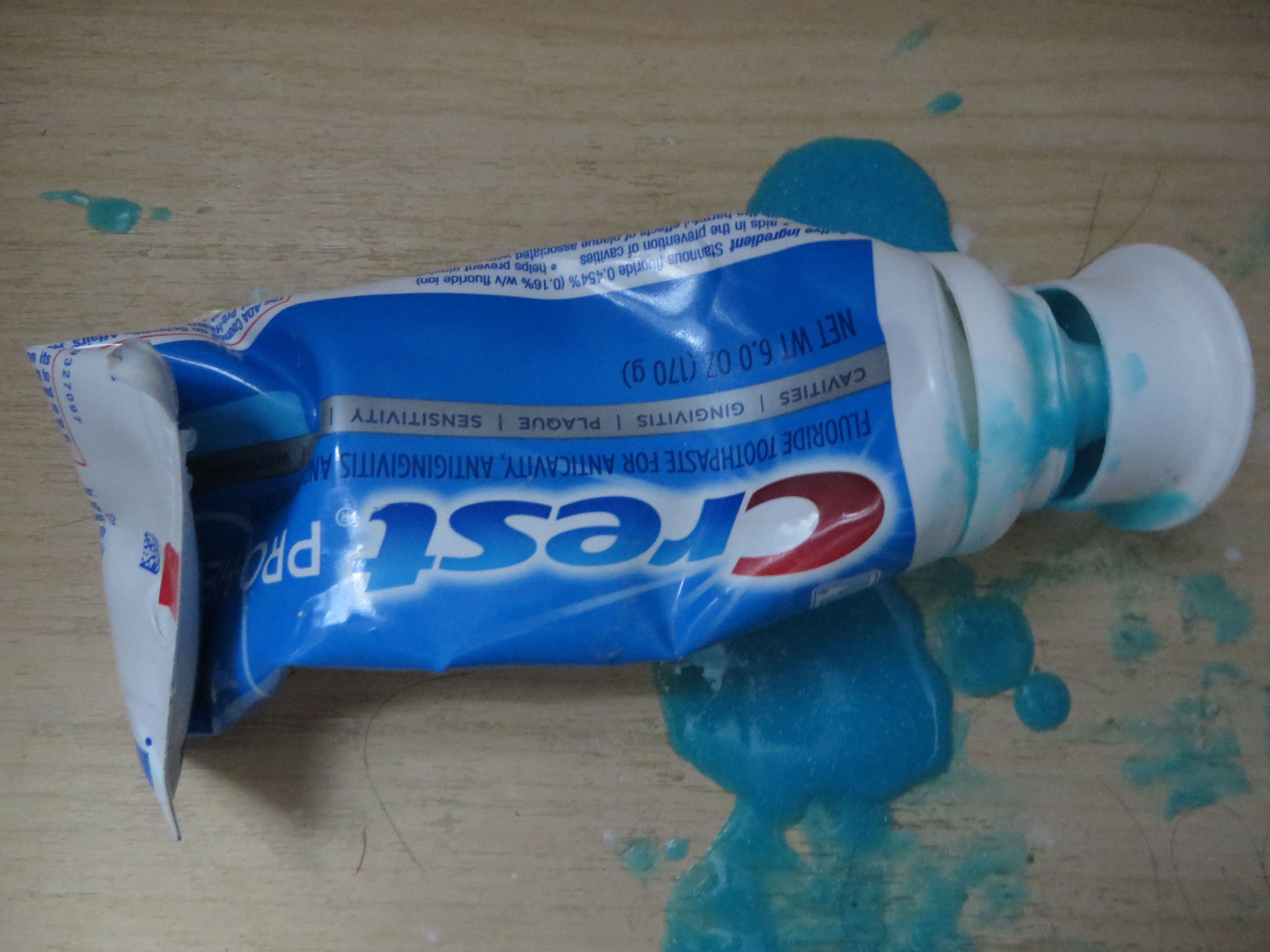
Crest tube can’t hold the toothpaste… brilliantDo you have a mess like this in your toothbrush drawer? You will, if you’re a loyal customer of Proctor & Gamble and their flagship Crest brand.
Seems like the old tube with the small opening and the screw top wasn’t good enough for them, so they went to this great big cap that is supposed to pop on, but it doesn’t. And they also changed the formula of the paste so it’s more liquidy and oozes out all over the drawer.
Anybody know why they did this? Hard to believe it’s less expensive than the traditional tube. I think it’s a case of a/changing two things at once, which as marketers we know is folly and b/somebody with too much time on their hands.
I’m too cheap to throw it out, but as soon as it’s done I’m going to switch brands to somebody who still uses the old fashioned tube.
My son is a high school junior who recently took the PSAT, so he’s receiving a ton of prospecting mail from colleges. The other night we went through a stack of these direct mail packs, and it was interesting to see his reactions.
There was a lot of good stuff. Overall, the colleges did a strong job of presenting what makes them unique, and if it’s not a good match for my high school student there’s no fault to either side. But he had a couple of interesting comments from which lessons can be learned.
A couple of colleges disqualified themselves for consideration with cut-rate production. Here’s a college he’s never heard of, and you send him a solicitation that looks like you’re operating on a shoestring, and out you go into the discard pile. Lesson: be aware of the competitive environment in which your solicitation is viewed. If you really can’t afford a professional photographer and designer, maybe a heart felt letter from the president, in laser addressed envelope, is the way to go.
And, a good third of the schools wanted my student to continue the dialog by going to a special web page and logging in with his name and password. This is Gen-X, or even Baby Boomer, marketing: assuming people will feel special because you’ve gone to the trouble to set up a “personal web page”. My millennial found it laughable. Passwords and user names are for World of Warcraft and a discussion of them usually leads to how you have been hacked. He also drew amusement from how he was “gmaxwell” on some college sites but maybe “gmaxwell3” on others and wondered if that meant he was less desirable to the latter.
To me, the best of the bunch was a completely non personalized self mailer from Carleton College with body copy that started: “Nice work on the PSAT!” Do they have access to his score? No matter. Why not assume the best about him and give him a compliment he may or may not deserve?
As a small business owner, I turn out to be one of those people who doesn’t get to keep the health insurance I like. We got the letter from our provider yesterday, advising us to go right to the New York State site thus avoiding the healthcare.gov train wreck. Unfortunately, mystateofhealth.ny.gov isn’t much better. I tried to register about 30 times each time getting the message that my session had expired as soon as I hit the “submit” button. It didn’t help that I had to get over a check of my preferred username to be sure no one else had it, and answer a particularly hard to read Captcha. Why in the world would they think bots would be trying to set up health accounts?
My wife had better luck today and got a good way through the application before the website went down. There were two drop-down menus at different points, one to identify our current health carrier and the other to identify our auto insurance provider (not sure why they need this info). And here’s the thing: the menu listings were in random order, vs. alphabetical. There were easily 100 health carriers and even more auto insurers so you just have to scroll back and forth till you find the one you’re looking for, and I bet there are lots of mistaken choices. My wife was able to find our health insurer. But when it got to auto insurance she scrolled and scrolled, back and forth, and finally realized our carrier (USAA) wasn’t on the list. So she put down “none” because that was the best choice available. Doesn’t exactly help the state exchange with the actuarial part.
Where do they get the people who code these sites? Isn’t there any kind of darwinism in government that rewards people who strive harder to do a good job? I know a lot of you will say “what a stupid question” but I really do try to have faith that people entrusted to help other people will take that responsibility seriously. So this is discouraging, and I hope we don’t get sick before we get insurance.
I got a survey invitation the other day from American Express that exhibited a number of worst practices. I’ll share highlights so we can hopefully learn from it.
1. The survey arrived too late. The email started, “Our records indicate you logged on to americanexpress.com on September 19, 2012, and we would like feedback about your on-line experience.” Problem: the email didn’t reach me till September 24. How am I supposed to remember something I did online 5 days ago?
2. The survey offered no incentive. It’s a sad but true fact that you have to give people a reward to participate in these days, simply because everybody else is doing it. It doesn’t have to be much … how about just a chance to win a $100 American Express Gift Card?
3. The survey is poorly written. The landing page starts, “As a valued American Express® customer, your views on how we can improve our service are extremely important. “ My views aren’t the customer, I am. That’s a dangling prepositional phrase and it’s distracting.
4. The survey doesn’t promise that it will be a quick and easy experience. The landing page simply states, in bold type, “The survey takes a few minutes to complete.” In context, that feels like a very long time.
5. The survey demands an explanation on each question of why I answered the way I did, written in free text. Eg, “What could have been done to make you more likely to recommend American Express to a friend or colleague?” (More bad or awkward writing.) Nothing really… I was just paying my bill! And it won’t let me leave the field blank. I have to type something, even if it’s nonsense, otherwise the page reloads.
6. The survey asks questions it already knows the answer to, in this case why I was on the website and what I did there. (It could have ben spun into a “do you recall what actions you performed while on the website” question which would have had more apparent validity since it appears to be testing the intensity of my recollection.)
7. The survey asks a question I can’t answer: “Please rate your satisfaction with the ease of navigating the American Express website, americanexpress.com.” Yo! The site I go to is called “Open Savings”. It does resolve (I just checked) to americanexpress.com but a consumer I shouldn’t be expected to know that. Why mention the URL at all?
8. The survey communication wasn’t sufficiently personalized. After I abandoned the survey for all the irritations described above I got an email “reminder” which was the same as the first email with this additional superscript: If you have already completed the survey, thank you and please accept our apology for the additional e-mail. But when I returned to the survey I was deposited where I left off.
What’s happening here is that they are automatically sending a follow up email to EVERYBODY who received the first email, and not removing or acknowledging the completions or people who started and then abandoned it. How irritating is that?
The “independent research company” that provides this survey is researchhq.com. Autofills on the search panel suggest they’ve also done surveys for Wells Fargo and Allstate. Good luck with that.
Direct marketing watchdog Denny Hatch had his knickers in a twist about the online ad shown here. And with good reason. It’s simply a long copy direct mail letter turned into a PowerPoint video and it runs 77 minutes (I am taking that part on faith since I lasted about 4 minutes) with no pause button and no call to action until the very end. The sell is for an investment newsletter which allegedly has 241,700 active subscribers, which I presume are the same as the 241,700 people currently viewing Otisregrets.
Stansberry’s “don’t leave” interrupter screen
Hatch waited all the way to the end; I didn’t and clicked the close button, bringing up the frantic “WAIT!” alert usually reserved for adult content sites. I clicked the “stay on page” button … and was rewarded with the opportunity to read the same copy, but in its original mega-letter format. (And badly reproduced, too. Hope that Stansberry picks up a few subscribers so he can afford a new imaging drum for his scanner.) Even so there is no call to action until the very, very end of the letter where we find a single “subscribe” button.
Stansberry’s letter
Of course this is NOT evidence that long copy is a bad idea. Rather, it’s a great way to experience good direct marketing by its absence. When asked how long a man’s legs should be, Lincoln allegedly replied “long enough to reach the ground.” It’s the same with sales letters. They can be one page, or 32 pages (my personal record), or hundreds of pages like the Stansberry effort… just as long as the copy is permeated with calls to action so the reader can stop reading and give you the order as soon as they are convinced.
Hatch’s article had a great quote from old school copywriter Claude Hopkins, which talks about “print” but applies equally well to electronic media:
“People are hurried. The average person worth cultivating has too much to read. They skip three-fourths of the reading matter, which they pay to get. They are not going to read your business talk unless you make it worth their while and let the headline show it.
People will not be bored in print. They may listen politely at a dinner table to boasts and personalities, life history etc. But in print they choose their own companions, their own subjects. They want to be amused or benefited. They want economy, beauty, labor savings, good things to eat and wear.”
Getting back to the format of Stansberry’s online ad, Hatch closes (as will I) with this zinger from “Visual Display of Quantitative Information” author Edward Tufte: “Power corrupts. PowerPoint corrupts absolutely.”
If you have shopped at Ikea, you will notice that periodically you come across an escape hatch. You can stroll through the departments (which is what Ikea would like you to do because random browsing causes you to purchase additional merchandise) but if you get bored you can just duck through one of the little side doorways into a completely different department.
Good software user design includes an escape hatch as well. A good example is the TurboTax desktop product, which gives you an always-accessible choice of “Forms” or “EasyStep” so you can look at your current information in the way that makes most sense for you.
But I’m using TurboTax Online for the first time, and they don’t do that. The ONLY way to navigate is to follow the prompts on the screen, and if the prompts don’t work and you ask for help then Intuit twists itself into contortions trying to answer your question. (I’m talking about the in-program help, not the too-broad User Community sidebar.)
So, I want to import the return created with TurboTax Desktop 2009. I find a help screen with instructions which I’ll paste below (and cut out some info that is not pertinent):
Transfer Last Year’s Tax Info from Desktop to Online
Updated: 11/29/2010 Article ID: GEN12156
Below is the procedure for transferring (or uploading) a tax return created in 2009 TurboTax Desktop software to TurboTax Online 2010.
Follow these steps to transfer:
1. Sign in to TurboTax Online (or click the Create an Account or Try It First buttons).
2. Once you’re in TurboTax Online, click the Home tab and then select the first link in the lower half of the screen, titled Transfer last year’s TurboTax return from your computer.*
3. On the Transfer Last Year’s TurboTax Return screen, click Browse, and then select your 2009 tax data file. (Find last year’s tax file on Windows or Macintosh)
4. Click Transfer Return.
5. Once you see the message Transfer Complete, click Continue to start your 2010 return.
I assume you didn’t read all that, but I had to. I started from the top and followed the instructions to clear my 2010 return that I had started by accident. I looked for the link which they told me very clearly would be “Transfer last year’s return from your computer” but I saw no such link; instead I saw “we can help you transfer last year’s computer return from your computer”. Clicking that just resets the page I just reset, taking me nowhere.
Finally I notice the asterisk, and track down to the footnote at the bottom. It tells me:
* If you don’t see the Transfer last year’s TurboTax return link, it’s because you: • Previously entered information in your 2010 TurboTax Online return; or • Already transferred your 2009 data, either by uploading last year’s tax data file or by signing in with your 2009 TurboTax Online login. Unless you signed in using your 2009 TurboTax Online login, you can click the Clear your 2010 return and start over link on the Home tab, and then resume at Step 2 above. Clearing your return removes all tax data from your return, so make sure you really want to do this. However, if you signed in using your 2009 login, clearing your return automatically re-transfers your 2009 online data, making it impossible to transfer your desktop tax file. The only solution in this case is to create a new account in TurboTax Online 2010 so you can start with a clear return. [underlining mine.]
Again, I assume you didn’t read that so here is what is going on. IF you created a login last year, THEN you can’t transfer in a desktop return because TurboTax assumes you already have a return online. But I don’t because I created the return with their desktop product, then created a login for e-filing. It’s a Catch-22 which Intuit recognizes, hence their outrageous solution that I have to forget my old username and password and start anew.
This should never have seen the light of day. Whereas most companies urge you to set up an account and save your user name for a better experience, Intuit tells me the only option to get out of this problem is to forget I have a user name and start over with a brand new account. Boo, hiss. That’s what the lack of an escape hatch will do to you.
There’s always a nice buffet at the ShowStoppers press event at CES. This year it included a beautiful arugula salad with orange slices. Trouble was, the long strands of arugula fell off the tiny plates they gave us. So by the end of the evening the kitchen was chopping the arugula into pieces that didn’t fall off the plates. User interface problem, solved.
It is not so easy for a consumer electronics company to change direction with its user interface, and I think that a lot of worthy products never get a foothold in the market because of poor or simply unfamiliar choices about the way the consumer interacts with them. This is allegedly the “Year of the Tablet” at CES, and indeed it is with hundreds of models on display. Tablets don’t have keyboards, so you have to design a way for consumers to manipulate the on-screen icons that is intuitive.
BlackBerry PlayBook
Most copied the iPad model with a grid of apps icons that you can select by touch. BlackBerry’s new PlayBook did something different and I liked it. There is a horizontal band of icons actual running applications [thanks to Peter Hansen, below, for this correction] across the middle and a dock of smaller favorite icons at the bottom. It’s a cleaner interface with much less on the screen. You can flick the band to left or right to expose more icons. When you want to activate an icon enlarge an application’s window you tap it and it fills the screen, but you can get back to a desktop by “rolling in” the edge from any of the four inner edges of the bezel. After a minute I was using it with ease. I wish RIM success with this device, although I’m a little nervous that they have not announced a battery life.
Apps menu on Samsung TV
Less successful are the TV Apps I saw from Samsung and LG; I’m sure they are available from other brands as well. High-end “smart” TVs have a menu screen that looks like an overgrown iPad with big icons for sports programming, partner channels, and their own version of apps, mostly games and kid activities. The whole idea seems like a non-starter to me. How many people fiddle around with their TV menu instead of going right to the menu of the TiVo or set top box they’re familiar with? And tabbing among the icons with a handheld remote was awkward and reminded me how much more intuitive a touchscreen is.
A giant electronics company can absorb a mistake, but the same may not be true of Anti Sleep Pilot, a device that mounts on your dashboard and monitors the driver’s performance and alerts you if it’s time to take a break. This is a very serious subject and a worthy thing to do but I wondered how they went about deciding how exactly to alert you and nobody at the booth could inform me.
The demo video shows a melancholy Dane who looks like he’s quite willing to cooperate but I wondered how it would be sold to Americans who are distracted to begin with. Here’s where the user interface makes a real difference. I’m told the warning sign, after you fail a certain number of tests, is a “chime”. Did they test that vs a buzzer or siren? I hope so. This is a product that truly will live or die by its interface. I watched it at ShowStoppers while munching my arugula.