When changing your logo is like wetting your pants

Adirondack Trust logo change
Why Adirondack Trust changed its logo… TMI!

The bank in town recently changed its logo. They explain in the pop-up above, which appeared when checking my statement online, that they wanted to “keep up with advances in technology” and that the new logo is “very well suited to today’s mobile world” and then go on to explain the design strategy, much as the designer might have done when presenting to the client. How much do I, the customer, care about this stuff?

They’ve also got a new website that must seem complicated to use because there’s a statement at the top: “Welcome! Learn to use our new website–watch our tutorial video here.”  When I click that link I get a warning that I am about to go to a third party website, which turns out to be Youtube. The video is a screen capture done with Camtasia, where we watch as they select from a drop down menu, access a contact form and such, all without any narration. Meanwhile the old website–which is called Webwise Banking–is still there and looks pretty much the same other than the logo change and doesn’t have any new functionality. Unlike most bank websites, it doesn’t present me with a table of recent activity. I have to counterintuitively click “history” to see any of that stuff.

The best thing about all of this is that their mobile sites, both adirondacktrust.com and webwisebanking.com, have been mobile-optimized; formerly webwisebanking (I never knew about the other site) returned a micro type version of their desktop. And their app, which formerly didn’t work for making mobile deposits, has been updated as well.

One wonders why Adirondack Trust thought it was necessary to put up a video tour of the site and why they didn’t imbed it on the page so they didn’t have that warning about the third party site. (This morning, by the way, the site is glitching and clicking the video link doesn’t do anything.) And why they continue to operate two sites, adirondacktrust.com and webwisebanking.com rather than redirecting the latter.

Think about Betty Crocker and Aunt Jemima and how those food product icons have evolved over the years. Do those companies make an announcement every time they update the art? Think about your favorite apps which are constantly updated behind the scenes. If you’re curious or bored you can look up a snippet about what’s changed, but often these are silly, suggesting the developers don’t think anybody will read them.

It’s fine to update your logo (the old Adirondack Trust logo was complex and not particularly attractive or bank-y) and a good thing to improve the user experience. But just do it, don’t harp on it to your customers. To do so is like wetting your pants while you’re wearing a dark suit. It gives you a nice warm feeling, and nobody will notice but you.

Regional differences, revisited

Hess
$3.729 at Hess...
...$3.859 at Sunoco.

In an earlier post I talked about regional differences as demonstrated by the way people talk about food on social media. Here is another example. These two gas station price signs are directly opposite each other on Route 50 in Ballston Spa NY, just north of the Highway 67 intersection. Hess is selling regular for $3.729 a gallon and Sunoco for $3.859 a gallon. Down the road past the stoplight, an independent has regular for $3.709. Seven miles up the road in Saratoga, the going rate is $3.899.

You wouldn’t see this where I moved from in California, where gas stations in the same area are universally with in a penny or two of each other. If one station undercuts another by as much as 10 cents, cars would line up around the block. But in upstate New York, you get gas where you get gas, and a few cents a gallon isn’t going to change that.

The conventional wisdom is that urban areas, where most copywriters live, are more open to new experiences while exurban folks are more cautious and conservative. After two years in Saratoga I’m inclined to say this is true. Certainly it’s true that business is conducted more on the basis of whom you know than what you can do. In California we had lots of brilliant tech folks who were a disaster at social interaction. They wouldn’t do well here.

Regional differences are why, as copywriters, we often pull back from the edge a bit in the edginess of our copy and are sure to stress that even though our product or service is “new” it’s also “proven” with absolutely no negatives for trying it. When every customer counts, you can’t afford to ignore the conservatives in Saratoga County or the flyover states even though they may not be the coolest kids on the block.

Taking bad marketers to the woodshed

Did you ever get punished as a child for doing something naughty, because a parent or teacher didn’t believe you even though you were telling the truth? The problem here is a lack of authenticity—or, to borrow a favorite word from ace copywriter and gore movie maven Herschell Gordon Lewis— verisimilitude.

Consumers in general tend to be skeptical of marketers, which is why verisimilitude is very important. In addition to actually being true, a claim must APPEAR to be true or you break the spell and lose the sale. Today’s badvertising classic is a case in point.

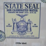
The original State Seal label
Original State Seal Label (from a plaque at the springs)

I live near the bubbling natural springs of Saratoga, NY. Folks have been coming here to “take the waters” for centuries and the greatest number of springs, as well as the classic bath houses, are located in a park which is owned by the state.

Early in the 1900s an entrepreneur had the idea to bottle the water and sell it nationally. To emphasize the official connection, it was called “State Seal” water and the antique-y state seal of New York was actually shown on the label. Millions were sold and FDR became a big promoter of the springs and the water.

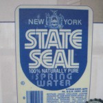
New State Seal Label
State Seal Spring Water label, c. 1980

Fast forward to the 1980s, and another entrepreneur had the idea to revive the brand. But he/she picked the wrong thing to revive. The new water is again called “State Seal” but the label design is bland and modern. Within a few years the revived brand was defunct.

The original State Seal water had verisimilitude. It looked like the kind of packaging a civic department might come up with if it had no clue about marketing but was simply trying to promote healthy water to its citizens. The revived water had none of this charm and authenticity. The revivalist probably thought the old design was out of date when in fact it was the essence of the brand.

Fetch me that paddle, ma. I think some marketer needs a whuppin’ here….