Your personalization vendor has a great idea: add variable fields to localize direct mail by mentioning the reader’s geographical location. This is especially effective if you’re a national brand and you want to connect with prospects on a grassroots level. Hence this month’s example from the Salvation Army:
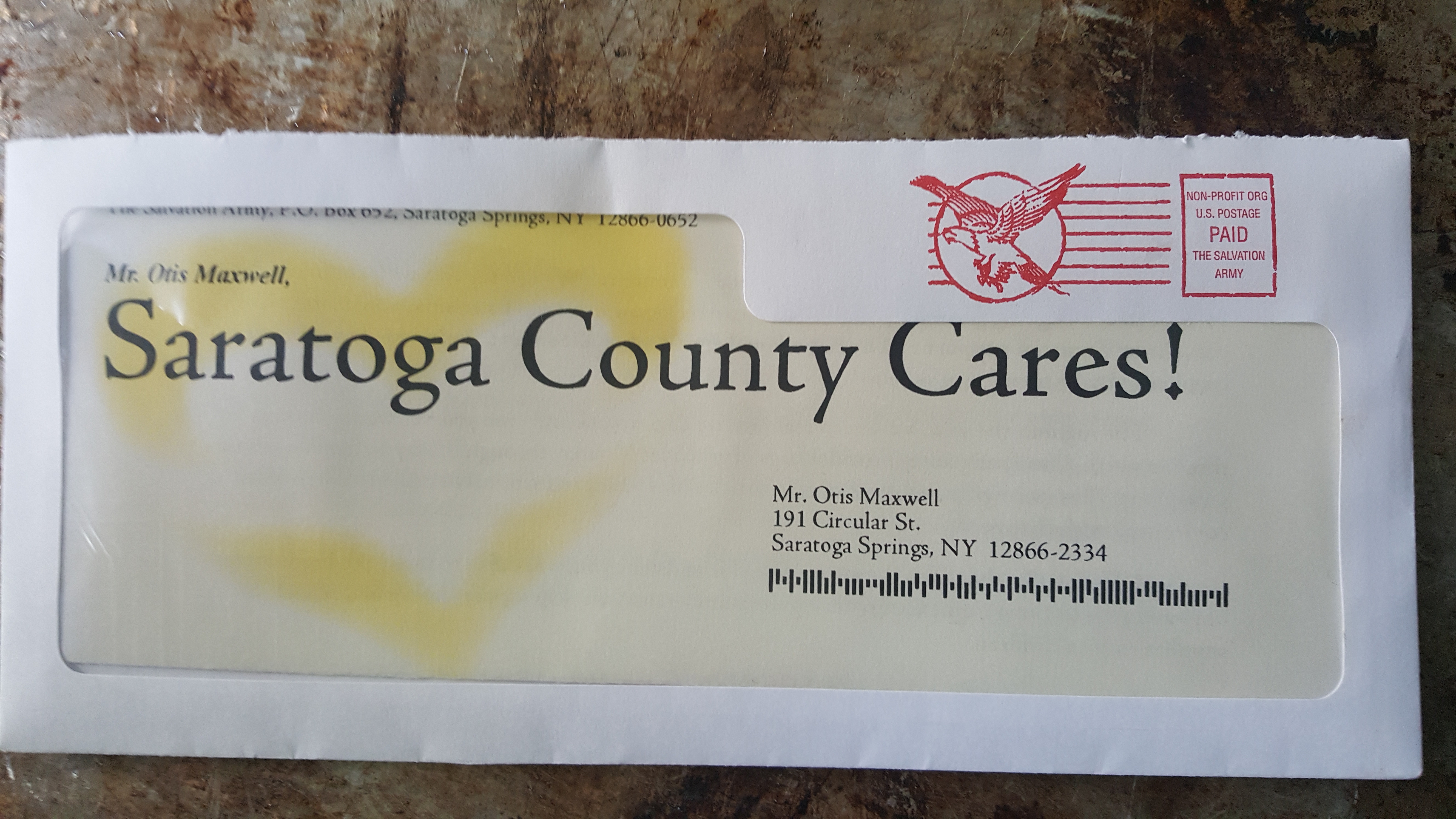
Salvation Army wants me to know Saratoga Counta Cares
The biggest problem with this effort is something that can happen to any marketer–which is why I am sharing this even though I have beat up on these poor folks and their localization in the past. I know where I live, so making a reference to that place has no meaning unless you add another attribute. For example, “last night 368 people in Saratoga County went to bed hungry. Here’s your chance to help them get a good meal”. Just saying “this is a mailer about Saratoga County” is a huge so-what because almost every piece of localized mail, whether it’s a bill or a message from a civic group, says the same thing.
A secondary problem is that “Saratoga County” is a meaningless term. Saratoga County is a gerrymandered entity and I feel no affinity for my fellow citizens down in Waterford or across the lake in Edinburg. I am a resident of Saratoga Springs, a city, so please identify me/yourself as such. If you’re going to localize, take the time to research local usages like this and avoid faux pas. (A favorite, which I searched unsuccessfully for just now, was a liquor ad localized to San Francisco from a few years back in which the tippler looking for an excuse to drink checks off “Saw a hippie at Haight”. It should be “in the Haight” of course and that boner immediately brands the marketer as a carpetbagger.)
Here’s another interesting example of personalization/localization. A Canadian ad firm drove Porsches to people’s homes, parked them in the driveway and took a picture, then drove away and mailed the prospect a picture of the car in their own driveway with the caption “it’s closer than you think”. In friendly Canada it drew accolades and 32% response rate. In the U.S. it would have drawn lawsuits. Know your local audience.
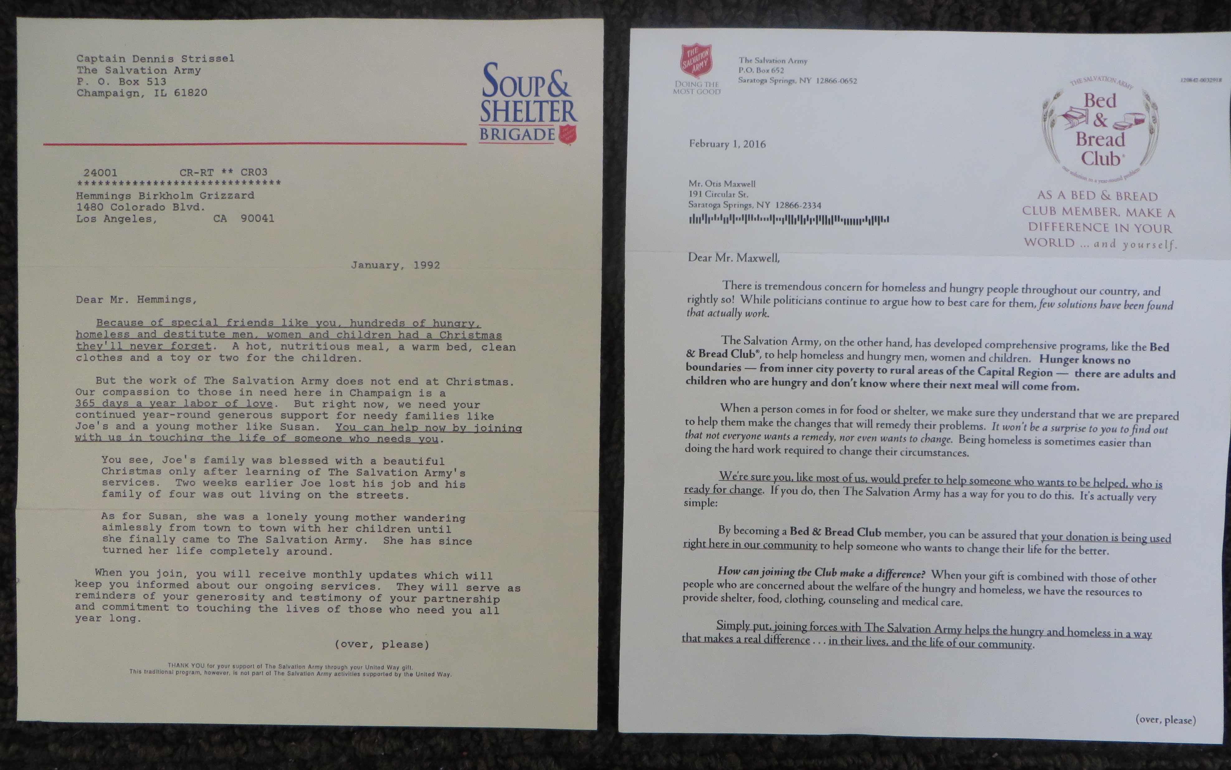
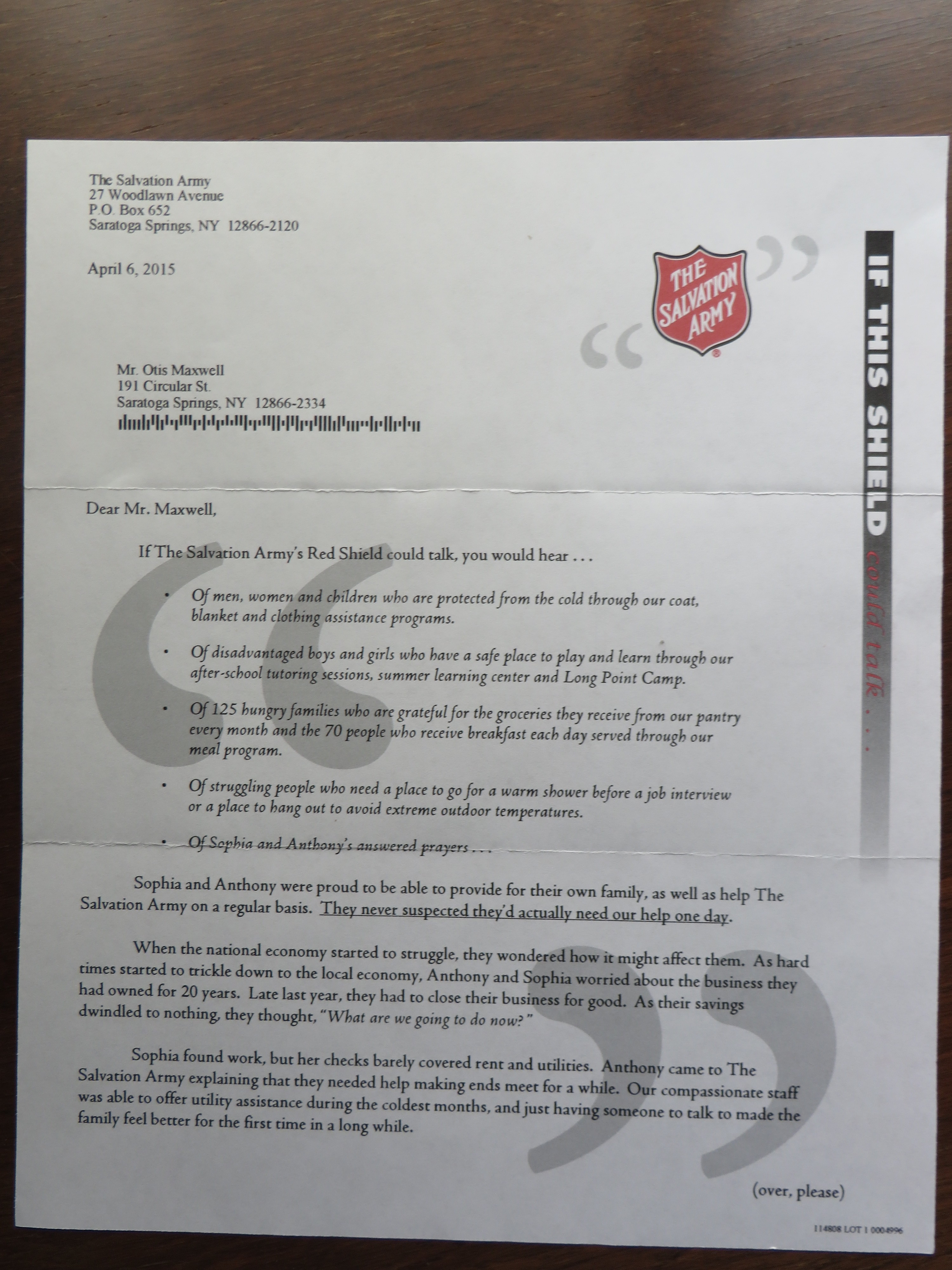
Front page of the two planned giving letters, side by side (click the image to enlarge to a readable size)
25 years ago I wrote a planned giving direct mail program for the Salvation Army. I recently received the current rendition of the same ask, and it was fascinating to see what has changed and what hasn’t. I’ve reproduced the letters from the two packages, which contain the key message, and you can read them by clicking on the images.
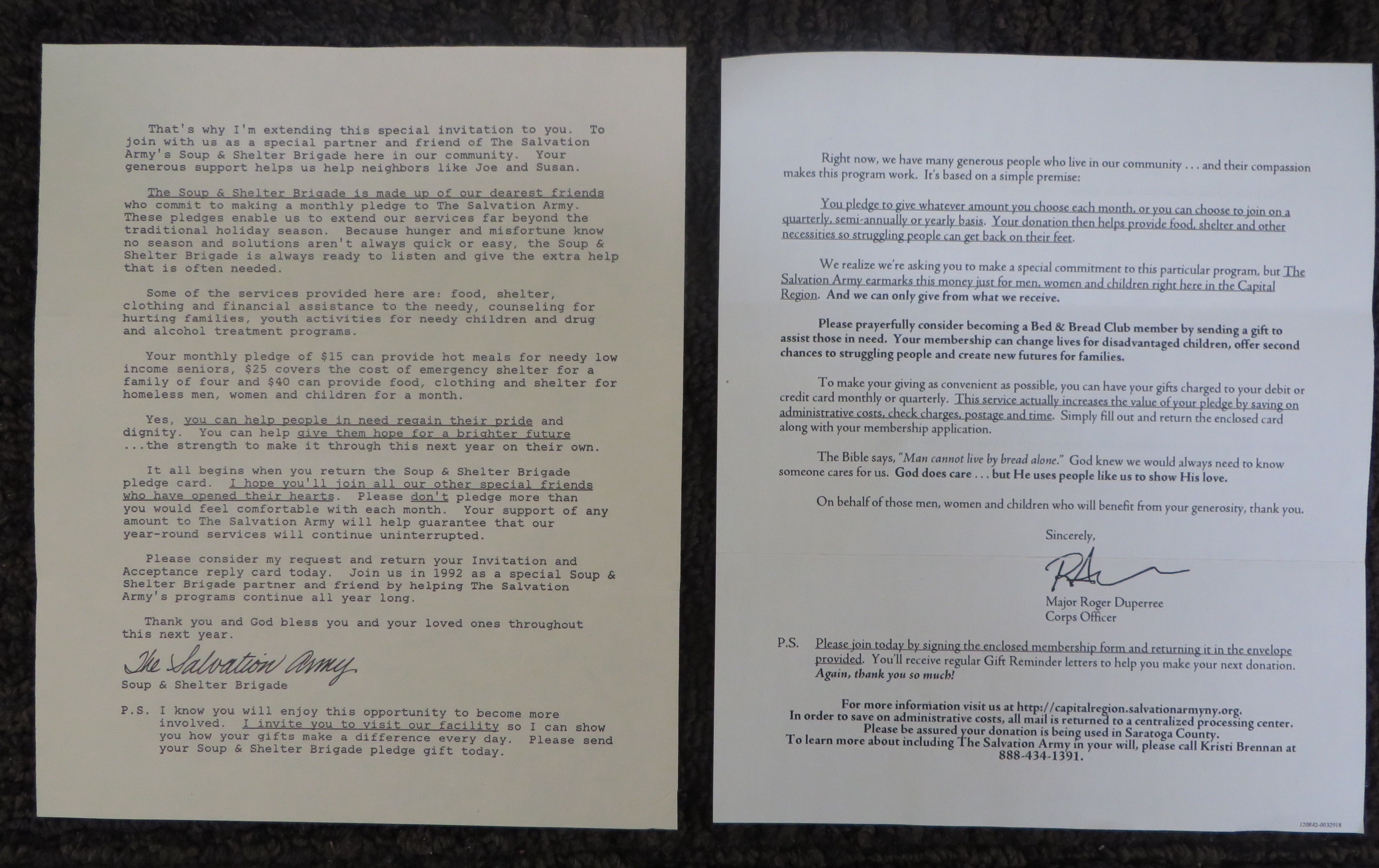
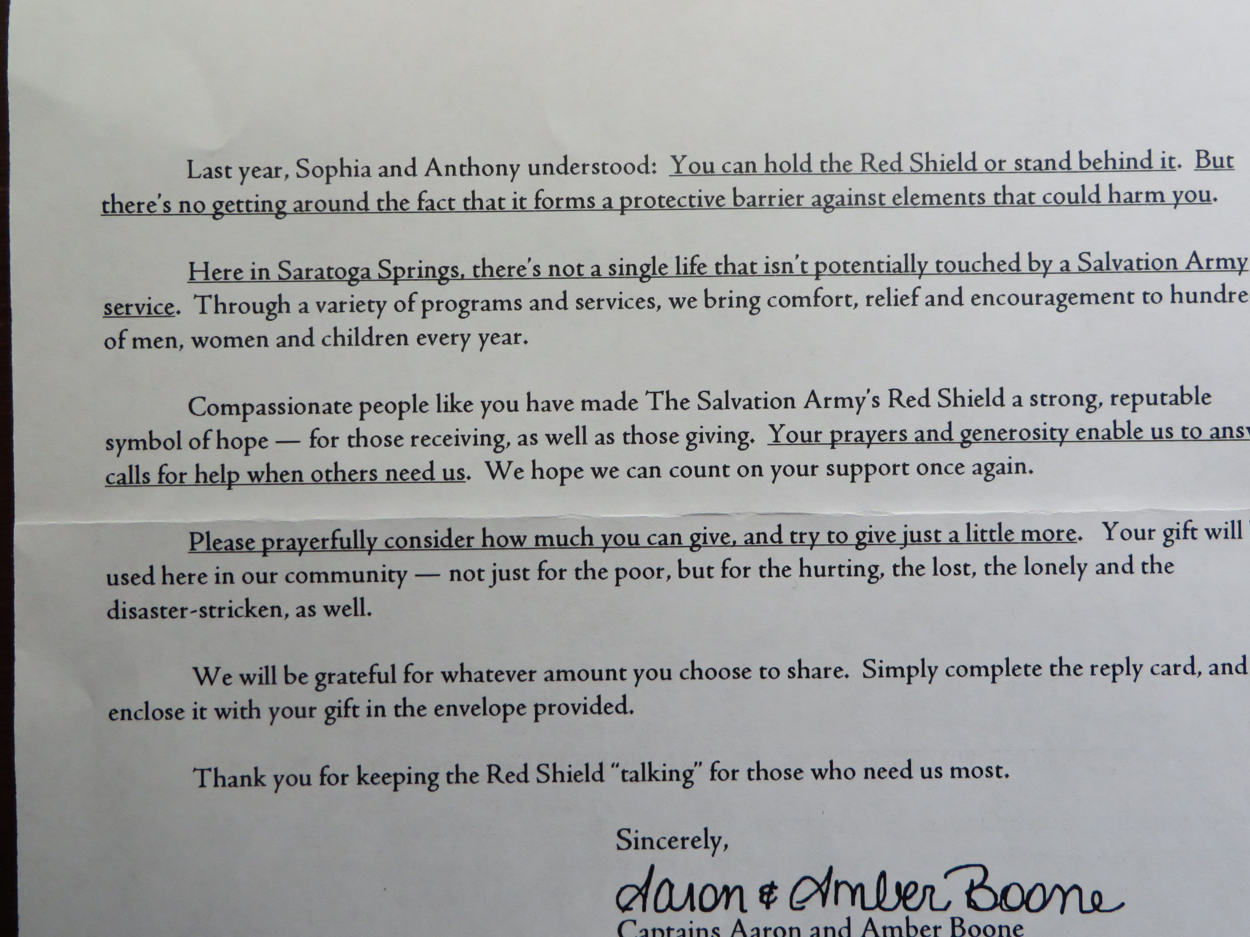
Back side of the two letters (click the image to enlarge to a readable size)
In both cases, the program appeals to high value donors and asks them to make a small regular contribution to fund community kitchens and shelters on a year-round basis. The vast majority of the Salvation Army’s donations come in fourth quarter, partly because of tax planning but also because holidays (Thanksgiving and Christmas) are a time when Christian donors are particularly sensitive to the needs of people less fortunate than themselves. The letters are sent in first quarter to people who made generous donations over the holidays.
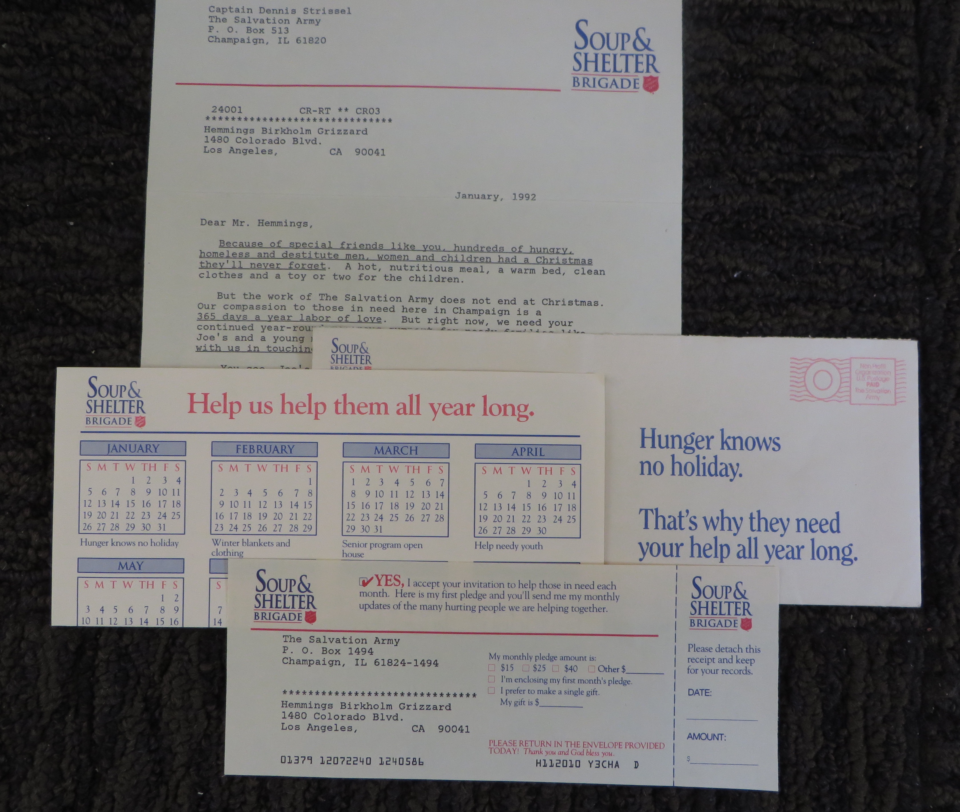
Soup & Shelter package, complete
My pitch was called the “Soup and Shelter Brigade”. It thanks the reader for their generosity and paints a word picture of “a Christmas they’ll never forget” which they made possible. It goes on to present the year round need and provides two vignettes of people like the ones you’ll be helping—good people who have fallen on hard times, usually through no fault of their own.
The vignettes are important because we’re going to send you more vignettes each month as part of the program—here’s who you are helping this month. The monthly mailing is a reminder and a request for the pledged donation, since this was before the days when automatic credit card billing was an accepted practice.
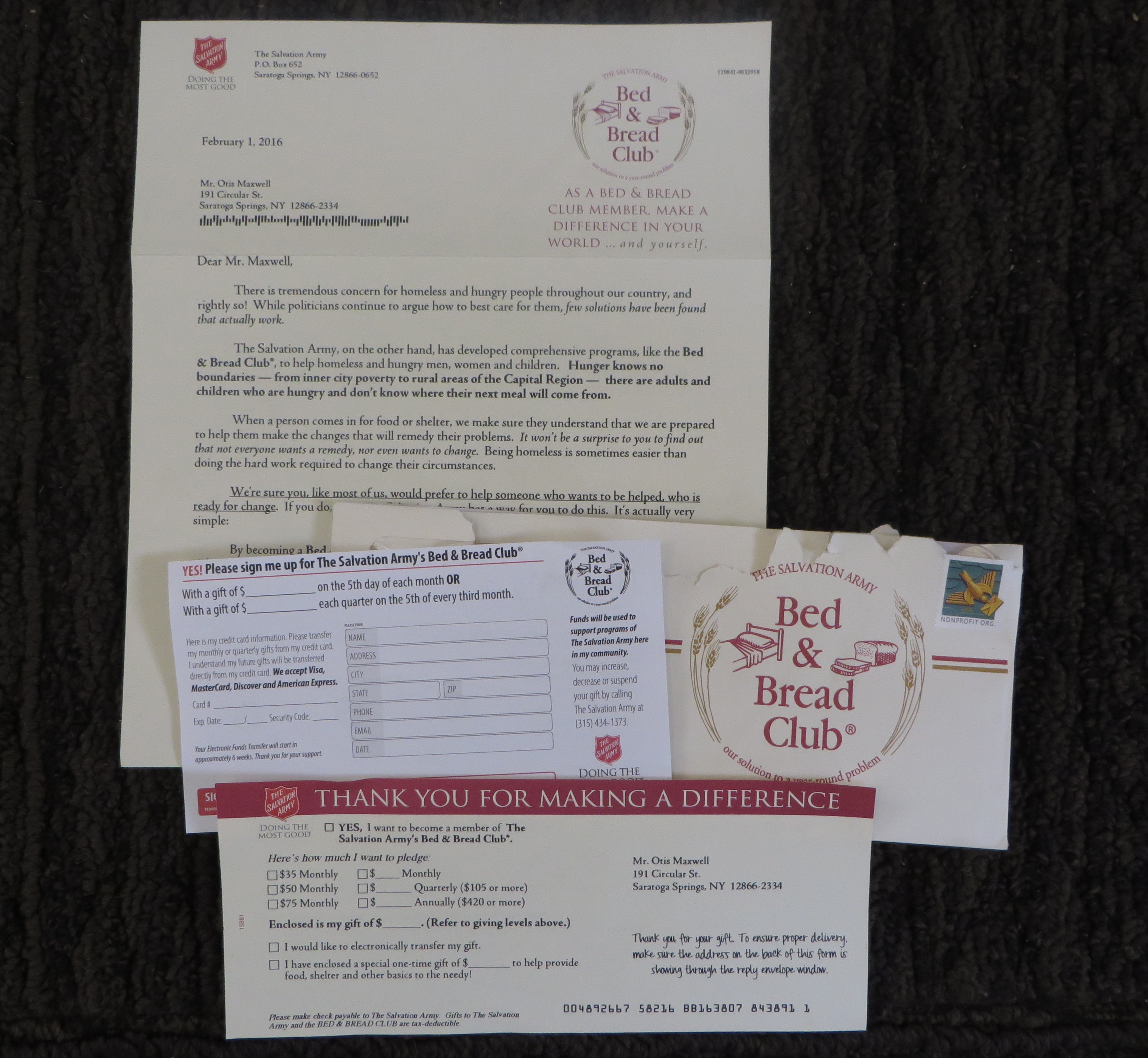
Bed & Bread package, complete
The new package is from the “Bed & Bread Club” and has a hard edge that surprised me—not to say it’s not successful. “Not everybody wants a remedy, nor even wants to change. Being homeless is sometimes easier than doing the hard work required to change their circumstances… We’re sure you, like most of us, would prefer to help someone who wants to be helped who is ready for change.” And the letter goes on to promise that your gift will be used to support this cohort.
So this is appealing to a donor who is fed up with the ineffectiveness of social programs…. Possibly because “while politicians continue to argue how to best care for them, few solutions have been found that actually work.” It’s an exhortation to take things into your own hands that leans as much on frustration as Christian charity.
I’ve also attached photos of the complete packages (minus the return envelopes, which were blank in both packages). Mine includes a calendar with a theme for each month to illustrate the ongoing need “Bed & Bed Club” has TWO remit forms, one a standard ask and the other an authorization for automatic credit card billing. This makes me think the auto billing is a test which will be rolled into the main form if it works.
If it still works as in my day, local Salvation Army corps have access to several direct marketing agencies who offer them prepared promotions to choose from and then localize (mine isn’t localized because it’s an agency sample). “Bed & Bed Club” was the choice of the Capital District corps, and that’s really all I know about it. I hope it’s working, but I also hope (and believe) people still give out of compassion as much as frustration.
I gave a fair-sized gift to my local Salvation Army this past holiday season, and was happy to do so. (I wanted a particularly enthusiastic bell ringer to get credit, so I found out his name, wrote it on the check, and dropped it off at the local center.) Inevitably, this has spawned a series of large donor mailings asking me to repeat with similar amounts.
I mentioned one of these mailings in an earlier post because the art direction on the outer envelope wasn’t particularly adept. But later I got a second mailing that caused me to dig deeper and I found some object lessons in what not to do if you’re a national not-for-profit and you want to customize mail for individual locations.
Why should you go to the trouble of localizing your appeal? Because local donors to a cause like the Salvation Army want to know their contribution is put to use in their community. Some years ago I did a localized campaign for the American Red Cross. It had an insert on emergency preparedness, which was variable. We didn’t talk about hurricanes in the Midwest, or rivers flooding in the Northeast. (With climate change, maybe we’ll soon have the same disasters everywhere and non-profits can save the money.) And there were statistics which were localized by county of number of people helped, first aid courses taught and so on. Even thought it was a national mailing, folks in Milwaukee would feel like it was about their local Red Cross.
Here it is… on the second page.
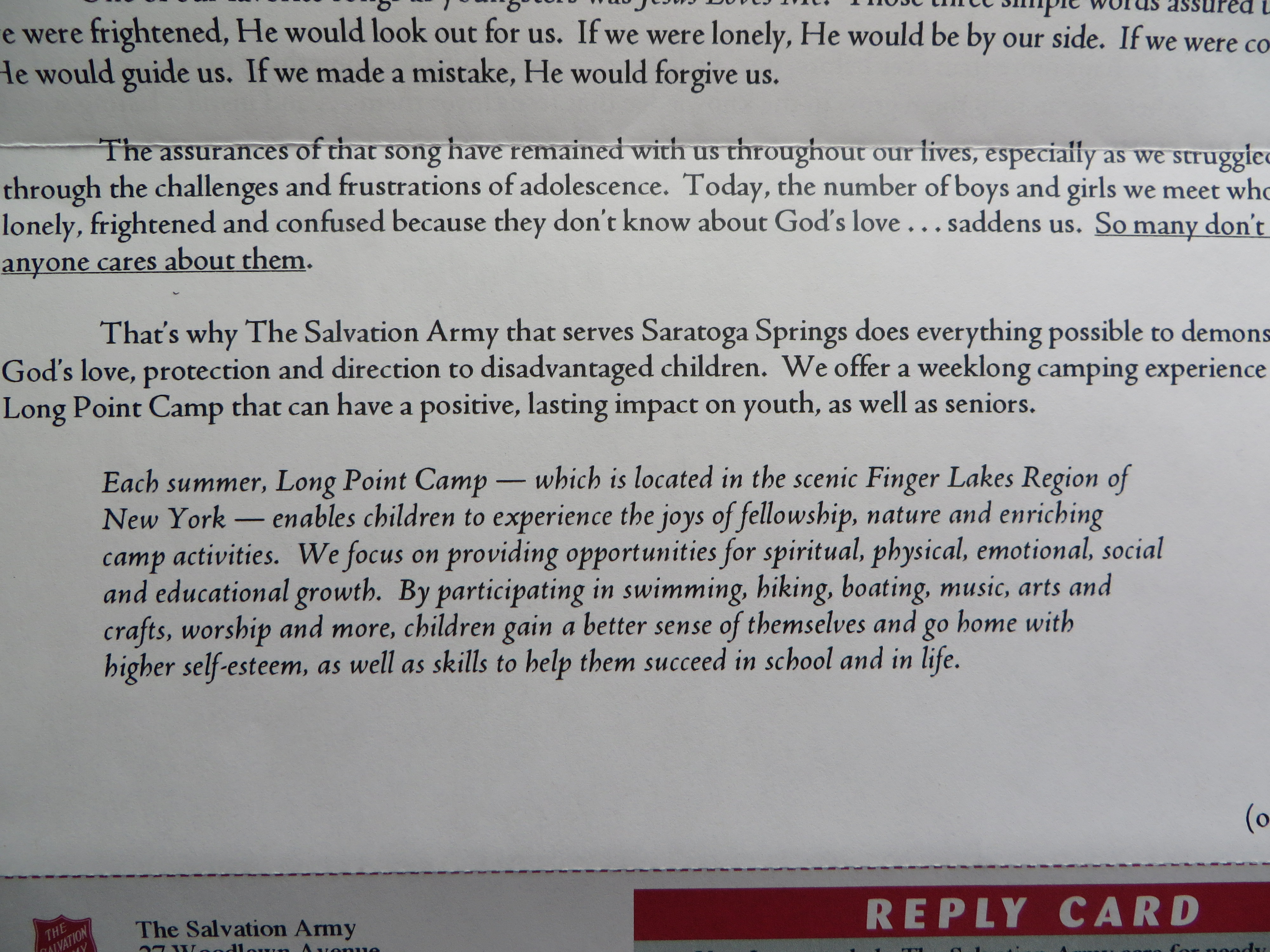
I expect the Salvation Army did some similar database research, but they don’t use it well in the copy. My own community of Saratoga Springs is not mentioned till the second page of the “if this shield could talk” letter. Who are the 125 hungry families and 70 people who eat breakfast? Is that in Saratoga? (To read this and other copy details, click on the images to enlarge them.) I suspect this is just a flub: the numbers are appropriate for a town our size, but somebody forgot to plug in the name of the town. As a copywriter I’m well aware that the story of Sophia and Anthony is not local, but blending in local statistics would have blurred that line and made for a more compelling narrative.
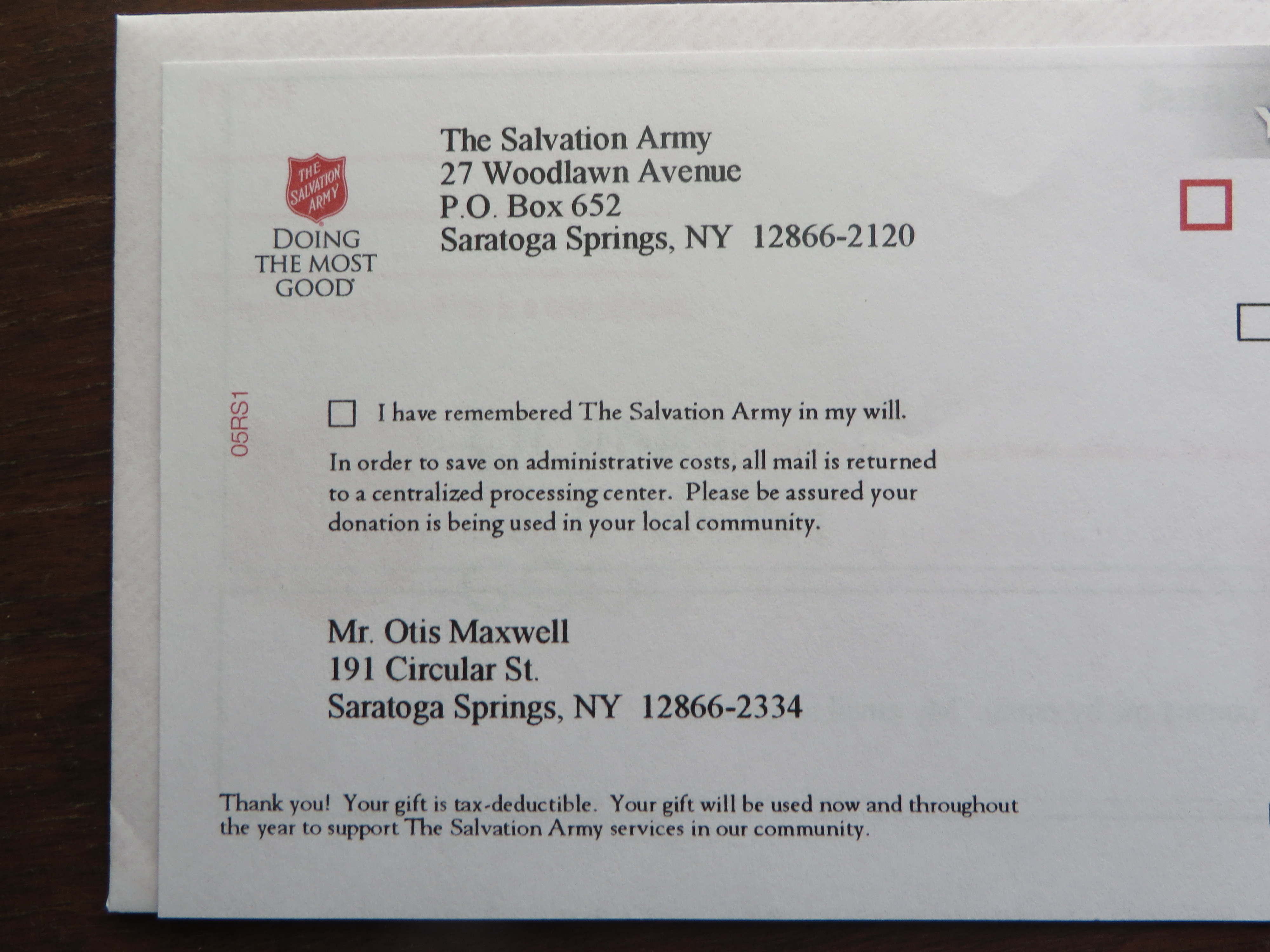
Institutional “processing center” language turns off donors.
I’m also not easy with the qualifying statement (on the letter and the response form) that “In order to save on administrative costs, all mail is returned to a centralized processing center. Please be assured your donation is being used in your local community.” Well, first of all, that processing center (bad word—as a generous donor I don’t want to be “processed”) is in Albany, the nearest big city, so I don’t have a problem with it. Second, why don’t you say “in Saratoga Springs” or “in Saratoga County” instead of “your local community”? I have a very strong hunch that including this statement, thus raising an objection where one might not have existed, results in fewer donations that a mailing without that statement.
Second Salvation Army local mailer
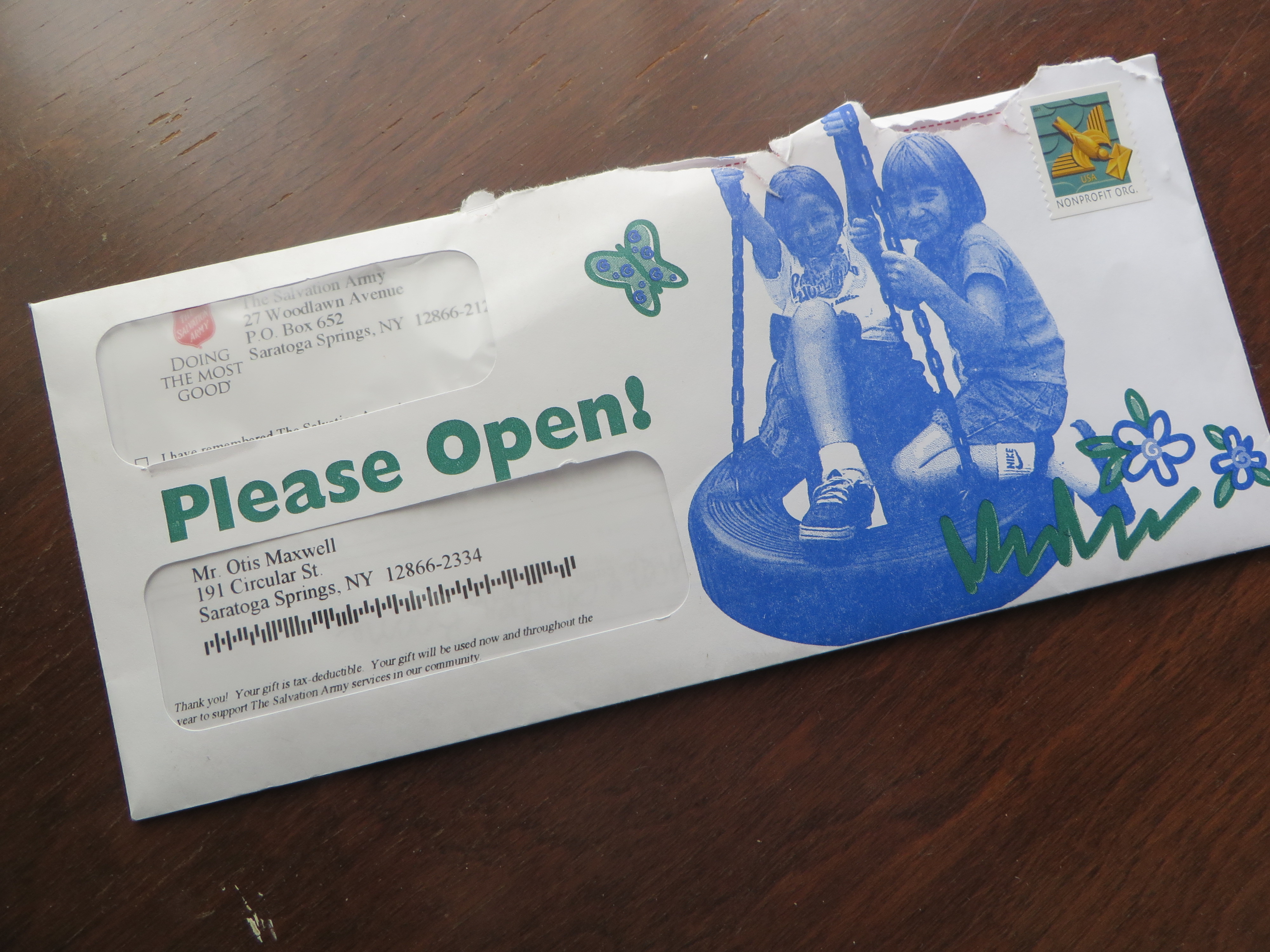
Then the second mailing arrived, which is about sending kids to Long Point Camp in the Finger Lakes. I’ve previously written about the difficulty of “send a kid to camp” programs—that’s a very hard sell compared to feeding a homeless family and you really have to paint a picture of the kid’s desperate situation. So now we have this outer with the message “Please Open!” (I think they could have come up with a better teaser, no?) and two white kids in a tire swing. Is this a variable picture? It’s true that my community is pretty lily-white so maybe so. But why a tire swing? Can’t they afford real play equipment at this camp, which probably isn’t very safe if they’re using discarded tires?
Send a kid to Long Point Camp.. why?
Moreover, why are we sending them away to camp in western New York when Saratoga County is chock-a-block with camps and rustic destinations? Or to Lake George, next county up the Northway? I feel like this effort is probably designed for donors who live in a big city, so when you mail to a resort area it really exhibits a tin ear.
I don’t have it in for the Salvation Army. I love these guys. I wrote fundraising campaigns for them many years through the Grizzard Agency, and contributed a pro bono effort to get donations after the Los Angeles riots of the early 1990s. But they have offered up a picture perfect example of what can go wrong with a localized campaign, and I’m sharing it as a bit of advice as well as others who think about localizing their national campaigns.
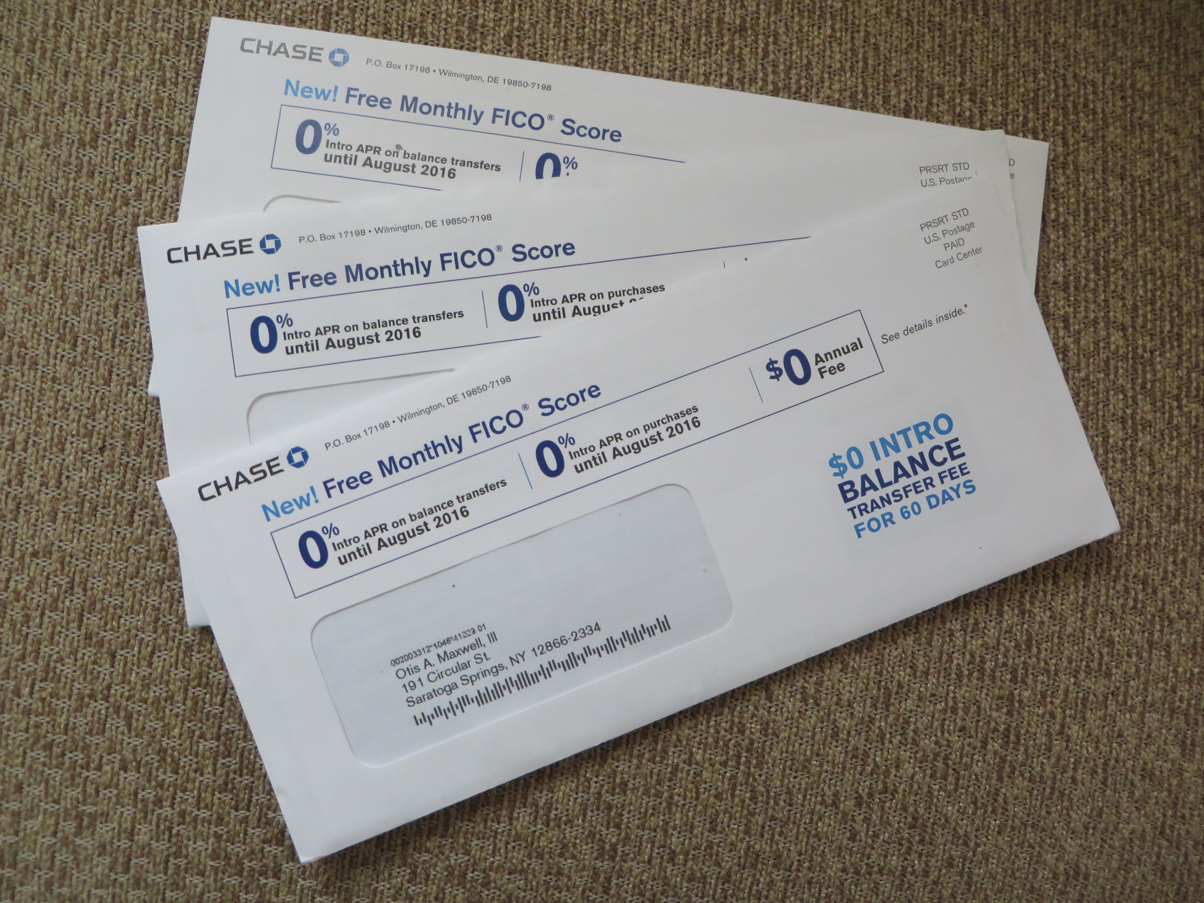
This credit card promo from Chase caused me to fire up the mailbox monitor. The premise is that you get a free monthly FICO report with the Chase Slate card. My household has been carpet bombed with these packages recently, both my wife and I receiving multiple mailings sometimes on the same day. There are a few things about it that make me wonder.
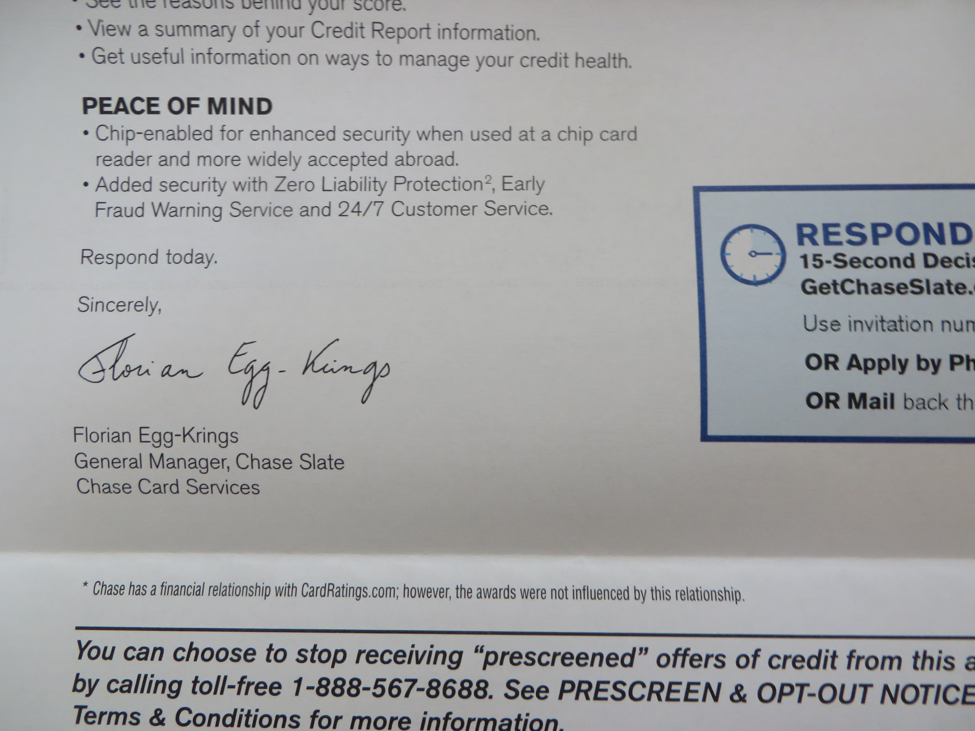
I’m Florian Eggs-Kring, and I approve this message.
First, Chase practices poor list hygiene which doesn’t dedupe recipients with the same or similar name, and obviously does not do its own credit scoring. Speaking of which, does everybody know what the promise of a “Free FICO score” means? Would it have been better to simply say “free credit report”, a term that’s used inside? And note the name of the signatory of the main letter. Florian Eggs-Kring is a moniker which would have the Monty Python lads doing backflips, which is my point. Might a more neutral pseudonym have been a better choice? I understand that Florian is responsible for this mailing, but if he/she loses even a few responses because of distraction it’s probably not a good deal.
One of my maxims is “if you see a mailing repeatedly, that means it’s successful.” But I have the feeling this package is the exception that proves the rule; someone had a huge budget and didn’t feel it was necessary to test. Florian Eggs-Kring, if you’re reading this please tell me I’m off base. (Of note, it’s not a Visa or MasterCard or Amex so it’s not going to wotk initially in a lot of terminals; maybe Chase needs to build a huge user base quickly in order to convince merchants to accept it.)
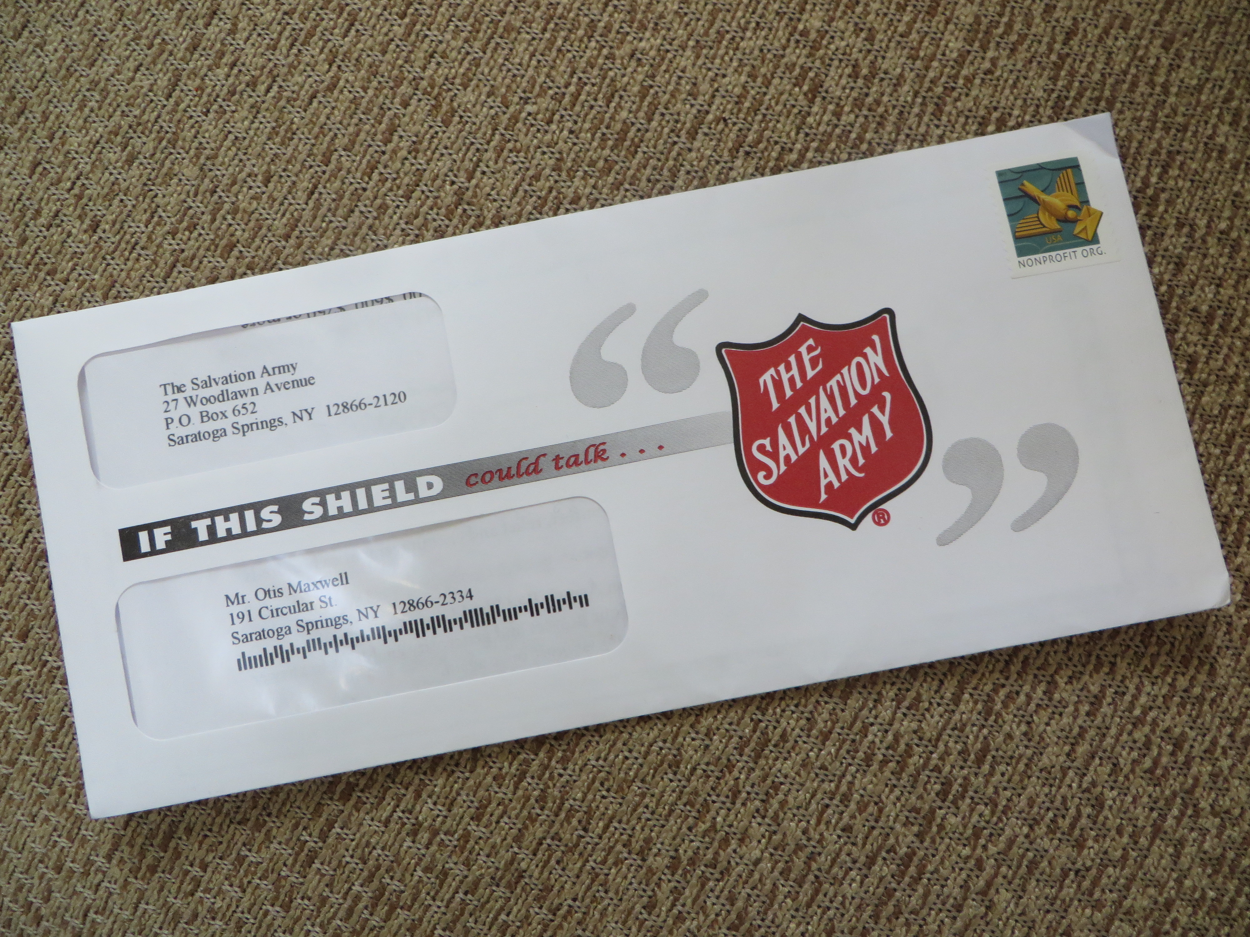
Salvation Army package has a legibility problem
Let’s move on. The Salvation Army envelope, for a large donor mailing, starts strong with “If this shield” but then trails off because “could talk” is illegible in the mailbox (it looks much more legible in the photo than in real life). The problem could have been solved, or at least mitigated, with some adjustments at blueline stage or even on press (dial back the magenta). The lesson is, no matter noble your ideals, you have to follow through in production.
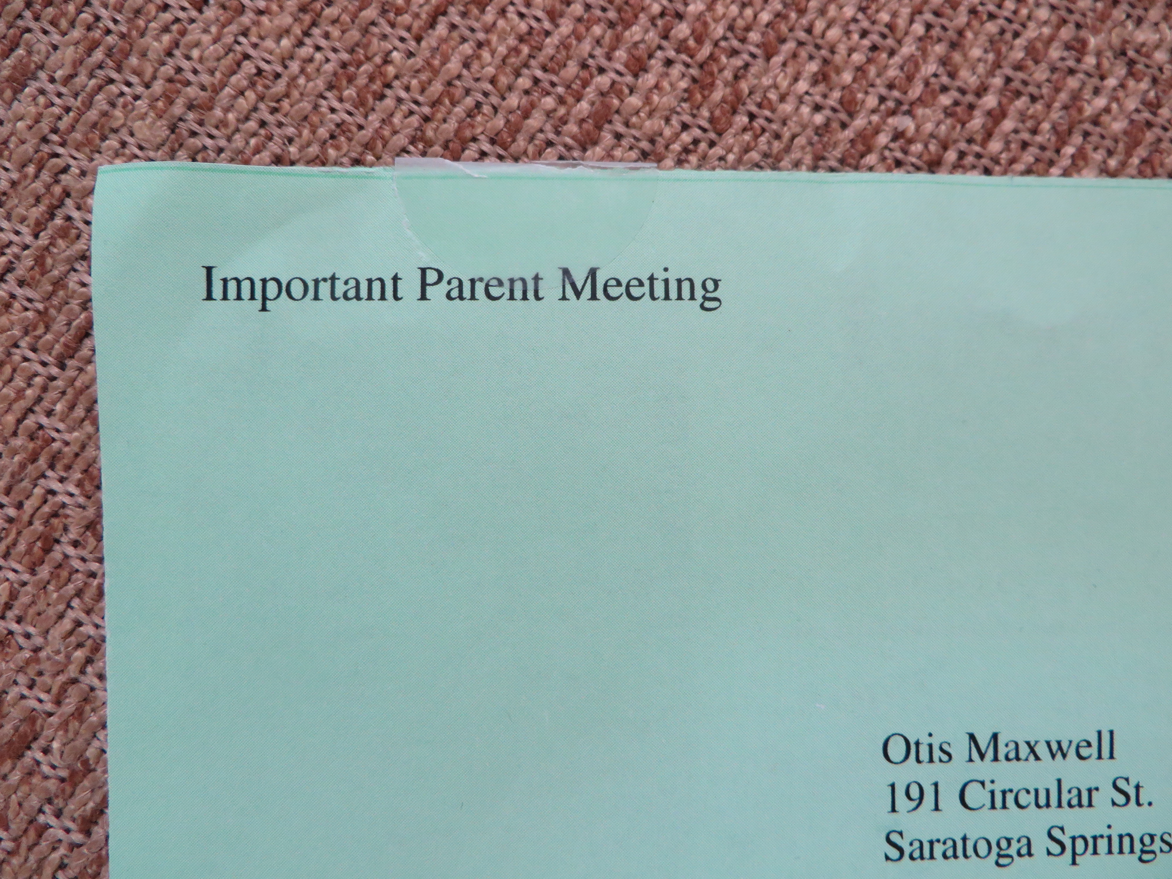
Great teaser on a simple self mailer
The green “Important Parent Meeting” on this academic-green self mailer is simple and brilliant. No parent of a school age child can ignore an apparently official announcement of a meeting. This solicitation is for a seminar on how to get financial aid and I bet it’s successful.
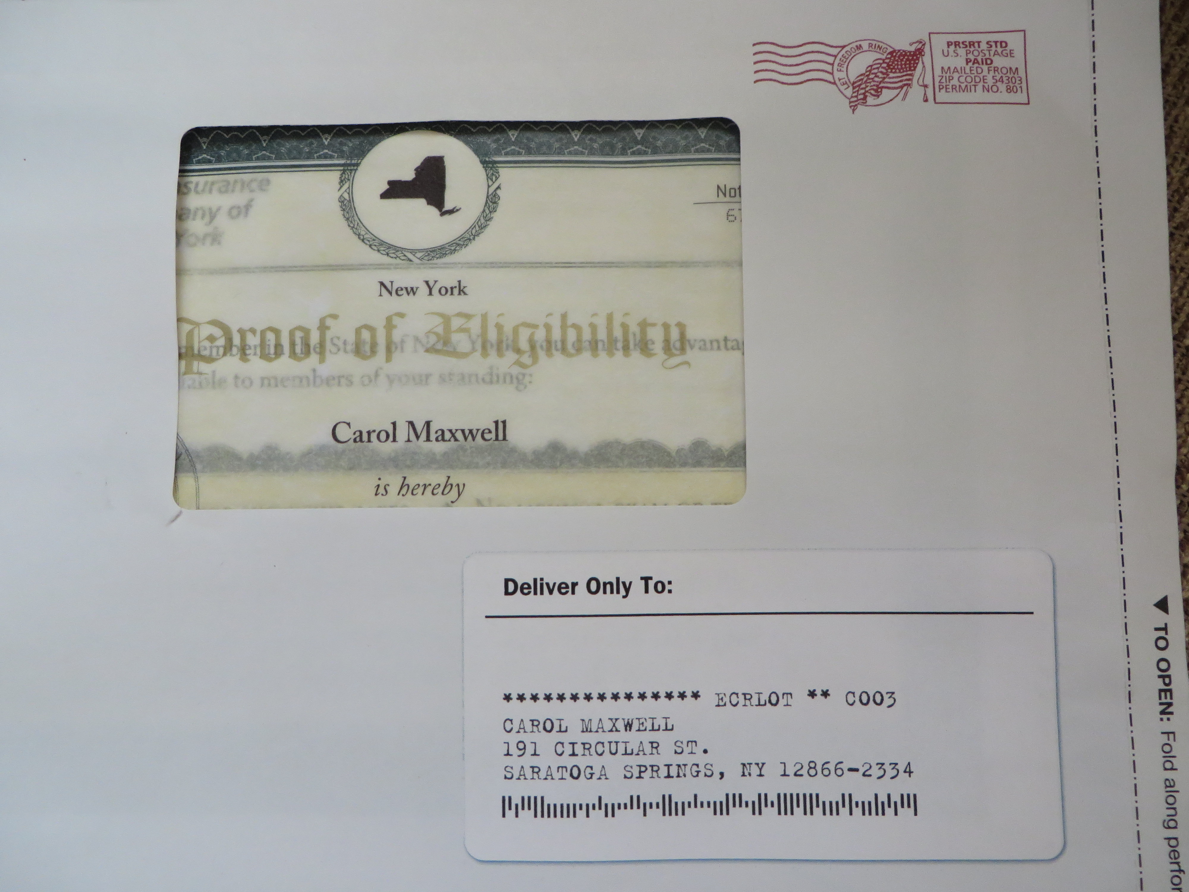
Beautiful stage management in an AAA Life 9×12 package
Our final example offers some beautiful stage management for AAA Life. Note the three-dimensional effect of the mock-vellum certificate seen through the window, and the shadow behind the fake mailing label below. Inside we find a complete application pack which asks the reader to mail a check for term life insurance. This company is extremely thrifty and I can’t believe they would have approved this package if it wasn’t a winner in testing. I hope it is so we can keep this great designer working; you don’t see much direct mail created with such care nowadays.
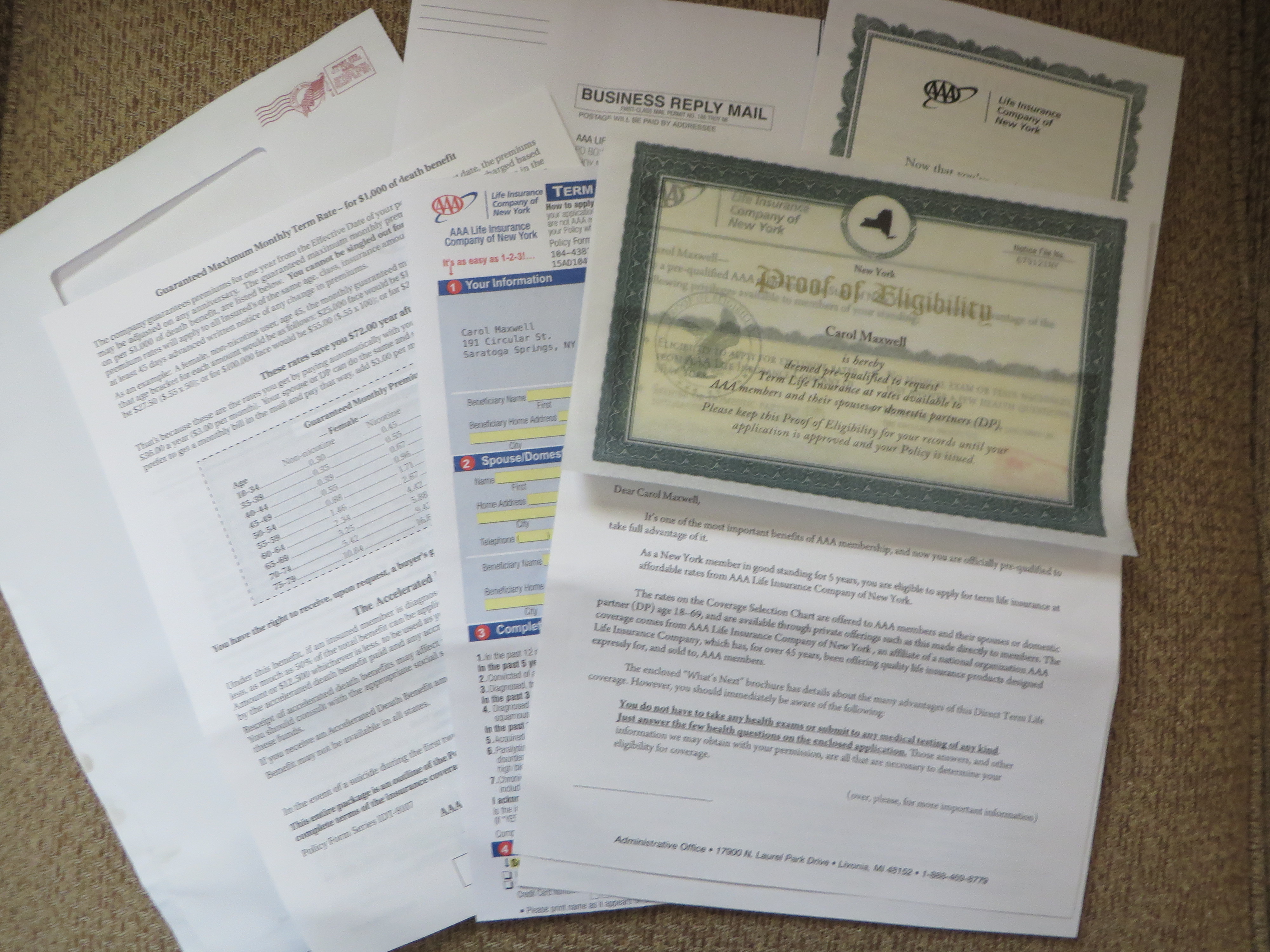
Here’s the entire AAA Life package.
NOTE: as always, click on the image if you’d like to see any of these in greater detail, then click again to blow up the photo for a super-close up look.
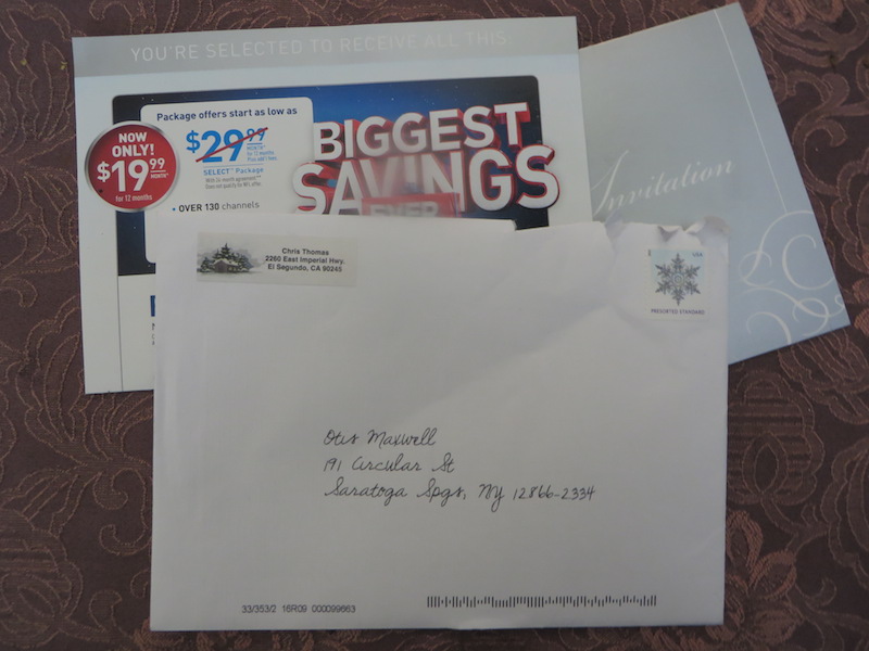
“Made you look” address sticker direct mail from DirecTV
I got a Christmas card this week from Chris Thomas—or so I thought. I was intrigued by the seasonal address sticker and wondered who I knew in El Segundo, a community near LAX notorious for its predatory speed traps. I opened it up…and there was the familiar tent card invitation from DirecTV, which indeed has its corporate headquarters in that city.
The DirecTV invitation is successful judging by the frequency with which we all receive it; the question is whether this “made you look” twist on the outer envelope helps response. I’ll guess it does, because some people will open who otherwise wouldn’t, like me, and some of those may be in a mood to churn their TV subscription. But is there a negative effect from people who are irritated by the trickery and become LESS likely to respond in the future?
The same question applies to a graduate student’s marketing experiment described in yesterday’s Wall Street Journal (it’s a long article, and this example is way down at the end). The researcher noticed that when a Salvation Army bell ringer was posted at one entrance of a mall store, shoppers would go out of their way to use the other entrance. He then posted solicitors at both entrances and had them directly request donations from some shoppers, and not from others.
Shoppers who were directly asked for donations were 60% more likely to give. That would seem to be a big win for the Salvation Army. But what about people who were irritated by the pressure and less likely to donate in the future (or maybe to visit that store)? Donors have memories and if you create a negative impression, does it hurt you in the long term?
I’d love to hear from readers who have some experience or thoughts on this. For me it goes back to my early experience with subscription and catalog direct mail when we definitely saw fatigue; mail somebody too often and they become less likely to respond, now or ever. I’m sure there is a negative effect from pushing too hard, and I’d like to know how organizations are factoring it into their fundraising.
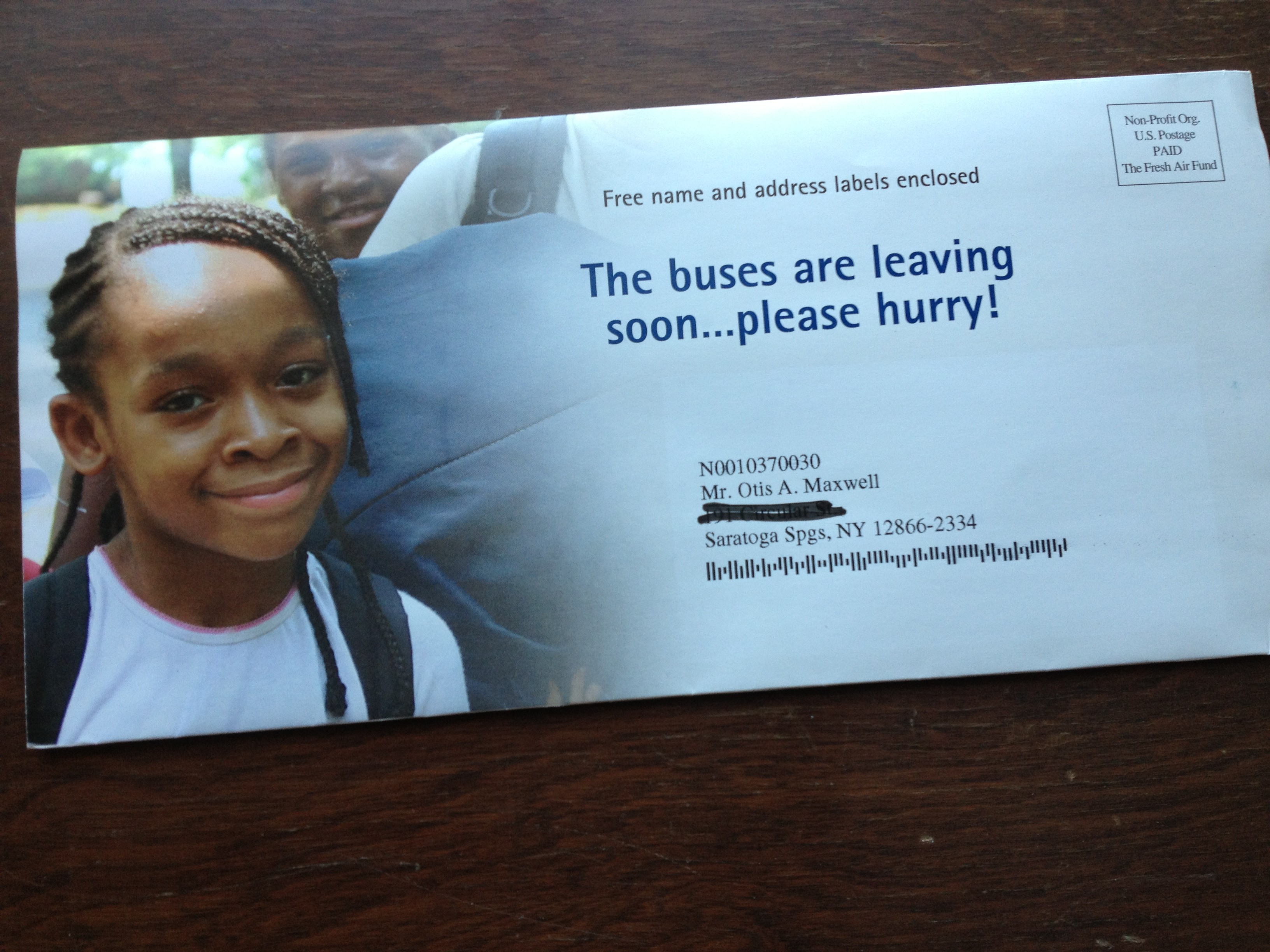
It’s been far too long since we’ve visited the Badvertising Hall of Shame… that corridor of horrors where unfortunate marketers teach us by example what NOT to do. Let’s begin with this outer envelope teaser from Fresh Air Fund.
This is a seasonal appeal I used to struggle with when doing work for Salvation Army… the “send an inner city kid to camp” fund. It seemed less urgent than putting food on the table or rescuing a child from the streets, and it was complicated because you’d have to create a word picture of why this was important before the reader got away. No missteps are permissible.
So look what Fresh Air Fund has chosen as its teaser: The buses are leaving soon… please hurry! What buses? Am I supposed to be on one? Why on earth does this not say instead, “The bus is about to leave for camp without me… please help!” (Singular better than plural because it’s more specific, and let’s mention the reason for the appeal for chrissake.) Also, while camps are universally recognized as a good thing buses are not. Seems like a terrible choice for the opening salvo in this appeal. Next.
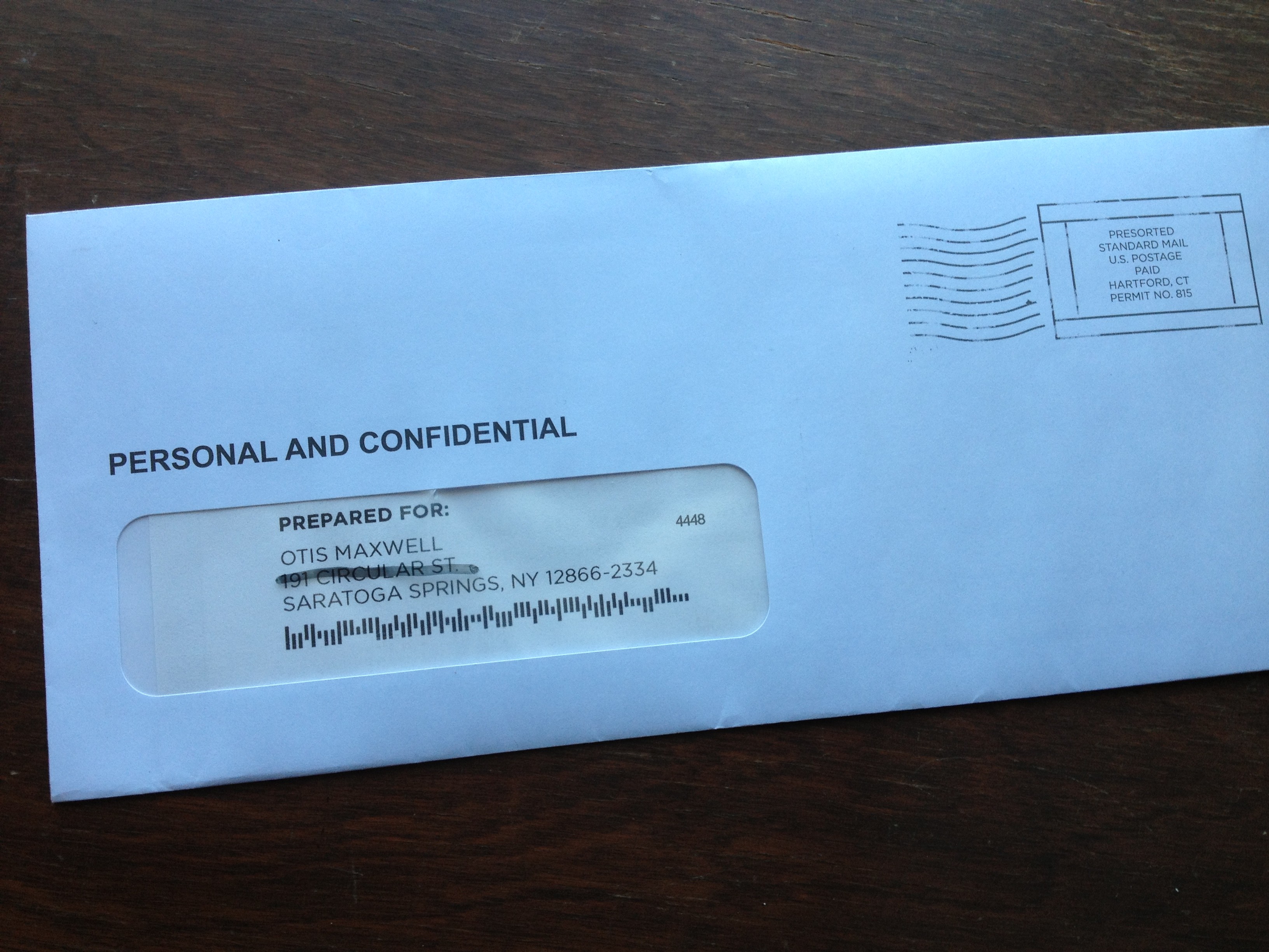
Do you believe this?
From… I don’t know who because I never opened it… I have a blind outer with nothing but PERSONAL AND CONFIDENTIAL printed above my name. Maybe I notice the “standard postage” indicia that spoils the illusion, but maybe I don’t; they’ve done a good job of designing something that looks like a real meter imprint.
But, look what’s above my name: PREPARED FOR: Okay, that’s too much and it’s also discordant with PERSONAL AND CONFIDENTIAL which suggests a very individualized letter, maybe a collection notice, whereas PREPARED FOR suggests a mechanized process like maybe a refund. Either would have been good on its own, together they cancel each other out. The blind outer has lost its intrigue so out it goes.
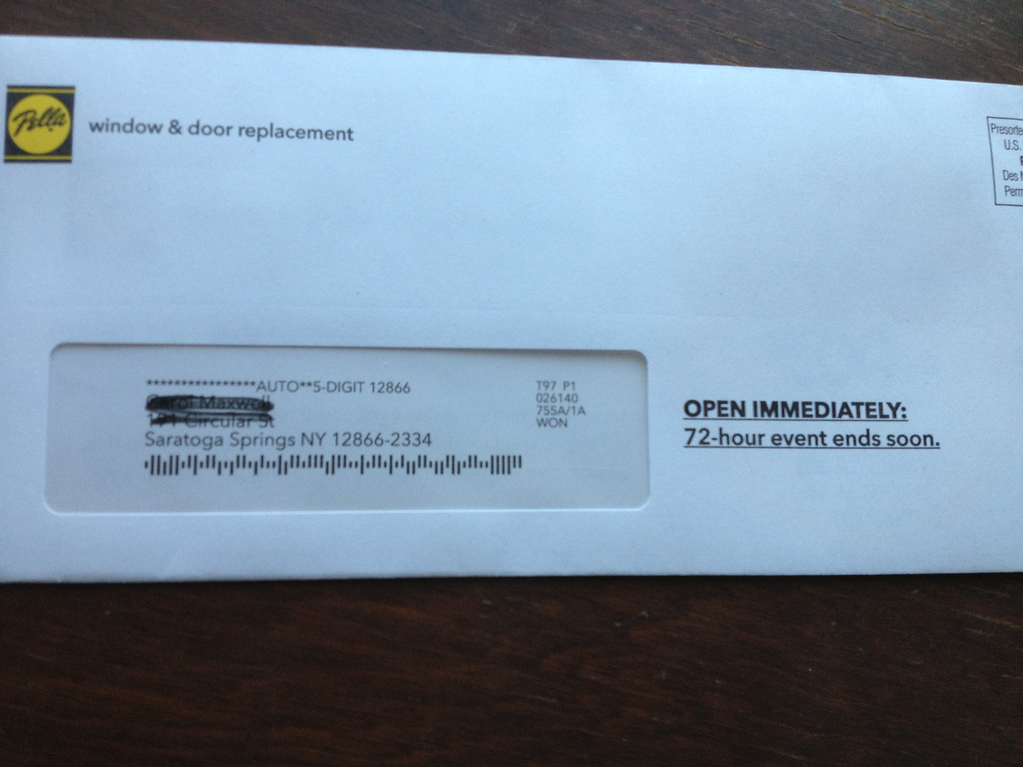
When did the 72 hour sale begin anyway?
Finally we have this from Pella: OPEN IMMEDIATELY: 72-hour event ends soon. Well, is it 72 hours or isn’t it? If it is, it ends in 72 hours, not “soon”. The contradiction completely bursts the bubble of urgency and anticipation. Also, since this is clearly a piece of advertising mail, there needs to be more reader context, eg “Hurry! You’ve only got 72 hours to save” or “Open for your private invitation to our 72 hour preferred customer sale”.
That’s enough for today. Three examples in which the client or product manager is wondering why their mailing was not more successful, when in each case the fault lies with the copywriter who is probably making mischief on another campaign right now. I’ll have a couple more good ones in my next post.