How to transcribe speech from a web page

[UPDATE: Unfortunately, Google has disabled the ability described below to transcribe audio from a web page. Now you get an alert to attach a microphone and record from that. Playing audio over your computer, or playing a recorded message from your phone, doesn’t work. Unclear if this is a deliberate move to limit the program or just a glitch. Anyway, I’d like to know if anyone is using anther transcription tool successfully.]

As a copywriter, I often need to capture speech to text from a web page. My traditional method has been to play the video and start and stop it while I type what I hear into Word. Very tedious. Faced with a new project, I decided to find out if there is a better way. And it turns out there is, but it’s not as easy to find as you might think.

Google “capture speech to text” and most of the results will be for the opposite, text-to-speech, an important accessibility feature but not what I was looking for. Word for Mac still has a dictation feature built in (it’s gone from Word for Windows) but it’s only for YOUR dictation; toggle to another application, like a web browser, and the capture stops.

Finally, I found this page for Google’s beta of its Cloud Speech API. You can sign up for a trial of the Google Cloud Platform (they require your credit card, but won’t charge it without your permission) or simply use the widget on the page to translate in 15-second increments. The interface said my video was captured with 94% confidence of accuracy, which I’d say was about right. The transcript required a bit of cleanup, but the process was certainly faster than typing it all. Check it out.
Google Engage, did you have a seed list?

Google Pizza Box
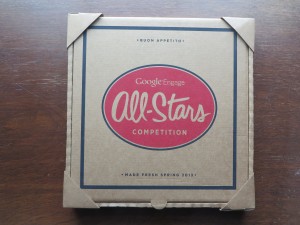
Google Engage Pizza Box mailing; note protective corners

I often get promotions from Google Engage, the division charged with boosting AdWords sales to agencies. They spare no expense to make sure their message gets across. They’re one of the last big users of dimensional mailers, and they take extra care to be sure the package arrives in pristine condition. This mock pizza box, for example, had corners protectors spot-glued to protect it and was further protected by shrink wrap (which I’ve removed).

PizzaBoxInside
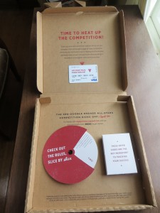
Inside the pizza box, as the marketers intended you to see it. Click the picture for a closer view of the wording on the gift card.

Inside, we have a promo that uses the built-in stage management of the pizza box effectively. This is a competition of some sort, and there’s an involvement device (the wheel), a box with rules, and a $40 gift card to pay for pizza since you’re going to be spending a lot of late nights in the office planning your AdWords campaign. The message on the gift card says “Late Night Pizza. Sound Familiar?” Very clever.

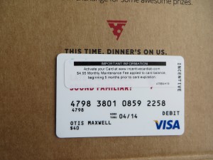
However, the first picture doesn’t show the package as first saw it when I opened the box; the second one does. There’s an ugly security notice across the gift card that hides the copy message, promotes the issuer of the card, and announces a $4.95 a month service fee if it’s not used quickly.

Google Pizza Gift Card with sticker
Gift card, as I actually received it, with security sticker covering the message.

I can’t believe this was what Google intended, and I’m sure at least one of of the project managers threw him/herself off the San Mateo Bridge on seeing this. (Why they chose an obviously cut-rate card company, after spending so lavishly on the other components, is a separate matter.)

The cure for this is to first, assume nothing. Don’t just order the cards, ask the issuer exactly how they’re going to look when they arrive. Second, do a check in the mail production house… this blooper could have been caught at that point, though I’m not sure what could have done since this is a time-value promotion. And third, address several pieces to seed names (without telling the mail house) so you can see it in the mail as your recipient does.

This promo arrived several months ago, and I can’t remember if a “please excuse the egg on our face” follow up was sent. I don’t think so, since it would have arrived Fedex like the original package and I would have noticed it and put it aside for later review as I did with this package. Too bad. It would have been fun to write that letter.

P.S. In case you can’t read it on the security sticker, the card issuer is incentivecardlab dot com. As of now, they’re not on my short list for suppliers.

The Retailization of Heath Care at DMA2013

This was the best session I attended at the Direct Marketing Association’s just-concluded annual conference, featuring a CMO from a large insurer and a finance exec with huge experience in retail at Google, with excellent moderation from another healthcare exec. A few takeaways:

Tremendous change in the healthcare industry is underway, and it’s not just because of Obamacare. Used to be insurers could underwrite and consumers had no choice because they got insurance through employers. Now insurers have to accept everybody and consumers can shop around. Over the next 10 years a trillion dollars will shift in the industry as consumers shop around.

Google perspective: Google is where people come when they have concerns about their health. Worried about a diagnosis or a pain, they google it. They have a serious reason for being there and are making a critical decision about their health. 50% of queries now related to healthcare reform. Many queries from mobile devices and about Medicare… so it’s absolutely not true that “people 65+ don’t use the Internet”.

How healthcare is marketed: focus moving to retail. Consumers want self service. Price transparency is not necessarily a bad thing; retailers have known this for 10 years. (Retailers lead the way because their margins are razor thin so they have to be agile.) Insurers are worried about protecting their brand with standard Gold, Silver, Bronze levels. But customers not just interested in lower price, they will pay more for value if you demonstrate it. This is how Nike, Coach, Tiffany maintain a premium price.

The customer experience: companies need to add a Chief Customer Officer who reports directly to the C suite. Insurers are used to saying no to their customers; we’re in a new era where they need to learn to say yes. Don’t let your org chart show: if the customer goes through a phone tree and they have to answer the same health or personal questions they just answered to a new person, that’s your org chart showing. Customer has to be at the center of your business model, just as they are in retail.

Where should you spend your next dollar as a healthcare marketer? Traditional model was very straightforward: send people a mailer or an agent, they sign up. Now they may get input from a number of places. Most marketers don’t cover the fact that you’re watching an ad then go to Google and search; they don’t have a search strategy combined with their TV buy. Mobile devices a big black hole because there is no equivalent to a cookie to find out how they researched their decision on their phone or tablet, then moved to their computer or the other way round. Gamification may become part of the marketing process: reward people for learning about the health.

What’s the impact of the startup problems at healthcare.gov and the state exchanges? People assume that the Internet “just works” so this has been a profoundly negative experience. We know from retail that when people experience this kind of “choke point” they don’t return. But ACA is a marathon, not a sprint. The question is how well the government will respond from here.

Not OK, Chrome

I am not sure how Google Chrome became the default browser on my Macbook Pro, but it’s gone now. Just way too many instances of “the Shockwave plug-in has crashed”, the fact that it won’t run the current version of Flash, and the frequent escapades of the “Chrome Renderer” and his evil twin, the “Chrome Worker” that slow my system to a crawl.

So I went through the peculiar (though obviously self-serving, to Apple) practice of changing the browser through Safari, Mac’s own browser which can’t be the default because of just too many incompatibility problems. Now I’m back to plain old Firefox.

How did I ever get into this pickle? I think I was lured by a casual invitation to try Chrome on the Google search page, and initially it seemed noticeably faster than Firefox (which has its own problems with plug-ins that are constantly getting out of date; but unlike Chrome, Firefox simply disables them rather than allowing them to crash the app). I also liked my fresh results with Bing, the browser which was oddly-enough (because it’s not Google) pre-loaded. Once a daily productivity app becomes a habit, it’s hard to change. But now they’re both gone. And I’m feeling a sigh of relief.

The wrong (and right) way to use infographics in your marketing

Infographics seem to be the newest arrow in the art director’s quiver. Why say it with words when you can throw in a clever graphic? I’m fine with this as long as it enhances the communication, but recently I’ve seen some examples in which the visuals actually got in the way.

Rovi infographic
Rovi infographic

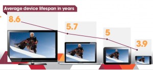
Here’s a simple infographic from Rovi (they’re my client, but I wasn’t involved in this) which demonstrates several best practices. The stat is about the effective life of different categories of device and it turns out the bigger the screen, the longer it tends to stay around. So the designer created a graph in which time is expressed by the size of the screen and is reinforced by the more precise timeline at the top. It’s memorable and instantly understandable. It pulls one fact out of a longer article which is particularly appropriate for visual expression.

Less good are infographics in which a legend is required to understand what the visual is communicating—in other words, there are design objects that symbolize something and then off to the side there’s a caption that says what they mean. This is a necessary feature with complex charts but an infographic is not supposed to be complex. If you need a legend to make your point, start over.

Google+ infographic
Google+ infographic

Still less good are infographics in which numbers are just translated into graphics with color and clever type treatments. This seems to be the most common type of faux infographic. Our friends at eConsultancy shared this classic from Google+ in “How Not to Make an Infographic: Four Examples to Avoid”. (Sorry it’s tiny; click through to the jpg then click on the magnifying glass to blow it up.) There’s nothing in these numbers that could not have been said just as effectively with simple words. The graphics don’t add anything; they’re arbitrary and don’t add the visual revelation we saw in the Rovi example.

Finally, at the bottom of the barrel, we find infographics that are actually incomprehensible. This is the kind of work I’ve seen from a couple of would-be infographics designers who pull out words or numbers that look important, then turn them into graphics and assume they will support the text. But it doesn’t work like that. An infographic has to work on its own as an element of the message.

None of this is news, of course. Edward Tufte’s The Visual Display of Quantitative Information, first published in 1983, has great examples of infographics dating back to the time of Napoleon. I wish some of today’s would-be infographers would read it.

Do Initial Caps Improve Response?

I was half-dozing through a Google Adwords tutorial the other day when something woke me up: the instructor’s advice that you can improve results by putting all the words in your ad, but especially your keywords, In Initial Caps Like This.

David Ogilvy must be spinning in his grave as if on a rotisserie. He railed against ALL CAPS in Ogilvy on Advertising because they deconstruct a word and turn it into a bunch of separate letters which the reader must look at one by one in order to make sense of it. Readers don’t do this. If there is any impediment to readability, they move on.

I have always assumed that Capitalizing The First Letter Of Each Word presents a similar problem, and I thought Ogilvy wrote about it, although I can’t find the source right now. But it’s the same issue of comprehension. Inappropriate use of initial caps means the reader sees individual words, not phrases, so it’s that much more trouble to seamlessly absorb the message. What’s more, overuse of initial caps gives your advertising a kind of stilted, affected, 19th century look. It’s certainly not what you want if you are selling a product or service which is closely attuned to the needs of 21st century consumers or businesses.

For these reasons I’ve always advised my clients against unnecessary initial caps, and often changed their copy if I get my hands on it. That’s why the Google “tip” is so demoralizing. Have people stopped reading copy completely, so they no longer have the mental acuity to focus on more than a single word or at most a keyword phrase?

Please, tell me it ain’t so. If you have testing experience with standard capitalization (what Microsoft Word calls “Sentence case”) vs initial caps, I’d love to hear the results. If initial caps are indeed the wave of the future, I’ll accept that. But I Won’t Like It.

Google blows it with new layout

The other day I was talking about the Unique Selling Proposition and how valuable it is when a marketer can distinguish itself by claiming a benefit or feature that cannot easily be claimed by another marketer. I mentioned that often you can do that simply by staking a claim to a generic benefit nobody else is talking about… make it your own, and anybody who later says “we have that too” would look foolish.

Google, though we take them for granted today, has a pretty unusual marketing history: they climbed to the top in a competitive field (remember when we all searched with Altavista?) by just being better than everybody else. So it was so very appropriate that Google’s interface also looked different. So stark and simple, just that search box in the middle of a blank page. The drama of unused white space… never a better example.

So now we have the new Google interface that has left this behind. You get a busy page with results in the middle, Adwords on the right, and a menu of related results on the left. But more important, you get a page that looks like everybody else’s search results page.

Not many marketers can claim the high ground that Google legitimately appropriated with its old page. To voluntarily cede your USP…. for that is what they are doing with this new generic interface… is a bone headed decision.

It occurred to me as I was thinking about this that  grandfather was a proud member of the Dallas Bonehead Club. I am not sure of all they did but I know a core value was to be silly and irrelevant. Good for them in that straight laced Southern business community, maybe not so good in today’s competitive business envronment. Bad move, Google.

Bing Photosynth demo at CES (video)

Bing is the Mac OS of the search world. (Yep, that’s ironic.) It only has a small market share, but those users have become so loyal that it has to be considered in any search marketing plan. Succeeding against all odds when other search engines were becoming an afterthought, Bing did it the same way as Google: an innovative software algorithm.

Now, Bing is taking on another Google property with its enhanced Streetside which was introduced at CES 1010. This is like Google Maps combined with Google’s directory features, but with more information and better organized. If you’re looking at a restaurant, for example, you can see ratings from a variety of sources and an aggregate quality score.

Yet what is most cool is the Photosynth feature, which allows multiple users to contribute their own visuals of a landmark which are then stitched together to enable a 3D view that can be much more information-rich than Google’s Streetview. For a heavily documented site, like the Rome Coliseum in the example, you can zoom in on a detail and do a virtual walkaround.

I shot a video with a demo of Streetside by a Microsoft boother. The really cool stuff, demoing Photosynth, is toward the end.

Google, other marketers spend way out of recession

In an earlier post I talked about the argument for spending more to gain market share when others are cutting back, and cited Bed, Bath & Beyond and New York Life as success stories. Now comes news that Google, Juniper Networks, Cisco and Microsoft have launched major new campaigns into a still-roiling economy. “Everyone is trying to be the first mover,” commented Dean Crutchfield at one of the major tech agencies. “This is a market now where you’ll stand out or die.”

Coincidentally, Google’s Q3 revenue was up 7% year-to-year, in spite of tough economic times. Somebody is spending more on Adwords, that’s for sure. How about your company?