We’re stepping back, not stepping away

Boy with American Flag
This photo is in the Creative Commons, meaning the photographer has approved its use without permission or payment. It originally appeared with an editorial, entitled “America’s struggles with cultural ignorance”, in the online publication of Biola, a Christian college.

As exactly nobody noticed but me, June was the first month since 2004 in which we did not publish a single post. Blowing that tradition feels great. I’m backing off on new freelance work and will continue to post here from time to time, but only if I have something worth saying. The collected wisdom of this site can be found mostly in the Copywriting 101 category or, if you want to pay very little extra for me to organize it for you, in my book Copywriting that Gets RESULTS! And if you are willing to read about food instead of marketing, Burnt My Fingers is alive and well with new posts at least 2x a week.

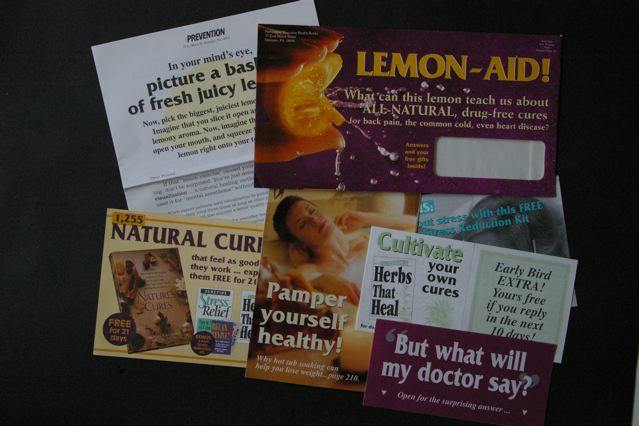
I started this blog because I was teaching a copywriting course for the Direct Marketing Association, and the innovative format (yes, blogs were new at one time) seemed a good way to keep in touch with students outside of class. In 2004 email and other electronic marketing was in the ascendancy, but we still used direct mail for many creative and marketing examples because there is such a rich history to draw from.

Today, the most effective marketing is found in ads that don’t seem like ads at all, in clickbait headlines and fake social media posts that target a specific group or concern. David Ogilvy and other giants of direct marketing would be very proud of, if not exactly chummy with, the Russians and others that excel at these new media. Just like Robert Collier or John Caples, they do the digging to understand what is important to their target audience, then present their product or service as a solution to the problem the audience is having.

As we learned from Roy Chitwood and other practitioners of effective selling (remember, a copywriter is a salesperson with a keyboard), every one of us is motivated in every decision by the desire for gain or fear of loss. Today the latter motivator seems to be on the rise. I hope we all live long enough that the tide will turn and we will be less interested in who is trying to take things away from us and how we can stop them, and more interested in being the best we can be and sharing any beneficial results that may accrue.

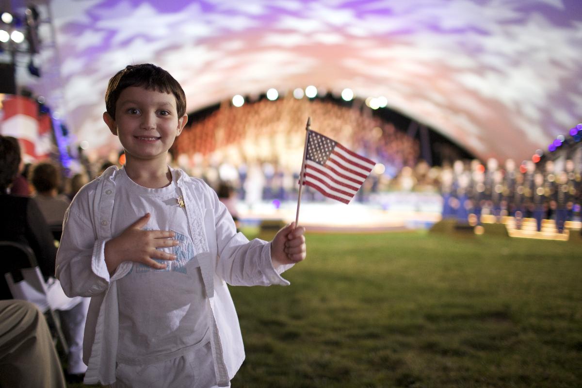
It’s America’s birthday, the 4th of July. Let’s celebrate by making a commitment to a more generous and optimistic society, and let’s each one of us take the high road in working to make that happen. Look your neighbor in the eye, even if they’re a stranger, and nod hello. Sharing and fellowship built our nation. It’s not too late to go back.

Ogilvy was quoting, not creating, famous “it’s not creative” maxim

Got an email the other day from Larry Hampel, ECD of Cramer-Krasselt in NYC. He says in part:

I happened to stumble across your blog while killing some time this morning, and I saw your piece on David Ogilvy. Nice Job. “Confessions…” was the first book I read when coming up in the biz and so much of it still makes sense today.

However…. I feel the need to correct you on one important thing. You are correct, Ogilvy did not say “it’s not creative unless it sells.” But he also did not come up with the phrase “if it doesn’t sell, it isn’t creative.”

That phrase appears in Ogilvy on Advertising… and it’s actually Ogilvy’s Misquote of the former, more famous, “it’s not creative unless it sells.”

I know because my father coined that phrase while Executive creative director at Benton and Bowles in the ’70’s. In fact, that line became their mantra. (and, in fact, if you go back I think Ogilvy attributes it to B&B in the book).

Anyway, just wanted to clear that up.

I had picked up the quote from Ogilvy’s Magna Carta of Advertising, which is today available only in internet form, but I looked at “On Advertising” and sure enough, Ogilvy does give credit to B&B. So there. My Ogilvy Tribute Page has been updated accordingly.

Should you ever turn down business as a copywriter?

When I started freelancing, a couple decades ago, a wise old art director counseled me: never turn down work. Even if you’re super busy, stay up all night to get it done or offload it to a fellow creative and hopefully mark up their work. After all, you never know which new client might become your bread and butter or, conversely, if your current bread-and-butter client might go belly up tomorrow.

And I do try to stay hungry. But recently I’ve been turning down a bit of work. Part of this is a hunch we are headed for good times. Freelance creative are the canaries in the coal mine, first to get laid off in a recession but also first to know when companies think they better get cracking to stay competitive. And that’s what seems to be happening right now. Buy U.S. equities, dear reader. Buy Facebook like I did last week. (Though not at the IPO price obviously.)

And, another part of my reasoning is quality of life. I’m trying to get some traction on a fiction project, which uses the same brain cells as my copywriting. At the end of the day, when I’m trying to get the attention of David Ogilvy at that great water cooler in the sky, do I want to admit I didn’t get my novel finished because I decided to take on yet another few hundred $$ project? Not to mention my kid’s in the Little League playoffs and we are looking pretty good over here.

Both my turn down projects this week had to do with budget contractions. When times are good, prices start rising all over the place (the $3.47 deck pieces I wanted at Home Depot rose to $5.94 in the space of a month, for example), and it’s natural to get aggressively defensive.

One client wanted to redefine a project to pay less for work we’ve already agreed to. There’s a line item for A, and a line item for B, but the assumption is you’ll get both and I do research and prep with that in mind before I ever type a word. Now this client wants to only pay for the “A” portion which makes it a loser for me since the prep work is the same, so I’m outta here. Have to finish current projects but asking to be excused from future ones.

The second contested budget was much, much larger… an entire website. This is always a leap of faith because you don’t know how the pages will shake out when you estimate and hopefully pick a per-page number that averages out (same with catalogs by the way). With a new client, you also don’t know how finicky they will be and how complex the revisions. So I added something I thought was pretty generous, which was an offer to write 10 pages of the client’s choice at the per-page rate, charge nothing for my startup research time, then after that we could decide if it make sense for both of us.

Client instead wants a deal of some kind, which I can’t offer because my deal was my deal. This could have occupied me late into the night for much of the summer. Instead I’ll be baking baguettes, following the capers of my protagonist (a 19th century Quaker with a terrible problem) and maybe watching Logistics One finally get the best of Staffing in the Saratoga American Little League. Maybe I’m crazy, but maybe not.

“Will it last for 30 years?”

This past weekend I ran across a historical display for Southwest Airlines in a Dallas Museum. The promotional materials and “LUV Potions” cocktail menu from the 1971 launch look amusingly dated, but the planes themselves are a dead ringer for the 737 I flew home the next

The first Southwest Airlines plane.

day—same design pattern, same color scheme. They’re fulfilling one of David Ogilvy’s key tests for a good concept: will it last for 30 years?

It got me thinking about what a consistent brand Southwest has been over the years—not just in design but in its irreverent voice that pokes fun at itself, the flying experience, and especially mandatory FAA announcements. (My favorite example of this humorous approach was the air sickness bag with a recruiting message on it: “sick of your job?”) This is heavy lifting from the marketing department and a key reason people who don’t generally “like” airlines go out of their way to fly Southwest.

Interestingly, Southwest itself has itself gotten a little tired of its consistency recently and is moving things around. Its website was recently redesigned with a color scheme that is a reasonable evolution from its beginnings, but with broad horizontal elements and an anonymous san serif type face that remind me on one of those sites you wind up on by mistake where somebody is squatting on a URL and wants to make it look like a “real” website with links and search.

Advice to Southwest: don’t get bored with success. Remember Henry Ford’s alleged complaint to his marketing director: “I like that campaign of yours but does it have to appear so dang often?” To which the marketing director replied, “Mr. Ford, the campaign has yet to appear in print!” Continue reading ““Will it last for 30 years?””

“It’s [still] not creative unless it sells.”


I’ve always followed David Ogilvy’s dictum, which means I never show work around if I know was not successful in the marketplace. But what if the market was wrong? Or, to put it less arrogantly, what if the lists got messed up somehow and my mailer or email went to the wrong folks? Shouldn’t you be allowed a free pass once every few decades on work YOU really like and think is good?

I was going to present the piece shown here as an example. It’s always been one of my personal favorites, though I hadn’t looked at it in a number of years. The client and I were very surprised at the time that it was not a big winner. But when I pulled it out today, I could immediately see what was wrong.

The outer envelope (upper right in the photo) is what kills this package. We’re selling a book of relaxing natural cures to women and I wanted to use a lemon to illustrate how our mind has powers to help us. (Really concentrate, think about a lemon and its taste, and your mouth starts to pucker up.) But where’s the reader benefit in this? I was also betrayed by my choice of visuals from a great designer… this stop-motion bursting lemon image is frenetic when it should be calming, and the background should be green not purple for a restful, natural cure. And yep, that reversed out type is pretty hard to read.

Inside is lots of good stuff which the recipient of this package never got to see. There are two headlines I like: “Pamper Yourself Healthy” and “Natural Cures that Feel as Good as They Work”. Either one of these might have given me a fighting chance if I’d used it on the outer.

Once again the marketplace—and David Ogilvy—are right.