Why market testing is worth the effort

Market testing is worth the effort
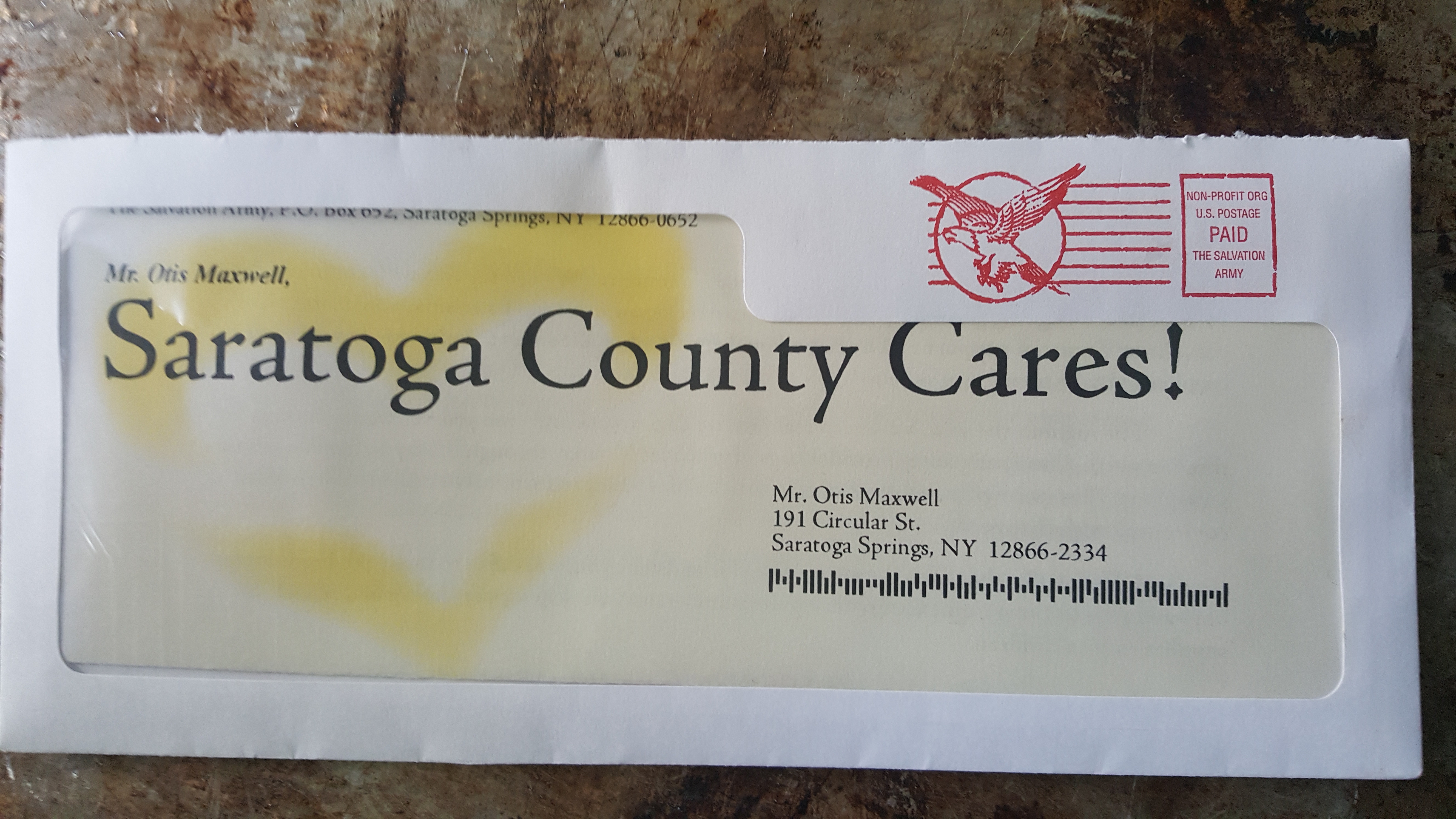
Over the years, I have known a number of clients who didn’t do market testing or didn’t think it was worth the effort. Often these are overworked employees of medium-to-small companies who have a lot of balls in the air; how can you justify spending hours to analyze a past campaign when it’s all you can do to get the current one out the door? I’m frustrated by this attitude as a copywriter because results are what I get paid for; if I can’t prove my effort outperformed your control then you’re less likely to hire me for a future project.

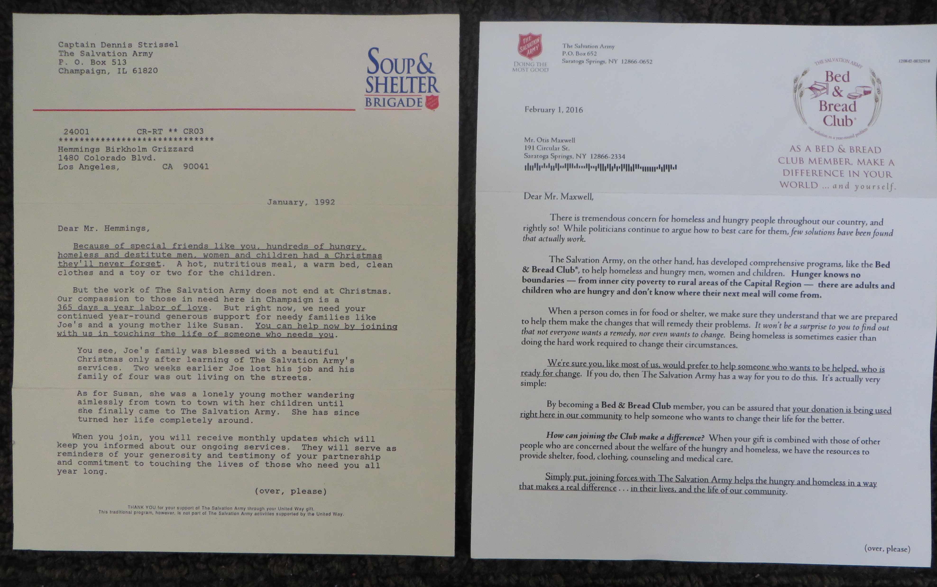
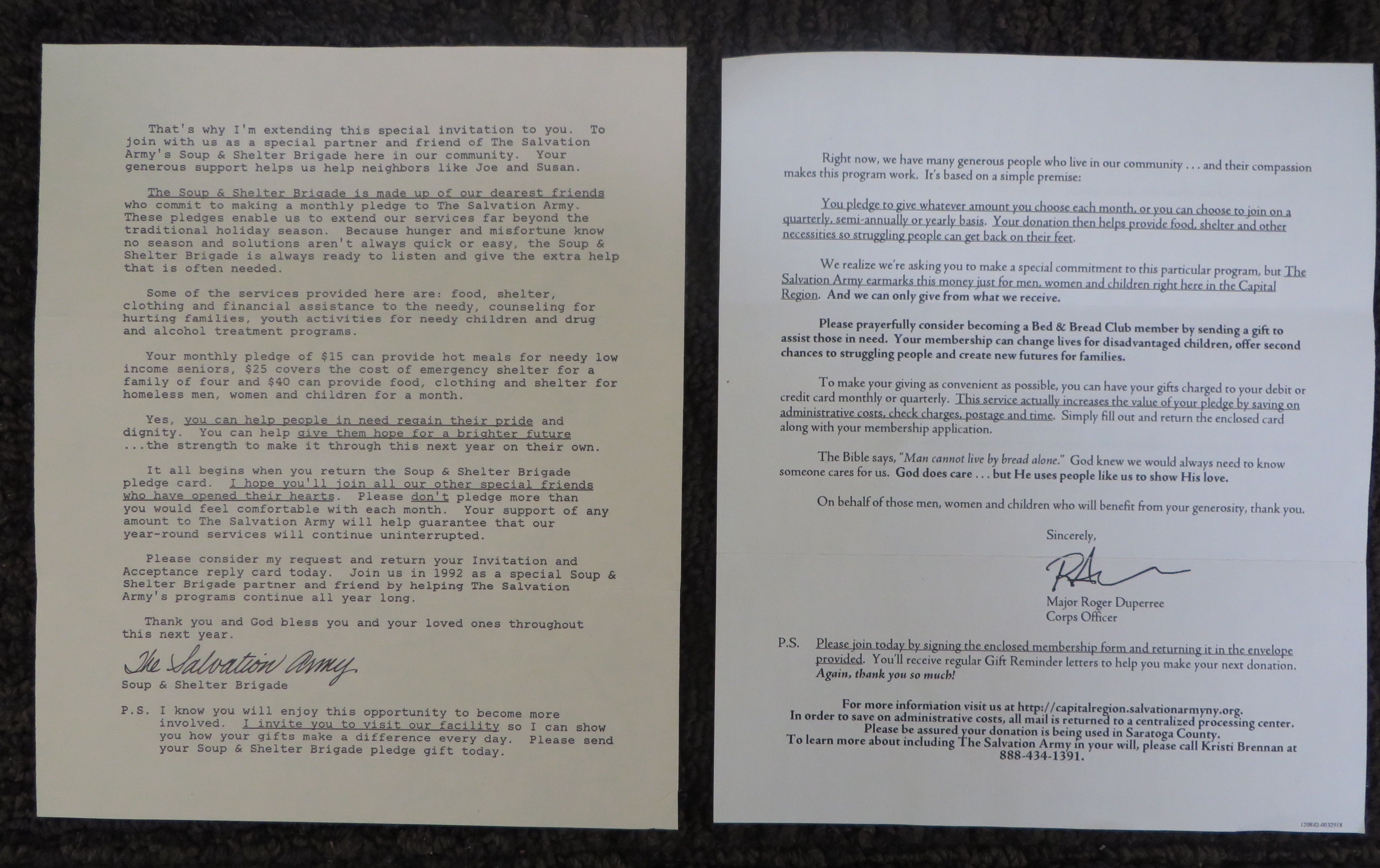
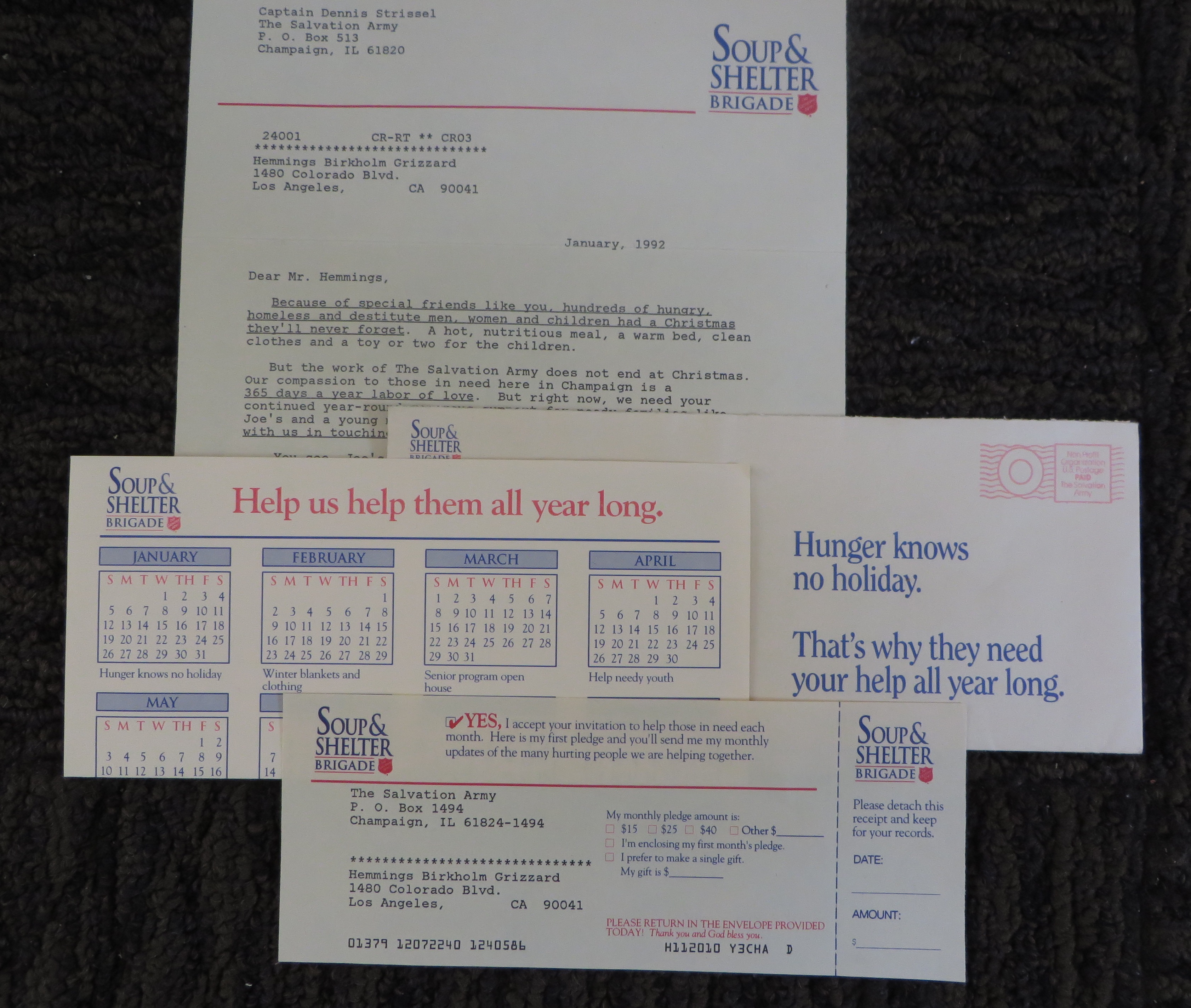
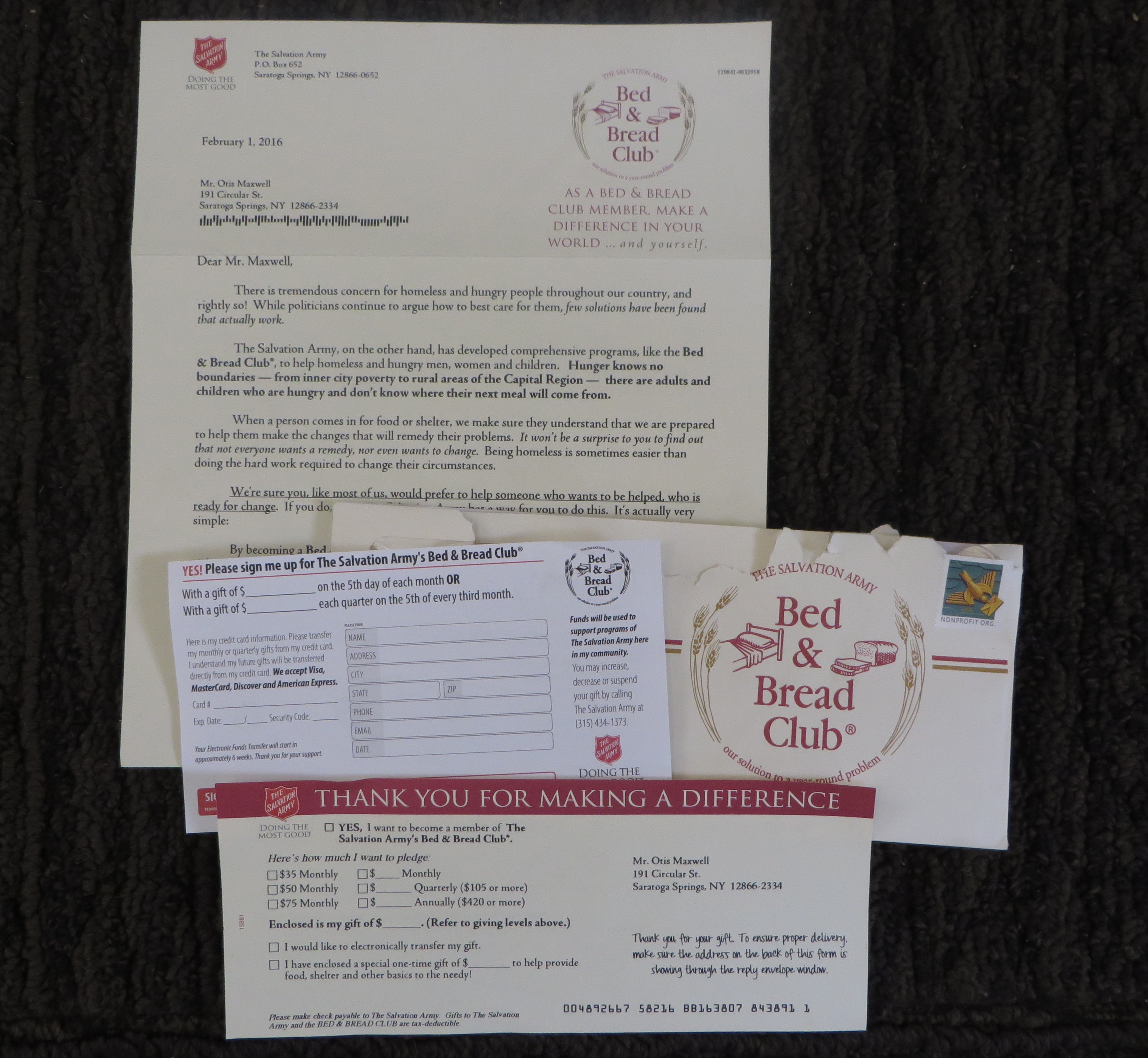
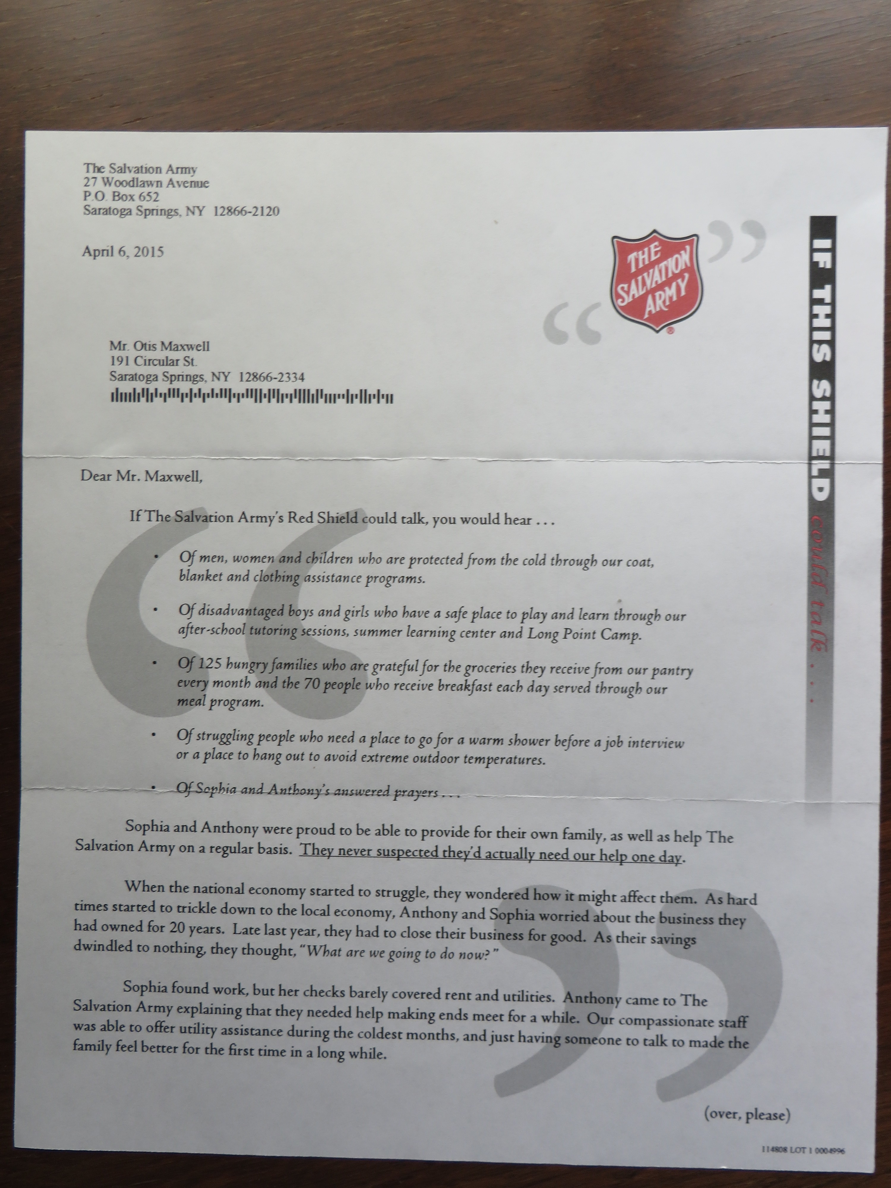
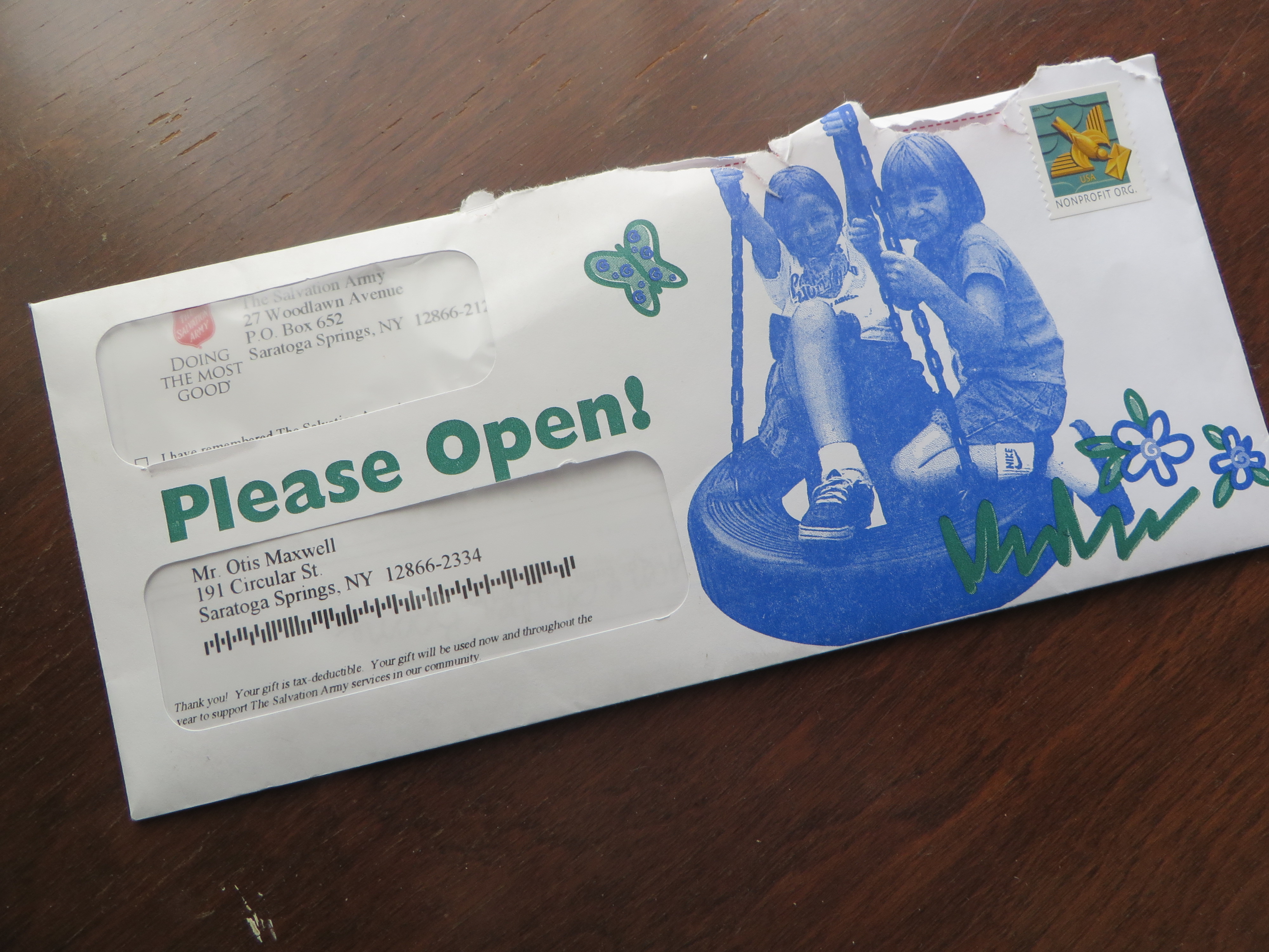
I like clients who live and die by market testing and are willing to follow its learnings even if results conflict with their gut or the preferences of their boss. Such a client recently asked me to write a number of variations of an email inviting investors to an introductory workshop. This organization has plenty of data tracking how registrations for this event turn into a future revenue stream. Increasing registrations costs nothing more than the few dollars you pay the copywriter to come up with a fresh message and the benefits go directly to the bottom line.

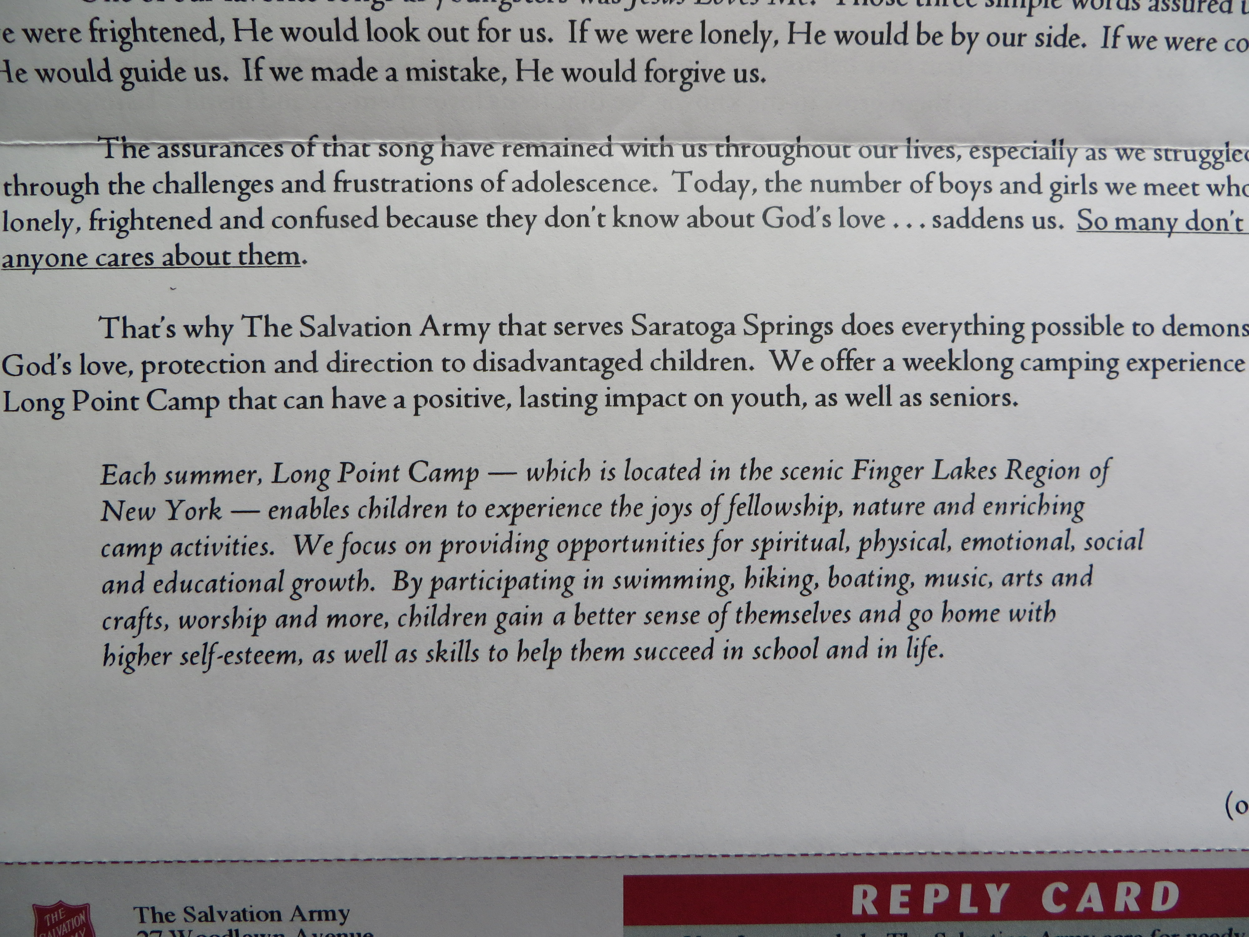
I crafted the test messages based on input from focus groups and polling of prospects who had registered for a previous event but did not show up; if we could find anomalies in these groups compared to the profile of their typical student and speak to those, maybe we could increase the perceived value of the workshop and make them more likely to register and then attend. I also did a series of messages based on an earlier successful test in which we emphasized that the event lasted just three hours and made that seem like a trivial commitment and a good use of their time.

Result: virtually all my emails beat the control and the most successful nearly doubled it measured by the percentage of recipients who signed up for the workshop. The creative was the only variation in the promotion, proving that yes, people really do read the copy. The messages will be retested, refined and rolled out, potentially bringing in a lot of motivated new prospects to be nurtured and developed into committed, profitable students. Market testing is definitely worth the effort.

If you need to sell the value of market testing internally, you might use the example of MoviePass. This company had the bright idea to buy unsold tickets in movie theaters and then wrap them into a membership plan where you can watch x movies a month for a fee of y. According to a recent interview with the CEO of its parent company, MoviePass did test y but apparently not x. They just decided to offer unlimited movies… which meant MoviePass would end up buying its members a full priced ticket if a discount was unavailable for a popular movie. The CEO didn’t see a problem with a burn rate which was then $21 million a month even though MoviePass only had $43 million in cash on hand.

Shortly after this interview (which went live on July 18 of this year), MoviePass announced the number of movies you could see per month would be reduced from unlimited to… three. The result was a sharp decline in its stock price and a feeding frenzy from competitors and the media. All of which could have been avoided with some simple market testing.

Hopkins Scientific Advertising for free?

Would you like a free copy of Scientific Advertising by Claude Hopkins? Sure you would, because this marketing classic is as relevant today as when it was published in 1923. Here are four principles from the book, as summarized on the Marketing Experiments blog:

1. People are selfish.
2. Generalities are worthless.
3. Advertising is salesmanship.
4. Advertising is a science.

The last is obviously to self-justify the book. But would you disagree with any of the others? Of course not, for reasons we have written about here many times. The world may change, the delivery mechanism certainly does, but people are still people with universal wants and fears.

Since the book is long out of copyright, a number of links to free downloads are available on the web. My favorite is this page by Roy Furr which showed up last week in my LinkedIn feed. Furr is a disciple of Jay Abraham who will of course use the podium to sell his own works while he has you engaged. But there’s no obligation, and I will take it on faith that opt-out requests will be honored.

You can go to this page and get full exposure to Furr’s marketing message, which is classic long form copy though a little long on analytics and short on emotion for me. In true Jay Abraham fashion, he really massages the info premium. Scroll to the bottom, and not only can you get the PDF download, but you can get an audiobook which Furr “recorded for my personal use”. The reader is pretty professional sounding, whether it’s Furr or somebody else.

My own publisher, FastPencil, is not so smart about freebies. They’ve discontinued the preview download feature whereby I offered the first ten chapters of Copywriting that Gets Results! at no charge. But a complete PDF is just $6.99, and since you’re saving so much on Claude Hopkins why don’t you just buy a copy?

What the pool guy can teach us about selling freelance creative

I’ve recently moved into a house which, two owners ago, was tricked out with all the bells and whistles available in the early 1990s. Most of these tchotchkes have fallen into disrepair and must either be abandoned (like the in-wall coax cabling throughout the house) or gussied up. This has caused visits by a stream of spa guys, pool guys and sprinkler guys and I’ve noticed something interesting and consistent in the way they address my wife and me which can help in selling freelance creative.

“See the three holes in the top of that sprinkler head?” says the sprinkler guy. “That’s a Toro. They require a special tool to open the head, so you have to call a service to do it for you. I’ll replace all those with Rainbirds you can adjust yourself.”

“This is junk,” says the pool guy as he turns the handle on the filter tank. “$125 for a new one.” Water starts to ooze out. “Look at that.” As the gaskets become saturated, the leaks stop. “Well, maybe it’s good for one more season. But keep an eye on it. If you lose your prime [which for some reason is what they call pressure in the system] then your pool will become filled with algae.”

What’s happening in both these instances is that the contractor is sharing a do-it-yourself tip to make me, the client, feel in control while simultaneously instill fears, uncertainties and doubts that I’ll actually be able to do it.

“Write like you talk,” you might tell a client who thinks they can do their own copywriting. “Short sentences, no more than 10 words on average but break those up with an occasional one- or two-word sentence. Paragraphs no longer than five lines, but break them up with an occasional one-line or even one-word paragraph. And your vocabulary should be plain English. No words over ten characters if possible.”

Now who’s going to remember all that? The guy is going to dutifully write it down, and possibly try it, but will quickly abandon the effort and call you. And you may well be able to ease your estimate a bit higher because they now have more appreciation of your craft.

This is why I shake my head at creatives who present their work as a black box and refuse to open the kimono and explain what they’re doing. The more you tell them, the more they will respect and trust you, and the more likely they are to hire you to do it for them. Now I’ve got to go down in the basement, because the last owner loved to tinker with his sprinklers and I’m pretty sure he had one of those special Toro tools.

Why Cadillac “Dare Greatly” campaign doesn’t

While many brands made a political statement with ads on the 2017 Super Bowl, Cadillac saved theirs for the (surprisingly non-political) Academy Awards telecast. “We are a nation divided. That’s what they tell us, right?” the ad begins. “But what they don’t tell you, what doesn’t make the news, is this: We carry each other forward.” And we have a series of clips of Americans supporting or carrying others, sometimes literally.

Next we go to a montage of historical figures standing next to their Cadillacs. “No matter who we are, or what we believe, or where we come from, we’ve had the privilege to carry a century of humanity,” the ad continues. The “carry” metaphor is not very subtle, but it speaks well to Cadillac’s history as a symbol of having made it. I grew up in a suburb of Dallas with a very eclectic population mix—from college professors to poultry distributors, and from aristocrats with a long southern heritage to first generation immigrants.

Some folks thought owning a Cadillac was a way to show off your prosperity; my Uncle Jim bought a new one every year. But others would never own a Cadillac because it was not appropriate to be so ostentatious. I suspect the new Cadillac campaign is speaking to the first group. You may live in fear of deportation, you may belong to an ethnic group that is the subject of hate crimes, but if you have money for the down payment at least you can drive a nice car.

As it wraps things up, Cadillac stretches its metaphor a bit too far in my opinion. “But maybe what we carry isn’t just people. It’s an idea. That while we’re not the same, we can be one. And all it takes is the willingness to dare.” And we close with the Cadillac logo and the tag line, “Dare Greatly.” (The tag is not new, but was introduced with this campaign a couple of years ago.) Again, what we’re talking about is bourgeois prosperity. It’s the same kind of daring that might cause you to go for it with a nicer anniversary gift or a pricier steak than you had planned because, hey, this is America and you can. It’s really not that daring, but maybe it hits the Cadillac buyer’s sweet spot.

The branding continues to veer off course with the next spot, “Pioneers”. “We’ve always been dreamers. We’ve been a symbol of the future…. A standard… a star. But our past is just that, past. What lies ahead is in our hands.” And the ad goes on to introduce concept vehicles including self-driving and electric Cadillacs. The drivers in these vehicles are younger, much younger.

The third ad, “Pedestal”, starts with a vehicle literally on a pedestal surrounded by gawkers. A well-dressed 30ish woman comes forward, mesmerized. “We know how it feels to be treated like a trophy. Driven to awards shows… parties… and across so many silver screens…. But a Cadillac is no trophy, no museum piece. This is our future, and it will inspire every car that follows…. Intermission’s over. This is how we drive the world forward.” And now the mesmerized woman is behind the wheel while multiethnic pedestrians gawk at her good fortune.

The problem here is that Cadillac is trying to transform its brand and appeal to a new audience, yet its history is the reason for its cred. They should have done what Lincoln and Chrysler did, in high concept campaigns of the past. Tell your story, then shut up. The campaign can continue with product-focused features and performance ads, and buyers will connect the dots.

I’ll close with Electro Cadillac, presumably a current owner, who says much the same thing in a comment under the YouTube “Pioneers” video:

“I can’t believe this… This commercial is basically telling you that all the achievements and great cars that were made in the past, history (which, let’s be honest is much better than the weak plastic bullshit we have today) let’s just throw all that in the garbage… I enjoy driving and all this ‘futuristic’ crap is getting on my nerves with every single day going by…

“One thing that is fundamental guys, Cadillac hear me out: You can’t beat the old school. Those flimsy plastic bumpers will never compare to those good old chrome steel ones.

“And here is another thing. I am watching the Oscars as we speak, and your Escala commercial says this: ‘Our cars will never be like before’. Well that means that you’re not going to be Cadillac anymore.

“Here is a new slogan for you: There is no future without the past.”

How not to localize direct mail

Your personalization vendor has a great idea: add variable fields to localize direct mail by mentioning the reader’s geographical location. This is especially effective if you’re a national brand and you want to connect with prospects on a grassroots level. Hence this month’s example from the Salvation Army:

Saratoga Cares
Salvation Army wants me to know Saratoga Counta Cares

The biggest problem with this effort is something that can happen to any marketer–which is why I am sharing this even though I have beat up on these poor folks and their localization in the past. I know where I live, so making a reference to that place has no meaning unless you add another attribute. For example, “last night 368 people in Saratoga County went to bed hungry. Here’s your chance to help them get a good meal”. Just saying “this is a mailer about Saratoga County” is a huge so-what because almost every piece of localized mail, whether it’s a bill or a message from a civic group, says the same thing.

A secondary problem is that “Saratoga County” is a meaningless term. Saratoga County is a gerrymandered entity and I feel no affinity for my fellow citizens down in Waterford or across the lake in Edinburg. I am a resident of Saratoga Springs, a city, so please identify me/yourself as such. If you’re going to localize, take the time to research local usages like this and avoid faux pas. (A favorite, which I searched unsuccessfully for just now, was a liquor ad localized to San Francisco from a few years back in which the tippler looking for an excuse to drink checks off “Saw a hippie at Haight”. It should be “in the Haight” of course and that boner immediately brands the marketer as a carpetbagger.)

Here’s another interesting example of personalization/localization. A Canadian ad firm drove Porsches to people’s homes, parked them in the driveway and took a picture, then drove away and mailed the prospect a picture of the car in their own driveway with the caption “it’s closer than you think”. In friendly Canada it drew accolades and  32% response rate. In the U.S. it would have drawn lawsuits. Know your local audience.

Copywriters, the end is near

I was paying my quarterly visit to a client when the online marketing manager mentioned he needed quite a few SEO articles written. I asked if I could help. No need, he said, I’ll just order them on TextBroker for ten cents a word and run them through copycheck to be sure they weren’t plagiarized.

I’ve always had a smug attitude toward the link bait that pops up when you search on a technical topic. It’s pretty obvious they’re partly machine-written and/or English is not the writer’s primary language. So to have my own client go this path was a bit unsettling. I signed up for my own TextBroker account and commissioned an article on Bengali cuisine for my food blog. The author would have to say what makes Bengali cuisine unique (specific spices and ingredients used) and provide a defining recipe as an example. All this for a maximum of $75.

2 days later, _Liz came through. She hit all the markers and the article is good enough that with a couple of tweaks I’m going to use it. The cost? $65.08, for something that would have taken me the equivalent of $500 or more at my hourly rate to research and write. By the way, why did I choose that topic? Because I assumed the writers were South Asia based and I might get lucky and find a real subject matter expert. But TextBroker tells me their writers are 100% in the USA.

Here’s the other reason we copywriters might as well trade in our keyboards for flip-flops. The Wall Street Journal, which I rely on for sports perspective for some reason, has twice reported in the last few days on organized races with declining registration. First 10Ks, now “mudder” type obstacle courses. The explanation? Those darn millennials. Studies show they don’t enjoy competition as much as previous generations, hence less interest in organized competitions.

Of course, the reason we as copywriters get paid what we do is that we convince readers they can rise above the competition—whether you define that by economics, status or ability to do a job better—with the help of our client’s product or service. If the reader no longer cares, where does that leave us?

A long weekend in New Orleans is looking mighty good right now.

Then and now: Planned Giving with the Salvation Army

Planned Giving letters (front)
Front page of the two planned giving letters, side by side (click the image to enlarge to a readable size)

25 years ago I wrote a planned giving direct mail program for the Salvation Army. I recently received the current rendition of the same ask, and it was fascinating to see what has changed and what hasn’t. I’ve reproduced the letters from the two packages, which contain the key message, and you can read them by clicking on the images.

backs of planned giving letters
Back side of the two letters (click the image to enlarge to a readable size)

In both cases, the program appeals to high value donors and asks them to make a small regular contribution to fund community kitchens and shelters on a year-round basis. The vast majority of the Salvation Army’s donations come in fourth quarter, partly because of tax planning but also because holidays (Thanksgiving and Christmas) are a time when Christian donors are particularly sensitive to the needs of people less fortunate than themselves. The letters are sent in first quarter to people who made generous donations over the holidays.

Soup & Shelter complete
Soup & Shelter package, complete

My pitch was called the “Soup and Shelter Brigade”. It thanks the reader for their generosity and paints a word picture of “a Christmas they’ll never forget” which they made possible. It goes on to present the year round need and provides two vignettes of people like the ones you’ll be helping—good people who have fallen on hard times, usually through no fault of their own.

The vignettes are important because we’re going to send you more vignettes each month as part of the program—here’s who you are helping this month. The monthly mailing is a reminder and a request for the pledged donation, since this was before the days when automatic credit card billing was an accepted practice.

Bed & Bread complete
Bed & Bread package, complete

The new package is from the “Bed & Bread Club” and has a hard edge that surprised me—not to say it’s not successful. “Not everybody wants a remedy, nor even wants to change. Being homeless is sometimes easier than doing the hard work required to change their circumstances… We’re sure you, like most of us, would prefer to help someone who wants to be helped who is ready for change.” And the letter goes on to promise that your gift will be used to support this cohort.

So this is appealing to a donor who is fed up with the ineffectiveness of social programs…. Possibly because “while politicians continue to argue how to best care for them, few solutions have been found that actually work.” It’s an exhortation to take things into your own hands that leans as much on frustration as Christian charity.

I’ve also attached photos of the complete packages (minus the return envelopes, which were blank in both packages). Mine includes a calendar with a theme for each month to illustrate the ongoing need “Bed & Bed Club” has TWO remit forms, one a standard ask and the other an authorization for automatic credit card billing. This makes me think the auto billing is a test which will be rolled into the main form if it works.

If it still works as in my day, local Salvation Army corps have access to several direct marketing agencies who offer them prepared promotions to choose from and then localize (mine isn’t localized because it’s an agency sample). “Bed & Bed Club” was the choice of the Capital District corps, and that’s really all I know about it. I hope it’s working, but I also hope (and believe) people still give out of compassion as much as frustration.

Why copywriting is like fixing a hole in the wall

I live in a 135-year-old house with lath and plaster walls. I have two teenage boys. Thus, I have a lot of opportunity to patch holes in those walls. Recently I’ve gotten a lot better than this, and it occurred to me there are lessons that apply to copywriting or any repetitive artisanal task.

Originally I patched the holes with Durham’s Water Putty, which is a wonderful substance so long as you do not ever plan to sand or otherwise change it after it dries. Fortunately I did not fix too many holes this way. I’ve evolved to what I think is a pretty standard formula: two layers of gypsum patching compound over the lath, then a final layer of Sheetrock drywall mud. (There’s possibly been some new regulation for health reasons, because the drywall mud is no longer available powdered but only in a premixed tub labeled “Dust Control”.)

Sometimes the laths are missing or broken. I use 1 x ¼ inch trim strips from Home Depot to replace them, applying wood glue and clamping the ends to the backs of good lath till it dries. The resulting lattice has a Rube Goldberg look, but once the plaster is applied nobody can tell what’s underneath.

Sometimes the plaster has separated from the wall. Using the technique I read about on this site, I drill numerous 3/8 inch holes through the plaster with a masonry bit, squirt a generous amount of Loctite All-Purpose Power Grab adhesive through each hole, then tighten the plaster down against the lathe with a short drywall screw and a fender washer. Two days later I remove the screws and knock the washers off with my drywall knife, and the wall is ready to be patched.

Applying the final layer is critical to making it look like you have not patched a hole. The coat needs to be even and it also needs to be “proud”, a wonderful plasterer’s word which means it’s raised slightly above the existing surface so it can be sanded down flush. If the coating isn’t proud, you will end up applying another layer to fill depressions left after sanding.

I’ve also learned to use the right sanding tool. Power sanders are too rough and kick up dust. Squeezable wet/dry drywall sanding sponges take forever. I use a flat drywall hand sander made by 3M with a 3” x 9” sanding face. It makes the wall as flat and even as it can be and exposes areas that will need to be built up. I start with 80 grit paper (also from 3M, and specially cut for this sander) and finish with 150 grit. On a couple of occasions my initial surface was way too high so I attacked it first with a Stanley surform plane.

So how is this like copywriting? First, your work improves with repetition. You observe what you are doing both consciously and instinctively, note what works and what needs to be corrected. In my experience improvement doesn’t happen gradually. You start a task you’ve done many times before, and suddenly realize you’re must better than the last time.

Second, you need to use the right tools and materials. For a writer, these include your creative brief, whatever method you use to organize your work and any props you use to improve your focus. (One great copywriter I know keeps a photo of his intended reader stuck to his monitor, for example.) You can’t just sit down and expect that inspiration will strike on a regular basis.

Third, you want to spend your best energies on the things that get noticed first. In a wall patch, you want to avoid bulges, dips, rough spots and separation lines where the patch doesn’t feather smoothly into the underlying wall. For the copywriter, pay attention to the outer envelope teaser, the subject line, the headline, and of course the clarity of the underlying concept.

Don’t get bogged down in the details until the big picture is clear in your mind. Your reader will forgive you the occasional flat sentence in body copy as long as your core premise is sound. Just as my home visitors, and future home buyers, will look past an occasional nick or ripple. Because no 135-year-old-wall is perfect… and neither is your copy.

Salvation Army shows the perils of localized donor mail

Front page of Shield letter
Where’s my town in this localized letter?

I gave a fair-sized gift to my local Salvation Army this past holiday season, and was happy to do so. (I wanted a particularly enthusiastic bell ringer to get credit, so I found out his name, wrote it on the check, and dropped it off at the local center.) Inevitably, this has spawned a series of large donor mailings asking me to repeat with similar amounts.

I mentioned one of these mailings in an earlier post because the art direction on the outer envelope wasn’t particularly adept. But later I got a second mailing that caused me to dig deeper and I found some object lessons in what not to do if you’re a national not-for-profit and you want to customize mail for individual locations.

Why should you go to the trouble of localizing your appeal? Because local donors to a cause like the Salvation Army want to know their contribution is put to use in their community. Some years ago I did a localized campaign for the American Red Cross. It had an insert on emergency preparedness, which was variable. We didn’t talk about hurricanes in the Midwest, or rivers flooding in the Northeast. (With climate change, maybe we’ll soon have the same disasters everywhere and non-profits can save the money.) And there were statistics which were localized by county of number of people helped, first aid courses taught and so on. Even thought it was a national mailing, folks in Milwaukee would feel like it was about their local Red Cross.

Localization on page 2
Here it is… on the second page.

I expect the Salvation Army did some similar database research, but they don’t use it well in the copy. My own community of Saratoga Springs is not mentioned till the second page of the “if this shield could talk” letter. Who are the 125 hungry families and 70 people who eat breakfast? Is that in Saratoga? (To read this and other copy details, click on the images to enlarge them.) I suspect this is just a flub: the numbers are appropriate for a town our size, but somebody forgot to plug in the name of the town. As a copywriter I’m well aware that the story of Sophia and Anthony is not local, but blending in local statistics would have blurred that line and made for a more compelling narrative.

Processing Center
Institutional “processing center” language turns off donors.

I’m also not easy with the qualifying statement (on the letter and the response form) that “In order to save on administrative costs, all mail is returned to a centralized processing center. Please be assured your donation is being used in your local community.” Well, first of all, that processing center (bad word—as a generous donor I don’t want to be “processed”) is in Albany, the nearest big city, so I don’t have a problem with it. Second, why don’t you say “in Saratoga Springs” or “in Saratoga County” instead of “your local community”? I have a very strong hunch that including this statement, thus raising an objection where one might not have existed, results in fewer donations that a mailing without that statement.

Salvation Army Camp Mailing
Second Salvation Army local mailer

Then the second mailing arrived, which is about sending kids to Long Point Camp in the Finger Lakes. I’ve previously written about the difficulty of “send a kid to camp” programs—that’s a very hard sell compared to feeding a homeless family and you really have to paint a picture of the kid’s desperate situation. So now we have this outer with the message “Please Open!” (I think they could have come up with a better teaser, no?) and two white kids in a tire swing. Is this a variable picture? It’s true that my community is pretty lily-white so maybe so. But why a tire swing? Can’t they afford real play equipment at this camp, which probably isn’t very safe if they’re using discarded tires?

Salvation Army Long Point
Send a kid to Long Point Camp.. why?

Moreover, why are we sending them away to camp in western New York when Saratoga County is chock-a-block with camps and rustic destinations? Or to Lake George, next county up the Northway? I feel like this effort is probably designed for donors who live in a big city, so when you mail to a resort area it really exhibits a tin ear.

I don’t have it in for the Salvation Army. I love these guys. I wrote fundraising campaigns for them many years through the Grizzard Agency, and contributed a pro bono effort to get donations after the Los Angeles riots of the early 1990s. But they have offered up a picture perfect example of what can go wrong with a localized campaign, and I’m sharing it as a bit of advice as well as others who think about localizing their national campaigns.

Who else wants to see their FICO score? (and other mailbox mysteries)

FICO mailing for Chase Slate
Where’s your list hygiene, Chase?

This credit card promo from Chase caused me to fire up the mailbox monitor. The premise is that you get a free monthly FICO report with the Chase Slate card. My household has been carpet bombed with these packages recently, both my wife and I receiving multiple mailings sometimes on the same day. There are a few things about it that make me wonder.

A memorable signatory
I’m Florian Eggs-Kring, and I approve this message.

First, Chase practices poor list hygiene which doesn’t dedupe recipients with the same or similar name, and obviously does not do its own credit scoring. Speaking of which, does everybody know what the promise of a “Free FICO score” means? Would it have been better to simply say “free credit report”, a term that’s used inside? And note the name of the signatory of the main letter. Florian Eggs-Kring is a moniker which would have the Monty Python lads doing backflips, which is my point. Might a more neutral pseudonym have been a better choice? I understand that Florian is responsible for this mailing, but if he/she loses even a few responses because of distraction it’s probably not a good deal.

One of my maxims is “if you see a mailing repeatedly, that means it’s successful.” But I have the feeling this package is the exception that proves the rule; someone had a huge budget and didn’t feel it was necessary to test. Florian Eggs-Kring, if you’re reading this please tell me I’m off base. (Of note, it’s not a Visa or MasterCard or Amex so it’s not going to wotk initially in a lot of terminals; maybe Chase needs to build a huge user base quickly in order to convince merchants to accept it.)

Salvation Army red package
Salvation Army package has a legibility problem

Let’s move on. The Salvation Army envelope, for a large donor mailing, starts strong with “If this shield” but then trails off because “could talk” is illegible in the mailbox (it looks much more legible in the photo than in real life). The problem could have been solved, or at least mitigated, with some adjustments at blueline stage or even on press (dial back the magenta). The lesson is, no matter noble your ideals, you have to follow through in production.

Parents Meeting teaser
Great teaser on a simple self mailer

The green “Important Parent Meeting” on this academic-green self mailer is simple and brilliant. No parent of a school age child can ignore an apparently official announcement of a meeting. This solicitation is for a seminar on how to get financial aid and I bet it’s successful.

AAA Term Life
Beautiful stage management in an AAA Life 9×12 package

Our final example offers some beautiful stage management for AAA Life. Note the three-dimensional effect of the mock-vellum certificate seen through the window, and the shadow behind the fake mailing label below. Inside we find a complete application pack which asks the reader to mail a check for term life insurance. This company is extremely thrifty and I can’t believe they would have approved this package if it wasn’t a winner in testing. I hope it is so we can keep this great designer working; you don’t see much direct mail created with such care nowadays.

Term Life AAA
Here’s the entire AAA Life package.

NOTE: as always, click on the image if you’d like to see any of these in greater detail, then click again to blow up the photo for a super-close up look.