What are you on, Diet Coke?

Diet Coke Kiosk
Diet Coke’s fiendishly ironic (or not) kiosk at Fisherman’s Wharf; click the picture for a closer look.

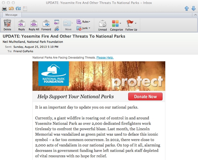
The riskiest kind of advertising is that in which you are so much inside the head of your audience that you can actually poke gentle fun at them and they will be appreciative rather than insulted. My favorite successful example is an etrade billboard that towered above San Francisco in the height of the dot-com craziness: “Sure, it’s scary. But so is falling in love.” Sly reinforcement of the trepidation the internet bubble investor was feeling, and implication you should do business with etrade because they understand. Of course, this love affair didn’t end very well, but that’s not the copywriter’s fault.

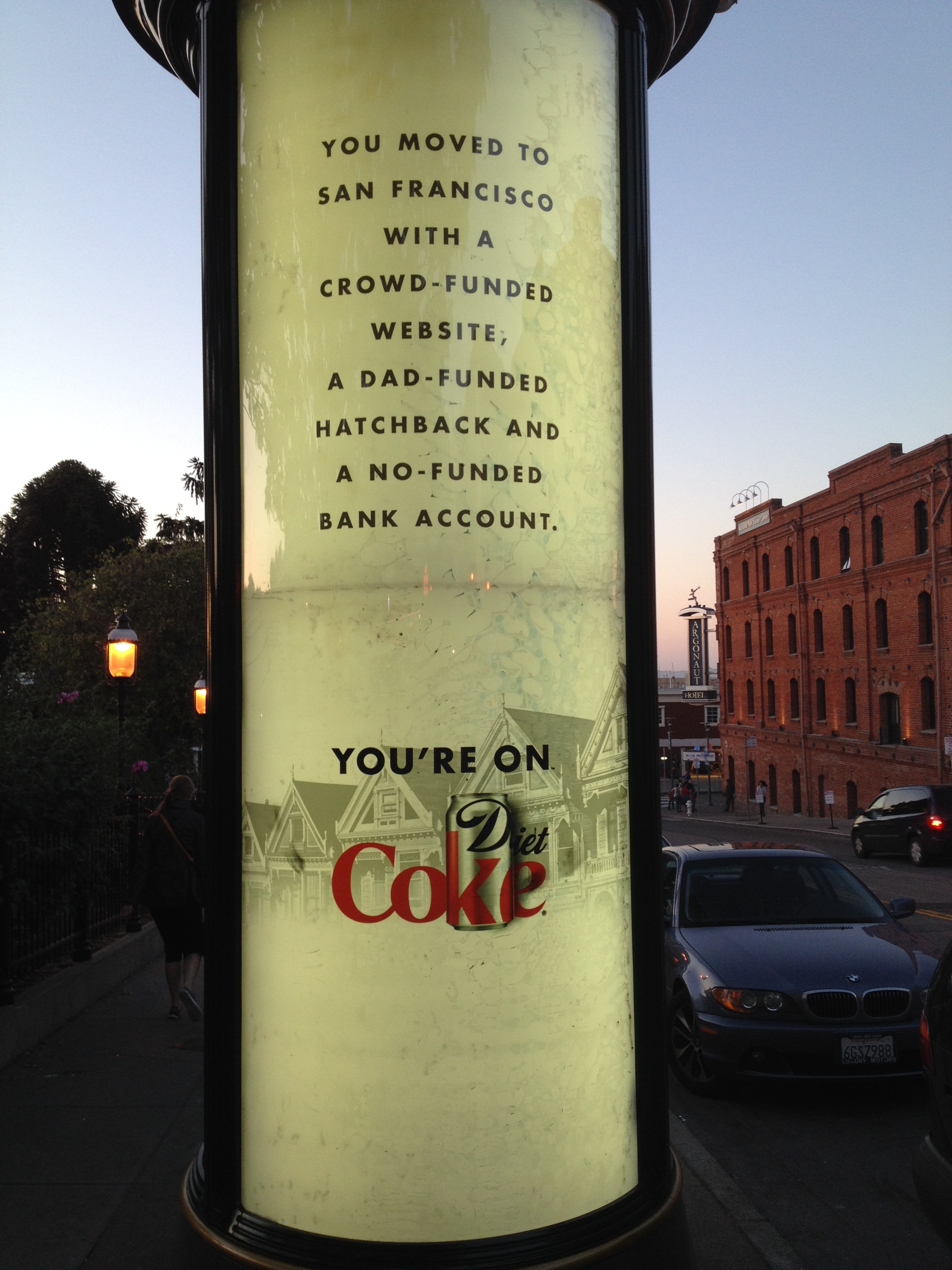
A less good example is the badvertising kiosk I photographed at the Hyde Street turnaround, one of the most touristy areas of San Francisco. “You moved to San Francisco with a crowd-funded website. A dad-funded hatchback. And a no-funded bank account. You’re on. Diet Coke.” Please tell me how the target of this ad could be anything but insulted.

To parse it, you’re a loser who can’t afford to buy a car and you have no money in your bank account, and you’ve moved to San Francisco like thousands of other idealistic young people who are about to get a harsh lesson in reality. The “crowd-funded website” is what does the greatest damage here, though. I don’t think the copywriter (who I have the feeling is some old cackling dude in New York, with arthritis-gnarled fingers, who last visited San Francisco when Carol Doda was performing on Broadway) has any idea what a “crowd funded website” is—that’s actually quite a complex thing to pull off, hardly in the wheelhouse of somebody who can’t balance a checkbook. No, they’re just trying to paint a picture using some phraseology they grabbed out of Wired magazine and the general idea is that’s what young people move to SF for these days, instead of serving coffee at Vesuvio.

Actually, it isn’t, necessarily. There’s quite a battle among young people these days for the city’s soul as evidenced by protestors vomiting on the massive buses with the black tinted windows that whip the techies back and forth. Being an internet billionaire is not on a par, karma-wise, with being discovered playing your guitar in Golden Gate Park. The stock photo (behind the Diet Coke logo) of the “Painted Ladies”, another touristic attraction with little meaning for the young scrounger unless he sleeps under the bushes in Alamo Square, and the very location of this kiosk where few actual San Franciscans would see it all suggest the campaign was conceived by a couple of nicotine-stained hacks peering out the dirty windows of an office in Midtown Manhattan.

I haven’t yet mentioned the tag line, with its subtle-as-a-brick double entendre. Note in the photo that the period in “You’re on. Diet Coke.” is in a smaller font than the rest of the type (compare it to the punctuation in the body copy) to give us an extra wink. Oh. I get it. “You’re on” is one of those anthemic phrases like “let’s ride” but they just couldn’t resist suggesting the youngster is hopped up on caffeine and artificial sweeteners.

Which makes me wonder…. Could this actually be intended as irony? Is it in fact designed for the tourists, inviting them to mock the Friscans they know are mocking them? If so, genius. But I don’t believe that is what is happening here. Diet Coke team, if you’re reading, please tell me it is or isn’t so.

Specifics sell… this example shows why!

National Parks
Beginning of the National Park Foundation’s email

Unfortunately, it’s an example of what NOT to do: The National Park Foundation saw the terrible wildfire currently out of control in Yosemite as a great opportunity to raise money for its cause. It’s exactly the same tactic used by The Salvation Army, The American Red Cross and many other charities which often have their best efforts on the heels of a disaster which triggers’ readers empathy and desire to help.

Unfortunately, as the NPF email was on its way to the coder some bone head saw the proof and said, “wait a minute, what about all the other parks? If they’re not in California, maybe they don’t give a hoot about Yosemite!” And so the “ask” was expanded to mention acts of vandalism, including green paint being splashed on the Lincoln Memorial.

I didn’t even realize the Lincoln Memorial was a national park, and it seems to me responsibility for cleaning it off (or keeping vandalism from happening) should rest with the local police. They then go on to tell us that there were 2,000 acts of vandalism in national parks last year and that the parks are underfunded. There’s also a reference to the fact this is the parks’ 97th anniversary and that the Travel Channel will match your gift. And they close with the unacceptably vague promise that a gift will “provide critical resources that directly aid and enrich our national parks and the work of the National Park Service.”

What should they have done instead? Leave the kitchen sink in the kitchen! In this case, a vastly stronger email could have been created by focusing entirely on Yosemite, saying how this makes us realize how precious our parks are and how much they need our support, and bringing in the Travel Channel match as exciting news that makes your gift go twice as far. Tell us very specifically what our contribution is going to do. Then get out.

And that anniversary announcement? Save it for the 100th, for goodness sake. Assuming this Foundation actually is doing good work, I hope they’ll be around that long. Meanwhile, this one goes straight to the Badvertising Hall of Shame.

Headline Horrors (outer envelope teasers that don’t)

Fresh Air camp appeal
What buses? Where are we going?

It’s been far too long since we’ve visited the Badvertising Hall of Shame… that corridor of horrors where unfortunate marketers teach us by example what NOT to do. Let’s begin with this outer envelope teaser from Fresh Air Fund.

This is a seasonal appeal I used to struggle with when doing work for Salvation Army… the “send an inner city kid to camp” fund. It seemed less urgent than putting food on the table or rescuing a child from the streets, and it was complicated because you’d have to create a word picture of why this was important before the reader got away. No missteps are permissible.

So look what Fresh Air Fund has chosen as its teaser: The buses are leaving soon… please hurry! What buses? Am I supposed to be on one? Why on earth does this not say instead, “The bus is about to leave for camp without me… please help!” (Singular better than plural because it’s more specific, and let’s mention the reason for the appeal for chrissake.) Also, while camps are universally recognized as a good thing buses are not. Seems like a terrible choice for the opening salvo in this appeal. Next.

Personal and Confidential OE
Do you believe this?

From… I don’t know who because I never opened it… I have a blind outer with nothing but PERSONAL AND CONFIDENTIAL printed above my name. Maybe I notice the “standard postage” indicia that spoils the illusion, but maybe I don’t; they’ve done a good job of designing something that looks like a real meter imprint.

But, look what’s above my name: PREPARED FOR: Okay, that’s too much and it’s also discordant with PERSONAL AND CONFIDENTIAL which suggests a very individualized letter, maybe a collection notice, whereas PREPARED FOR suggests a mechanized process like maybe a refund. Either would have been good on its own, together they cancel each other out. The blind outer has lost its intrigue so out it goes.

Pella 72 hour sale
When did the 72 hour sale begin anyway?

Finally we have this from Pella: OPEN IMMEDIATELY: 72-hour event ends soon. Well, is it 72 hours or isn’t it? If it is, it ends in 72 hours, not “soon”. The contradiction completely bursts the bubble of urgency and anticipation. Also, since this is clearly a piece of advertising mail, there needs to be more reader context, eg “Hurry! You’ve only got 72 hours to save” or “Open for your private invitation to our 72 hour preferred customer sale”.

That’s enough for today. Three examples in which the client or product manager is wondering why their mailing was not more successful, when in each case the fault lies with the copywriter who is probably making mischief on another campaign right now. I’ll have a couple more good ones in my next post.

Copywriting 101: Saratoga Chips

A local company is marketing a boutique potato chip in Saratoga Springs, NY, where that salty snack was invented in 1853. The chips are made with high quality potatoes and taste delicious. They are charmingly packaged in a replica of the “takeaway” box from the 1870s. The company is well regarded and family owned. And as a bonus, they are one of the largest clients of Saratoga Bridges, a not-for-profit that finds meaningful work for mentally disabled adults.

Okay, copywriters. Think you can create some kind of a marketing campaign from that?

Oh, there’s one thing I haven’t mentioned. For whatever reason, Saratoga Chips has chosen to sell at a per-ounce price about the same as Lays. I’m not in love with that decision because price competition is the mark of a commoditized product and this is anything but. In fact, there’s a huge potential audience of tourists who come for the track, the spa and the waters who would love to take something back to friends and family in Jersey or Florida.

Saratoga Chips Advertising

Unfortunately, the marketing department of Saratoga Chips is not you nor I. Avoiding history, warmth and local color, their copywriter came up with the Walmart-style headline: “Buy local… why pay more for the national brands?” Doing the copywriter one better, the art director mistrusted the visual appeal of the product and the antique box and subjugated them to a fake newspaper page (“Crum Cruncher” refers to George Crum, the inventor of the chip, but of course the reader doesn’t know this) superimposed on a fake wood background as if, I guess, the fake newspaper has been plopped down on a fake table.

Purely on the basis of missed opportunity, Saratoga Chips is hereby fast-tracked into the Badvertising Hall of Shame.

Chevrolet shoots self in crankcase, creates badvertising instant classic

You can’t make this stuff up. The VP, I mean Vice President of Marketing at GM, I mean General Motors, has asked all employees to stop calling Chevy by that casual name and refer to it by the formal “Chevrolet” henceforth. The request presumably extends to the brand’s new agency, Goodby Silverstein, but hopefully did not originate with them.

“We’d ask that whether you’re talking to a dealer, reviewing dealer advertising, or speaking with friends and family, that you communicate our brand as Chevrolet moving forward,” read a memo which was also signed by the Chevrolet Vice President for Sales and Service. “When you look at the most recognized brands throughout the world, such as Coke [they mean “Coca-Cola” of course] or Apple for instance, one of the things they all focus on is the consistency of their branding. Why is this consistency so important? The more consistent a brand becomes, the more prominent and recognizable it is with the consumer.”

Of course, you can also make a brand recognizable through generations of casual use until it becomes part of the national vocabulary as well as the title of several Facebook fan pages and the auto dealership of its chief NASCAR representative, Jeff Gordon Chevy. And presumably Don McLean will be asked to return to Café Lena here in Saratoga, where he originally penned “American Pie”, and revise its most memorable line to “drove my Chevrolet to the [whatever Chevrolet rhymes with] but the [whatever] was dry”.

The New York Times article which broke this story reports that there now is a “cuss jar” at Chevrolet headquarters and employees must deposit a coin every time they use the forbidden word. Once it’s full the proceeds will be used for a “team building activity”. Times reporter Richard S. Chang suggests that activity will probably not be a Mexican dinner at Chevy’s.

Thanks to Carol Maxwell to bringing this to my attention. And thank you America for making possible this badvertising epiphany. Your tax dollars at work.

Taking bad marketers to the woodshed

Did you ever get punished as a child for doing something naughty, because a parent or teacher didn’t believe you even though you were telling the truth? The problem here is a lack of authenticity—or, to borrow a favorite word from ace copywriter and gore movie maven Herschell Gordon Lewis— verisimilitude.

Consumers in general tend to be skeptical of marketers, which is why verisimilitude is very important. In addition to actually being true, a claim must APPEAR to be true or you break the spell and lose the sale. Today’s badvertising classic is a case in point.

The original State Seal label
Original State Seal Label (from a plaque at the springs)

I live near the bubbling natural springs of Saratoga, NY. Folks have been coming here to “take the waters” for centuries and the greatest number of springs, as well as the classic bath houses, are located in a park which is owned by the state.

Early in the 1900s an entrepreneur had the idea to bottle the water and sell it nationally. To emphasize the official connection, it was called “State Seal” water and the antique-y state seal of New York was actually shown on the label. Millions were sold and FDR became a big promoter of the springs and the water.

New State Seal Label
State Seal Spring Water label, c. 1980

Fast forward to the 1980s, and another entrepreneur had the idea to revive the brand. But he/she picked the wrong thing to revive. The new water is again called “State Seal” but the label design is bland and modern. Within a few years the revived brand was defunct.

The original State Seal water had verisimilitude. It looked like the kind of packaging a civic department might come up with if it had no clue about marketing but was simply trying to promote healthy water to its citizens. The revived water had none of this charm and authenticity. The revivalist probably thought the old design was out of date when in fact it was the essence of the brand.

Fetch me that paddle, ma. I think some marketer needs a whuppin’ here….

Travelers In-Synch campaign joins Badvertising Hall of Shame.

Mike Sciosa’s decision to take out John Lackey in Inning 7 of tonight’s Angels-Yankees playoff game has to rank among the all time worst decisions. But close behind it is the new In-Synch tagline from sponsor Travelers Insurance. That’s right, not “in sync” but “in synch” even though if you do a Google search for “Travelers in synch” they’ll correct it to “did you mean Travelers in sync”?

I’ve done advertising for Travelers in the past and trust me, they are not adding piercings and tatts to the traditional insurance pitch. This is an ill-advised attempt to slap on something of interest to a younger audience that would logically have little interest in insurance.

The ads, including a cute one with a terrier that ran during the game (he frets for his lost bone which he should have insured with Travelers) are standard stuff but then the bizarre tag line appears. “Travelers. Insurance. In-Synch™.” That’s right, in addition to pandering to 25-34 they are kowtowing to the legal department which is not the way to get the attention of the young and the restless.

Travelers, welcome to the Badvertising Hall of Shame.