Infographics seem to be the newest arrow in the art director’s quiver. Why say it with words when you can throw in a clever graphic? I’m fine with this as long as it enhances the communication, but recently I’ve seen some examples in which the visuals actually got in the way.
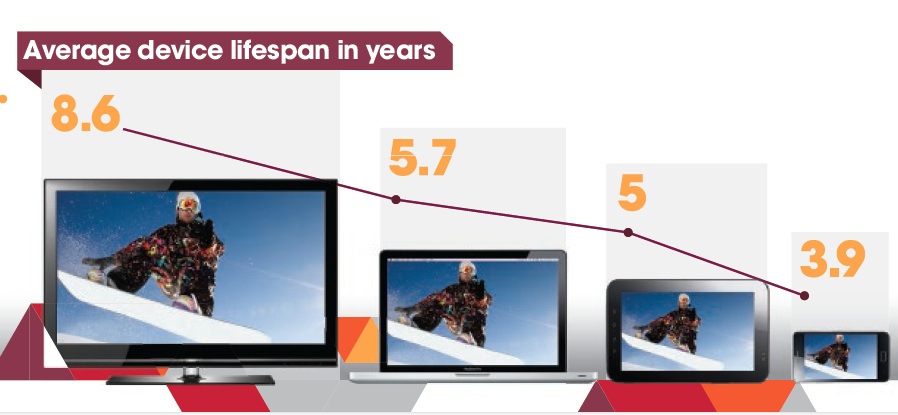
Here’s a simple infographic from Rovi (they’re my client, but I wasn’t involved in this) which demonstrates several best practices. The stat is about the effective life of different categories of device and it turns out the bigger the screen, the longer it tends to stay around. So the designer created a graph in which time is expressed by the size of the screen and is reinforced by the more precise timeline at the top. It’s memorable and instantly understandable. It pulls one fact out of a longer article which is particularly appropriate for visual expression.
Less good are infographics in which a legend is required to understand what the visual is communicating—in other words, there are design objects that symbolize something and then off to the side there’s a caption that says what they mean. This is a necessary feature with complex charts but an infographic is not supposed to be complex. If you need a legend to make your point, start over.
Still less good are infographics in which numbers are just translated into graphics with color and clever type treatments. This seems to be the most common type of faux infographic. Our friends at eConsultancy shared this classic from Google+ in “How Not to Make an Infographic: Four Examples to Avoid”. (Sorry it’s tiny; click through to the jpg then click on the magnifying glass to blow it up.) There’s nothing in these numbers that could not have been said just as effectively with simple words. The graphics don’t add anything; they’re arbitrary and don’t add the visual revelation we saw in the Rovi example.
Finally, at the bottom of the barrel, we find infographics that are actually incomprehensible. This is the kind of work I’ve seen from a couple of would-be infographics designers who pull out words or numbers that look important, then turn them into graphics and assume they will support the text. But it doesn’t work like that. An infographic has to work on its own as an element of the message.
None of this is news, of course. Edward Tufte’s The Visual Display of Quantitative Information, first published in 1983, has great examples of infographics dating back to the time of Napoleon. I wish some of today’s would-be infographers would read it.