A regional bank has invested in an image campaign, and the results are visible in the window of their local branch. Unfortunately, the copywriter has a tin ear. Let’s take a look at three sequential pieces of signage to see what I mean.
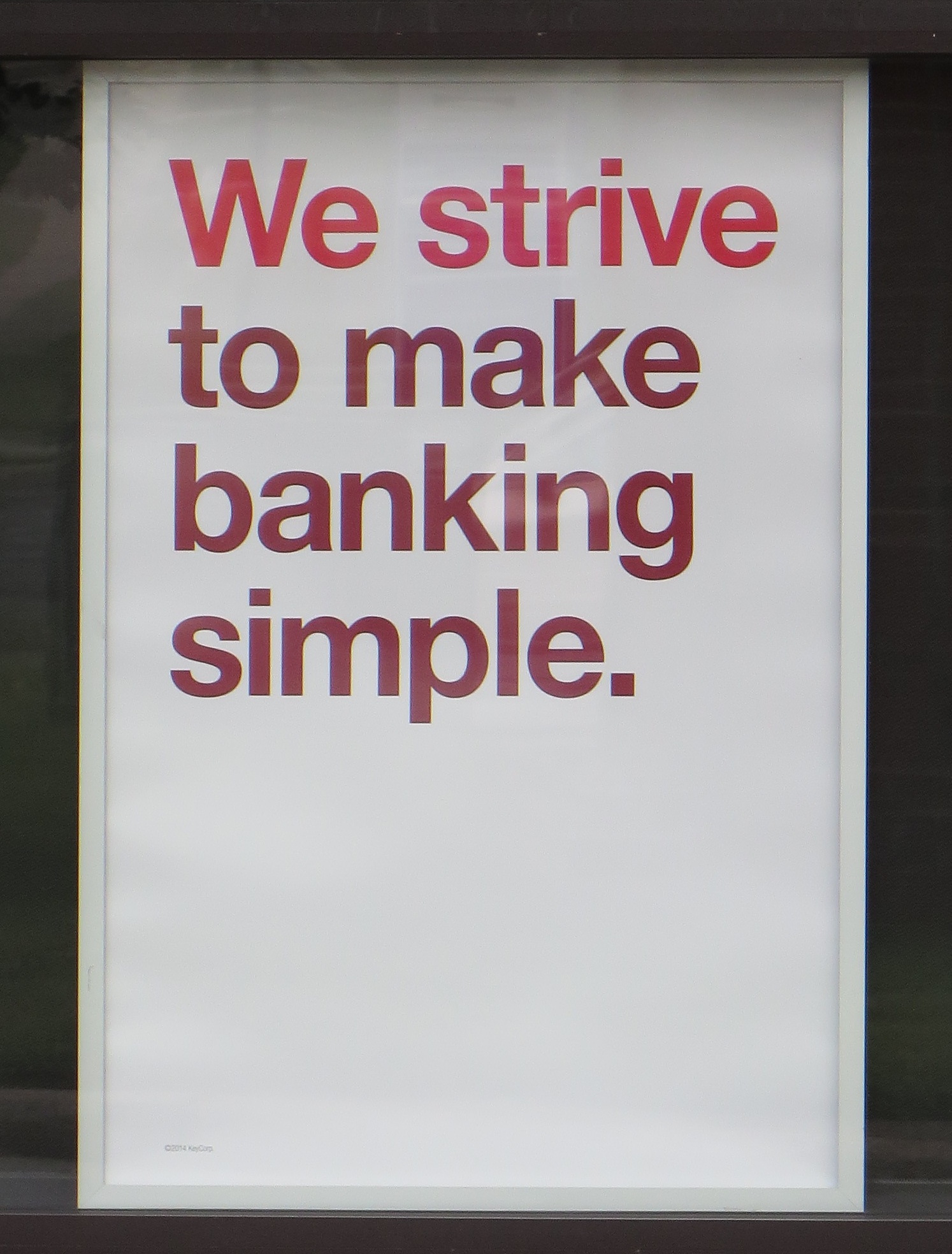
“We strive to make banking simple.” Making something simple is a benefit, but strive is a word that implies difficulty. It’s also a little bit above the average person’s everyday vocabulary. “We work hard to make banking easy” would have been better, especially because hard/easy balance each other in a way that strive/simple don’t.

“Feel good about your finances.” Another five dollar word. “Finances” is not a word in the average person’s vocabulary or, if it is, it’s not something you feel good about. “Feel good about your money” would be better but it doesn’t really tie back to the bank. (Neither does the original line, of course.) How about “We’ll give your money a good home”?
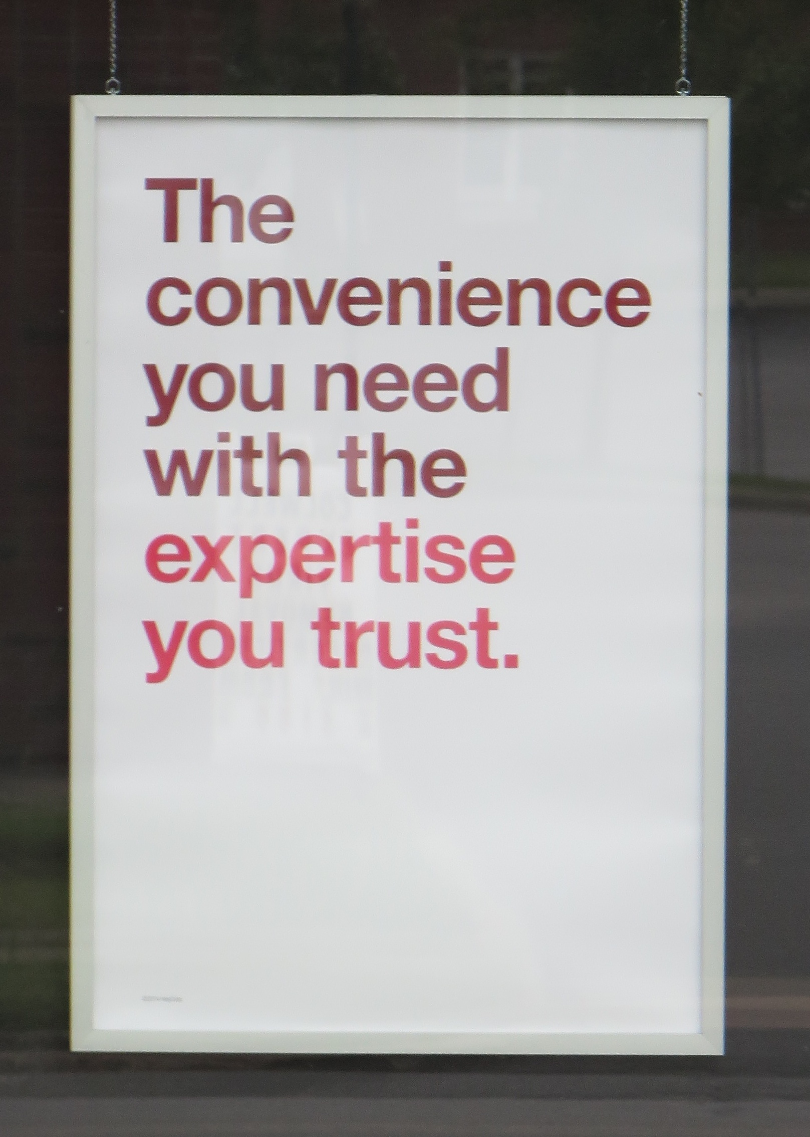
“The convenience you need with the expertise you trust.” The copywriter was running on empty when s/he got to this one. Convenience isn’t something you need. Want, crave but not need. Expertise is another of those high falutin’ words. What’s wrong with “experience”? Again, we have two concepts strung together so thought should be given to how they balance. Is it news that you can have expertise/experience AND convenience? Not really because they’re two unrelated benefits.
For that matter “need” and “trust” aren’t very well balanced either, are they? Let’s choose something you wouldn’t really expect to get with convenience, and use verbs of equal weight. “The convenience you want, with the security you need.” Because usually the more secure things are the, less convenient, right?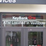
So there we are. Didn’t take that long, did it? But I have the feeling the copywriter’s not wholly at fault. I say that because of what’s written over the ATM entrance. “Vestibule”? How about “lobby”? The client probably got the big words because that’s what the client demanded. It reminds me of David Ogilvy’s maxim, “don’t keep a dog and bark yourself.”