I had been looking for a bad example of social media marketing to use in my DMA talk on Monday 10/11, when the good people at the Gap dropped one right in the lap of my denim jeans. Funny thing is, I don’t think they were aware they were involved in social media marketing which is part of the problem.

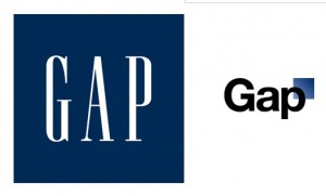
Gap, as you may know, changed its logo last week. To my non-designer’s eye, the new logo looks like something I was offered free at a conference by an outsourcing design firm: I was asked to answer a few questions about my business, then come back in 20 minutes. Gap’s new logo is simply its name, set in the same font used for the table of contents in the New York Times magazine, with a little blue square at the side as homage to the old logo they’re getting rid of. On the face of it this does not seem like a particularly good change. Plus the old logo had a lot of recognition built up over 20 years; most marketers would consider that brand equity but Gap felt it was a problem. They’d had the same logo for 20 years, so it was time to get rid of it. Not evolve it, as many companies have done (think about how Betty Crocker, Uncle Ben and Aunt Jemima have morphed over the years in response to changing social mores). Just toss it out and start over.
The change drew over 1000 comments on Gap’s Facebook Wall, with the balance overwhelmingly on the negative side. (The Facebook page still displays the old logo as of this morning, by the way. Oops!) The critics tended to say either the new logo looked like an exercise from a beginning Photoshop class, or that they loved the old logo and didn’t want to see it go. And, not a few offered to redesign the logo themselves. That’s where it starts to get strange.

Gap President Marka Hansen wrote on her Huffington Post blog that “given the passionate outpouring from customers that followed, we’ve decided to engage in the dialogue, take their feedback on board and work together as we move ahead and evolve to the next phase of Gap. From this online dialogue, it’s clear that Gap still has a close connection to our customers, so tapping into this energy is right. We’ve posted a message on the Gap Facebook Page that says we plan to ask people to share their designs with us as well. We welcome the participation we’ve seen so far. We’ll explain specifics on how everyone can share designs in a few days.”
Aside from the condescending we-we language (“passionate outpouring”? more like “howls of outrage), what is really going on here? Is the lame new logo actually a placeholder and publicity stunt? Does Gap really want its customers to help design a new logo, and if so why did they not say that in the first place? And if they are indeed going to hold a design competition, what are the rules of the game and how will the winner be compensated? (Designers are already posting to warn their colleagues not to offer designs until copyright protection measures are made clear.)
Right now Gap’s getting a whole lot of free publicity. Problem is, most of it is negative especially for a company that would like to have a positive image for its design and customer interaction skills. It will be interesting to see how this unfolds.
UPDATE: on the evening of 10/11/10, Gap announced that it was going back to its old logo. Here’s their Facebook statement, thankfully free of we-weisms: “Ok. We’ve heard loud and clear that you don’t like the new logo. We’ve learned a lot from the feedback. We only want what’s best for the brand and our customers. So instead of crowd sourcing, we’re bringing back the Blue Box tonight.” And according to Ms. Hansen in their press release, “There may be a time to evolve our logo, but if and when that time comes, we’ll handle it in a different way.” Sounds like a plan.