I’ve always followed David Ogilvy’s dictum, which means I never show work around if I know was not successful in the marketplace. But what if the market was wrong? Or, to put it less arrogantly, what if the lists got messed up somehow and my mailer or email went to the wrong folks? Shouldn’t you be allowed a free pass once every few decades on work YOU really like and think is good?
I was going to present the piece shown here as an example. It’s always been one of my personal favorites, though I hadn’t looked at it in a number of years. The client and I were very surprised at the time that it was not a big winner. But when I pulled it out today, I could immediately see what was wrong.
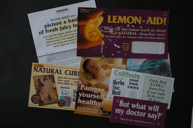
The outer envelope (upper right in the photo) is what kills this package. We’re selling a book of relaxing natural cures to women and I wanted to use a lemon to illustrate how our mind has powers to help us. (Really concentrate, think about a lemon and its taste, and your mouth starts to pucker up.) But where’s the reader benefit in this? I was also betrayed by my choice of visuals from a great designer… this stop-motion bursting lemon image is frenetic when it should be calming, and the background should be green not purple for a restful, natural cure. And yep, that reversed out type is pretty hard to read.
Inside is lots of good stuff which the recipient of this package never got to see. There are two headlines I like: “Pamper Yourself Healthy” and “Natural Cures that Feel as Good as They Work”. Either one of these might have given me a fighting chance if I’d used it on the outer.
Once again the marketplace—and David Ogilvy—are right.
Thanks for posting such valuable stuff! How do you get your infomation regarding color on a reader’s mood (e.g. purple v. green )?
There’s some research you can probably dig up on the web regarding the psychological import of various colors… but for this, all that I was saying was that there is a natural “green” feel to something involving a fresh lemon and we’d lost that by using purple instead.