Right now thousands of people are re-installing Microsoft Outlook as they upgrade from XP to Windows 7. And the majority of these folks won’t touch the default settings which don’t load graphics within emails unless the user specifically asks to do so.

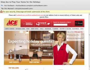
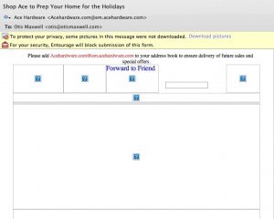
Right now hundreds of marketers are designing emails that ignore this reality, by placing a big beautiful graphic at the top of the message that shows up as a blank spot superimposed with a red X instead of the desired image. Which means that most recipients will never see the graphic, or the message, because there is nothing visually compelling to pull them in. The “before and after” examples from Ace Hardware are proof positive. Inviting graphic and great offers, but most of the people who got this email will never see them. (I’m on a Mac so the red X’s show up as question marks for me, but the problem is the same.)

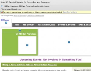
So what can you do to fix it? Use HTML text creatively at the top of your email instead of relying on graphics to tell the story. The REI newsletter example is isn’t pretty, but there is a lot of REI identity here to pull people in, including the bar of clickable links.

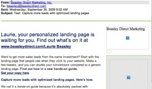
Better yet is the email from Beasley Direct that has a good ol’ compelling headline to pull people in, and places this to the left of the page so it will have maximum visibility on small screens. This email also includes ALT text—the words “Beasley Direct Marketing” over the graphic—which appear when the graphic doesn’t load. That’s another good practice. Better yet would have been a benefit message or call to action in the ALT tag, such as “request your complimentary landing pages guide”.
Make sure you’re following these simple steps next time an email goes out. Don’t get intimidated by your art director… the design can still look great, you just need a backup scenario when the graphics don’t load. And everybody will be happier with the higher open rate and, hopefully, more clickthroughs.
Great tip!
Amazing post! This provides awesome tips for us.