It’s not often you get to see a completely new user interface come on the scene, but that’s what we have today with dual flush toilets. This affords us a rare opportunity to look inside designers’ heads as they figure out the process of making consumers comfortable and confident as they use the product.
A dual flush toilet has two settings that use differing amounts of water depending on what is being flushed. The designer’s challenge is a/communicating this fact to the user, who possibly has never seen such a device before; and then b/letting them know which switch is for which function. Let’s look at a few examples of how this challenge has been met.

The University of North Carolina installed a very institutional toilet with a handle that goes up or down depending. Since you don’t know which is which way does what they put up a sign to explain. I would say this is not very good user interface design: if you have to include instructions for a toilet handle, it’s non-intuitive and too complicated.
A couple of companies offer retrofit kits that add dual flush capability inside your existing tank. To make this work, they replace the operating handle on the outside of the tank. Dual Flush also has a handle that goes up or down, and they include a decal in the package that you can stick on the toilet next to the handle to educate users. Again, not ideal but we’ll give them the benefit of the doubt since this device is a lot cheaper and more environmentally friendly than buying a new toilet.

Another retrofit kit comes from Flush Choice. This one has two handles, a little one for a little flush and a big one for a big. I think I would figure this out without a guidebook, but it would look a little circusy in a home bathroom and might not be sturdy enough for institutional settings.
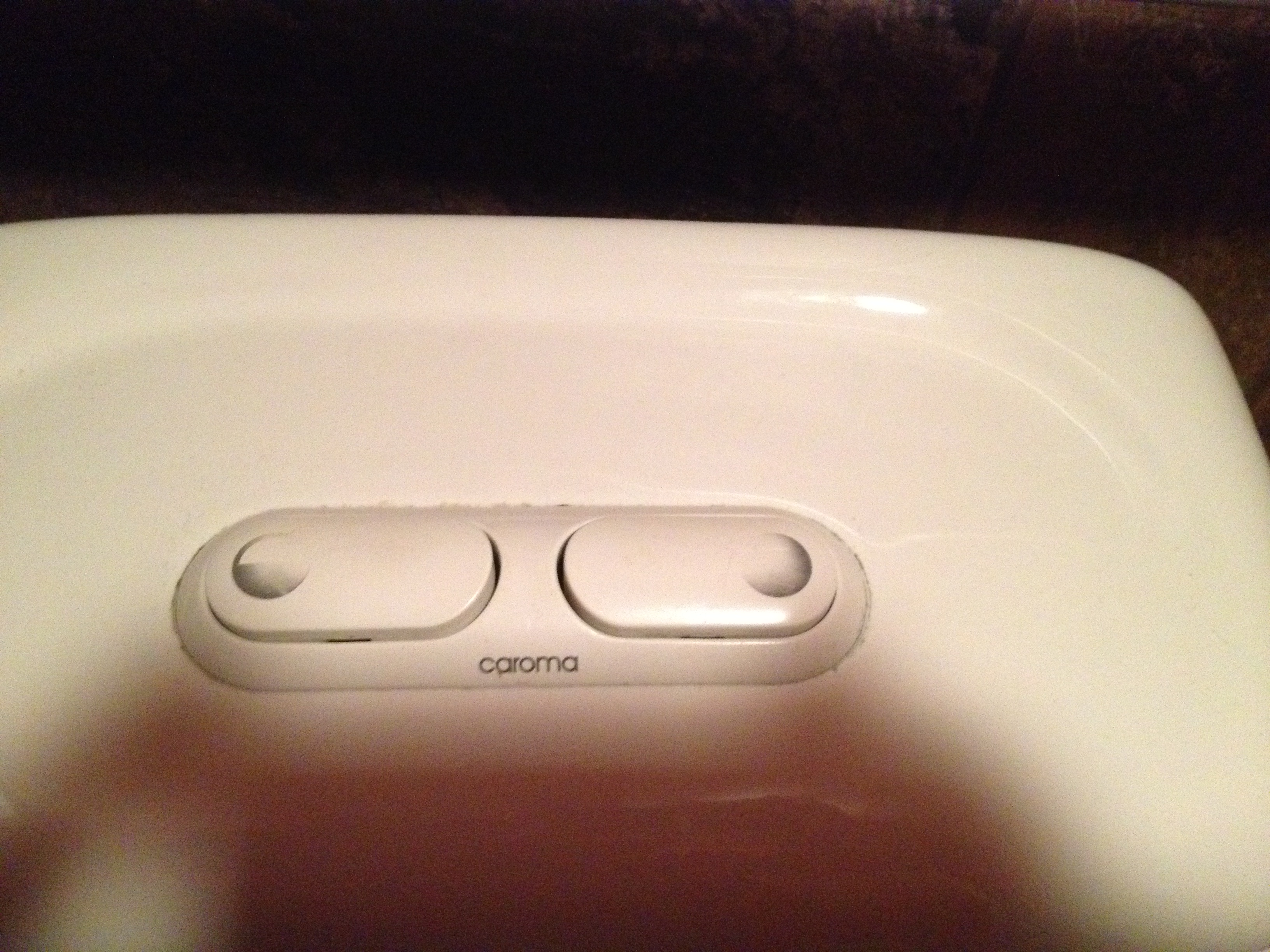
Other designers have abandoned the handle and flush the toilet with an entirely different mechanism: buttons. Making such a radical change in the interface is pretty unusual, and it can only work because people really, really want to flush that toilet, and will take the initiative to figure out how. Buttons can be attractively designed, and they’re sturdy because they connect directly to a plunger in the tank. And in fact, all the dual flush toilets I’ve actually seen in the wild have buttons.

Of the three photos here, the big wide buttons are from a toilet in a public restroom. The buttons are of equal size but they have images on them to tell you which is for which. The image of the solid circle implies “all the water” but it also reminds of solid waste. Maybe too graphic? And using same-size buttons for different-size flushes doesn’t seem like an elegant solution; the designer missed an opportunity to communicate by making the buttons also different sizes.

That’s what was done with the new-moon shape, which is my favorite. It hearkens back to outhouse doors and once you study it, it’s clear that one button is larger than the other and I think most people would figure out that small means less. I kind of wish they would make the “less” button green but maybe that calls too much attention to itself to be a successful home décor product. (Interestingly, the plunger underneath this inside the tank IS green; also interesting, the home fixit guy who installed it got the parts reversed so the green low flush plunger ended up on the high flush side. In the end, some human errors can’t be solved with design.)

The much, much more subtle split circle is from the same manufacturer, Kohler. This toilet is much more expensive than the one above and works a lot better. And I can easily see what went through the product manager’s head when they saw the new-moon configuration: “I’m not putting a picture of an outhouse in MY customer’s bathroom.” But it would have been an improvement.
Gotta go.
UPDATE: 4 1/2 years after writing this post, I revisited one of these toilets, located in a public restroom at my local coffee hangout. Take a look: with regular use, the legends on the two buttons have worn off so you can no longer tell which is which. D’oh!
Thanks to all who have come from near and far to read this post… I never knew an article on toilet flushing could be so popular!
After several months of using the two Kohler dual-button designs, I have one more thought: some people really would like to finish the job and flush before they rise from the toilet. This is nearly impossible to do with the button designs… giving the modified-handle option the edge in usability in my revised opinion
I find this to be very interesting and I hear about this at work.
I work in Wal*Mart Canada.
Is it hard to transform from an old toilet.
My bathroom off the master bedroom is a larger toilet and the one on the main level uses less.
Thanks,
Janet
Janet, I’d look into the two retrofit kits I mentioned–Flush Choice and Dual Flush. The links above lead to their websites. Though I personally would want to actually see the product in operation before I bought it, to be sure it’s sturdy enough for long term use.